Standout Features:
- Pristine white backdrops
- Contoured ingredient illustrations
- Cursive font
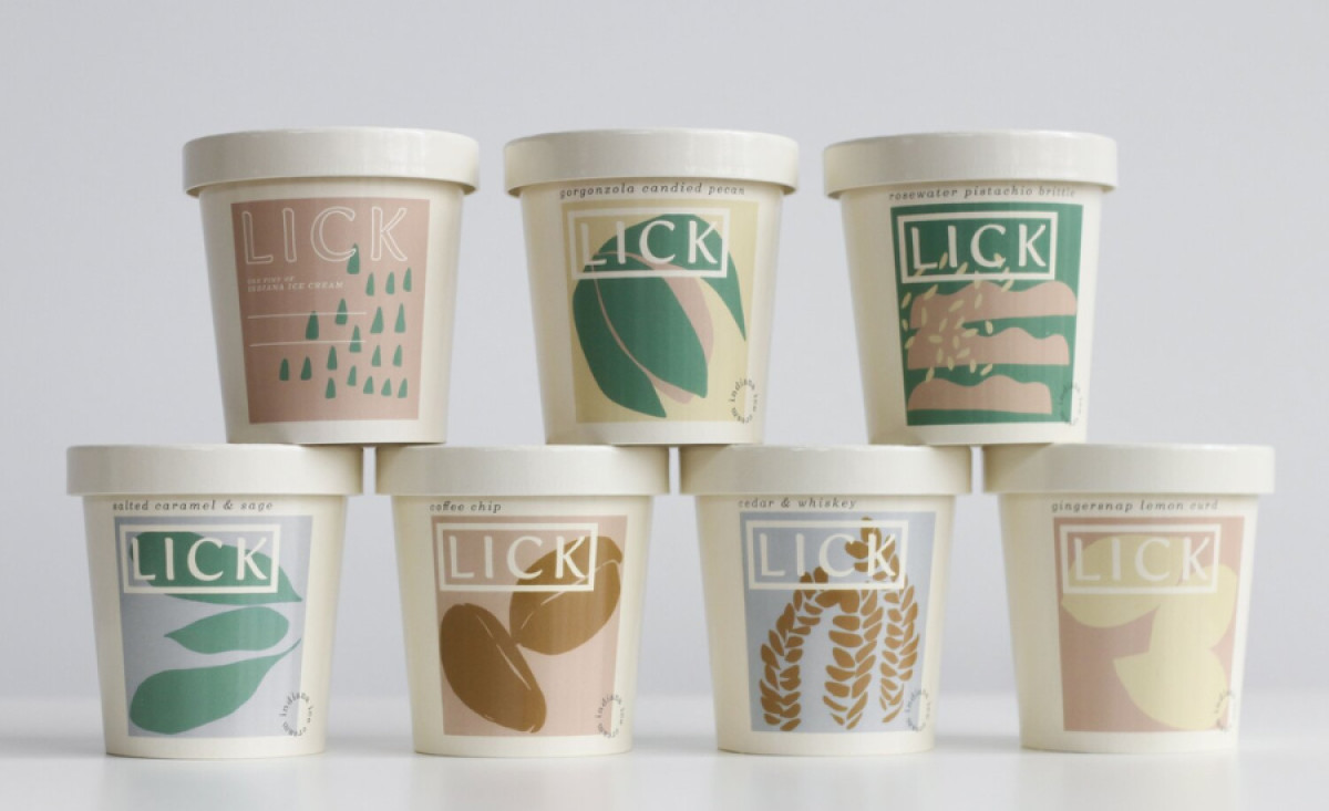
FLATLAND KITCHEN's packaging design for Lick ice creams is a delightful fusion of contemporary aesthetics and nostalgic charm.
The cream-white packaging, reminiscent of classic ice cream parlors, exudes purity and simplicity. This choice of color creates a clean and inviting backdrop that lets other design elements shine.
Moreover, the contoured ingredient illustrations add a touch of whimsy and artistry to the packaging. These visuals, covered in pastel hues, complement the brand's youthful, contemporary, and refined personality. Plus, they highlight the product’s unique combinations of quality ingredients.
To top it all off, the flavor names are presented in a sophisticated cursive font, infusing the design with personality and timelessness. The designer opted for this typography to depict the dutiful care Lick pays to its products, creating an exclusive ice cream experience with each flavor.