Standout Features:
- Cursive, rounded font
- Simple, youthful aesthetic
- On-brand color palette
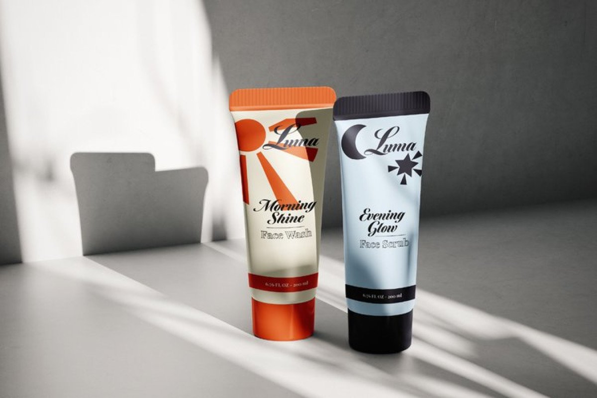
Kelsey Tara Nicole’s packaging design for the Luma skincare brand resonates with the youth by beautifully balancing a vibrant energy with a mature, elevated aesthetic. The cursive, rounded font reflects approachability and gentleness, making the products feel reassuring for its young audience.
The design uses simple, sophisticated illustrations of the sun, moon, and stars — each correlating with specific products. These elements infuse the design with maturity, steering clear of the overly sweet look often associated with teen products.
Ultimately, the pastel blue and orange color palette further enhances this balance. It gives the design a more refined yet youthful vibe. This color choice aligns closely with the brand’s identity, resulting in a fun and classy package.


