Standout Features:
- Systematic color-block architecture for flavor differentiation
- Expressive flavor typography and minimalist iconography
- Iconic logo stamp anchoring the brand identity
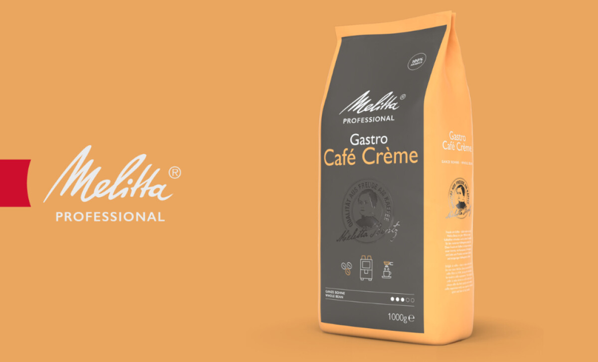
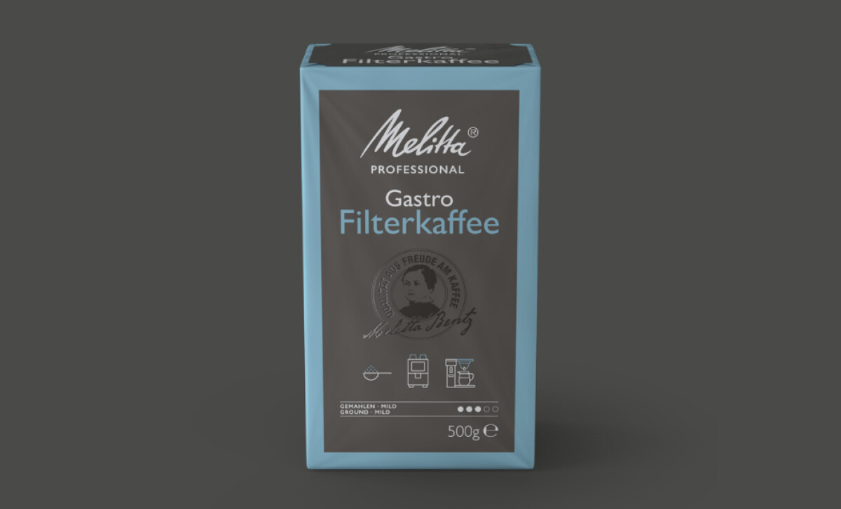
The vibrant packaging system for MELITTA coffee, from Hotsushi, is a successful modernization of a historic brand. It employs a clear, scalable design architecture, allowing for broad flavor differentiation while still cementing the brand's century-old identity.
The stakes for getting packaging right are high, as an Amcor survey found that 23% of consumers (a figure that rises to 37% for younger generations) have stopped buying a coffee product simply because of its poor packaging.
Each coffee bag is designed with a strong, systematic architecture of horizontal color blocks. The front section is always a neutral gray, while the rest of the food and beverage packaging uses a unique, vibrant color for each coffee variety — like bright orange for Hazelnut Creme.

The flavor name on each package is written in a unique, colored font to create a distinct personality. Sans serif dark mauve for "Espresso" for example. This simple typography and the minimalist line-art icons of ingredients work together to quickly communicate the taste profile and add artisanal charm.
Despite varied colors for flavors, every package is unified by the iconic logo stamp at the middle. This section, with the classic Melitta script logo, is non-negotiable. In a busy supermarket aisle, this immediate brand recall is invaluable, ensuring loyal customers can always spot Melitta products with ease.
This project demonstrates that a scalable, color-blocked system can effectively manage a diverse product portfolio, making it easy for consumers to navigate on busy retail shelves. The balance of consistency and expressive variation is key to its success.
-preview.jpg)