Standout Features:
- Botanical icon
- Unified label system featuring a signature blackout aesthetic
- Functional typography and clear product information hierarchy
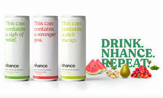
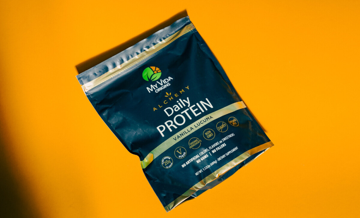
Originating from a community education mission, My Vida Origins offers diverse supplements with a focus on holistic wellness and science-backed nutrition. Blanco Creative Agency's packaging design for these products aims to reflect a commitment to proactive wellness and ingredient transparency.
Each product prominently displays a unique circular icon that combines a leaf with a rising sun or flower. This emblem, using a palette of green, orange, and dark brown/black, suggests organic wholesomeness and energy, effectively communicating the brand's core values and the product’s promise.
The packaging system consistently uses a blackout design — black or near-black matte containers. These are accented by vibrant color bands that differentiate product lines like "greens" or "detox." This premium look allows the white and neon-green text to stand out.
Restrained yet effective typography is a key feature. Product names are bold uppercase sans-serifs. Secondary information is in a lighter, condensed font. This deliberate hierarchy ensures that critical product details are easily found and understood by consumers comparing supplement options.
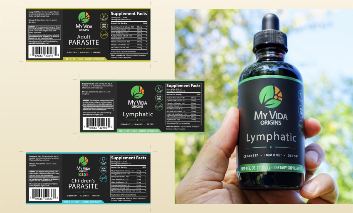
Most importantly, this health and wellness packaging ensures that consumers can easily parse the product information. This is crucial, as 75% of global consumers would transition to a brand that offers a greater level of detail than its competitors, making transparency directly influential on purchasing decisions.