Standout Features:
- Playful and bold logo design
- Vibrant color palette
- Distinct bottle shape and labeling
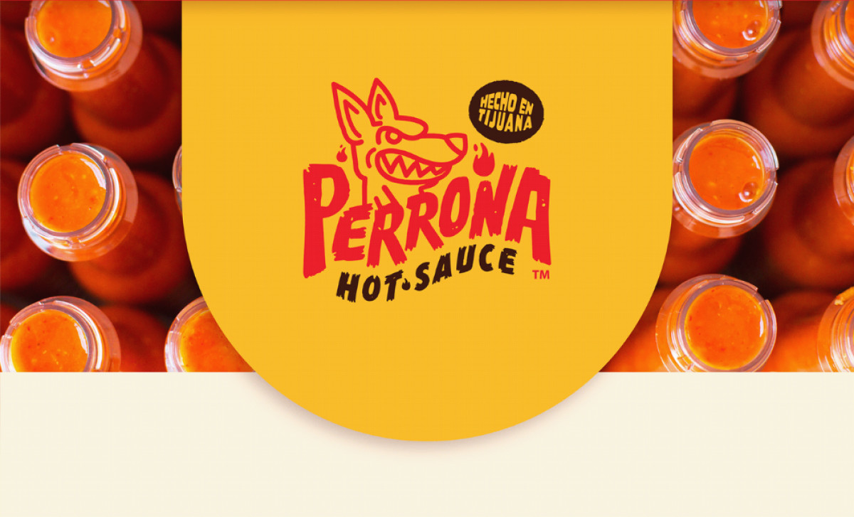
Perrona Hot Sauce is a fiery condiment brand that has recently undergone a brand refresh, aiming to capture its essence of spice and bold flavor. Mimi Guarnero’s redesign brings this vibrant and bold personality to life across its packaging, ensuring it stands out on shelves while clearly communicating the product’s core attributes.
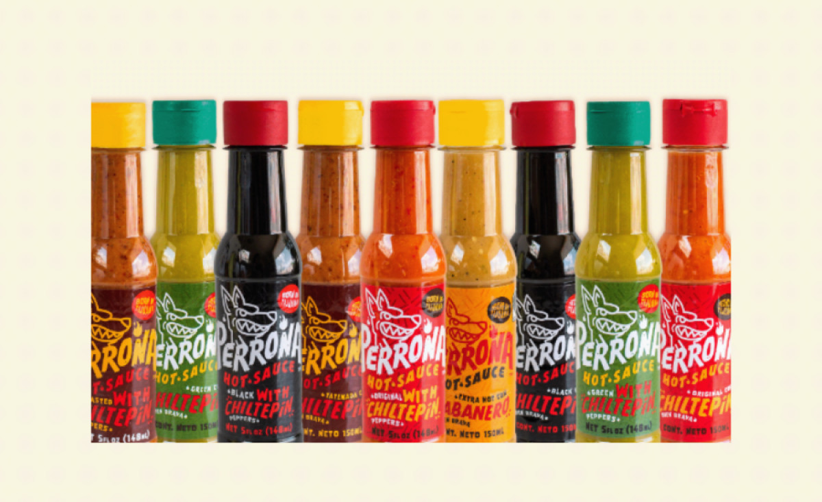
One of the first things that stands out in the design is the bold, playful label, featuring a snarling dog with exaggerated features. The choice of the dog serves as a symbol of the intense heat and wild energy associated with hot sauce. This character brings both a fun and fierce identity, perfectly aligning with the spirit of the product.
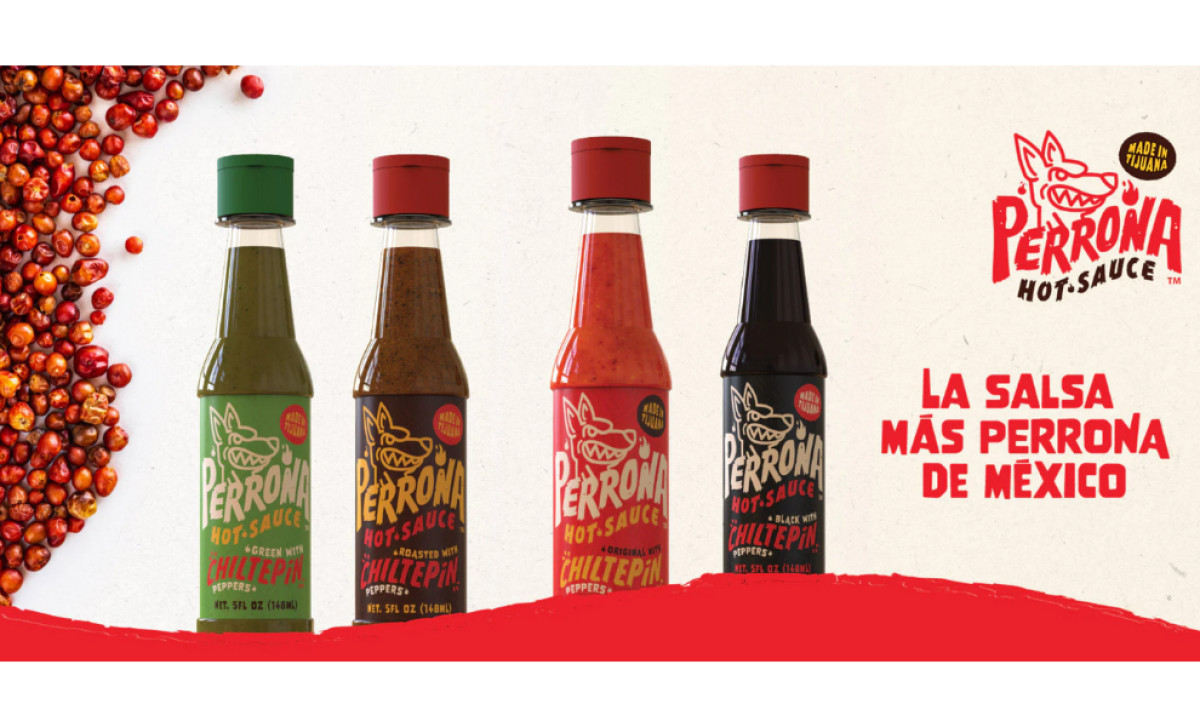
Each flavor is associated with a unique color, ensuring clear differentiation across varieties. The red, green, and black hues are complemented by the iconic yellow accents, making the sauces visually appealing and easy to recognize. This use of color not only aids in shelf visibility but also invokes the heat levels of the sauces themselves.
The packaging shape is similarly distinct. With its playful bottle design and clear labeling, the packaging feels modern yet unpretentious, resonating with a wide audience. The bottle’s shape, alongside the vibrant typography, reflects the dynamic and bold flavors inside, creating an immersive brand experience.
With this redesign, Mimi Guarnero successfully transforms Perrona Hot Sauce into an eye-catching and memorable food packaging design, capturing both the essence of the product and the excitement it offers to consumers. The fresh branding brings Perrona into a new era, positioning it as a fiery favorite in the world of hot sauces.


