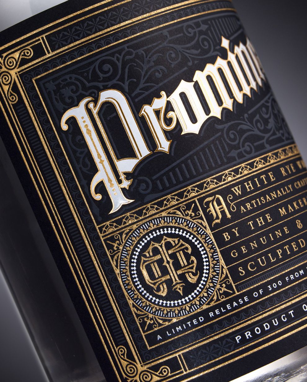
Chad Michael Studio has a unique style and the ability to create beautiful designs while using well-placed type, smart colors, and beautiful illustrations, and this limited-edition bottle of white rye whiskey (production was capped at 300!) is no exception.
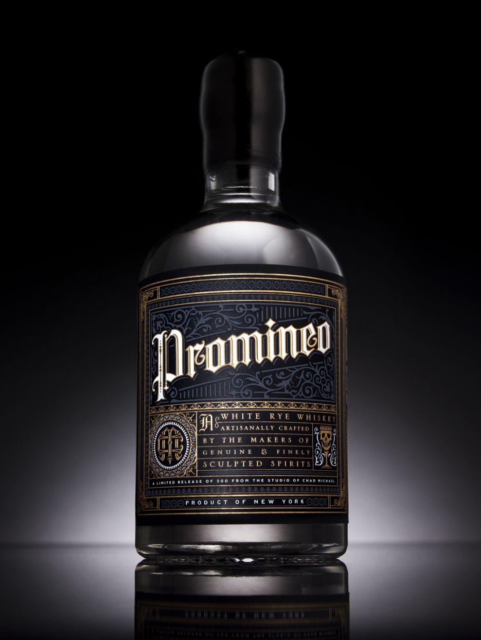
The bottle is a bold shape, but the label is where the overall packaging really shines. It uses a gothic typeface in conjunction with both serif and sans serif fonts. These fonts are spaced well and kerned to perfection.

Each piece is individually sealed, hand-labeled, and numbered by the artist. They were created to promote the launch of Chad Michael Studio. Promineo means “stand out” in Latin -- and this design does just that with its brilliant display and attention to detail.

This packaging utilized minimal colors, and prominently displays the title, Promineo, with a white and gold font treatment surrounded by line elements. These are toned down to a blue and gray color combination that, paired with the black label, fills out the space without crowding the title.

The Chad Michael logo sits directly underneath the title, and displays perfect element spacing that creates a seamless mark that is timeless and memorable. The combination of gold and white balance one another amidst the other design elements, while both thick and thin lines frame the type and set this design apart.
Promineo is an elegant packaging design in the Food & Beverage industry.


