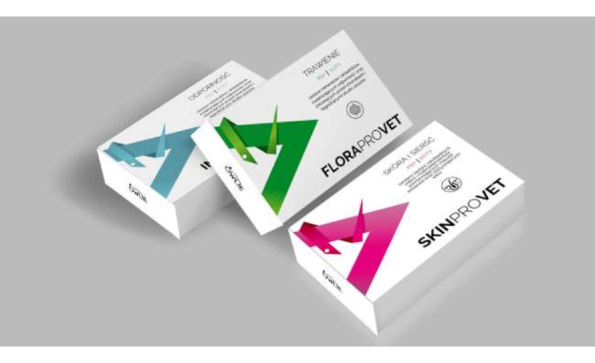
Standout Features:
- Striking streaks of colors
- Simple and legible
- Distinct icons per product
It’s often a challenge to deviate from the norm, especially when most medicine and veterinary products often have plain designs. But FDESIGN took this head-on when they worked on the ProVet packaging design.
As a well-established Polish veterinary medicine wholesaler, they needed a fresh look while keeping it professional.
The three primary products of the brand feature a unique color scheme each. The agency strategically used bright colors and laid them flat on clean white background for a striking effect.
Using a white background and providing plenty of whitespaces associated with medical products brings an essence of freshness, modernity, and convenience to the design. The supportive colors of the geometric patterns complement the clean look of the packaging.
Although the logos and the graphics remain the same, the geometric pattern design varies for each product variant, helping the buyers differentiate them easily. Another distinction is the unique icon placed above the product name that represents a certain body part or organ it’s good for.
-preview.jpg)

