Standout Features:
- Blue color palette
- Informative illustration
- QR code
Wendy Ju's packaging design for Seafood uses a thoughtful and cohesive approach to emphasize transparency, sustainability, and consumer engagement.
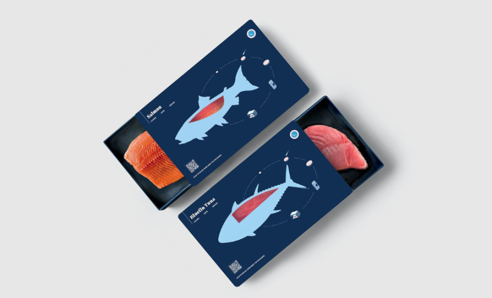
The design features a blue palette directly associated with the product's aquatic theme. The primary shade of the box packaging is rich, deep blue, an excellent canvas that makes the illustrations in lighter shades of blue pop.
One of its standout features is a simple graphic of a fish representing the product inside. This straightforward element depicts the product, giving consumers a sense of transparency.
Another standout illustrated element is the emphasis on the eco-friendly production process, symbolized by a circular visual at the top right corner. It underscores the healthy and sustainable practices in making "cleaner, safer, greener" products.
To further elevate transparency and consumer engagement, a QR code is placed in the bottom left corner of the packaging. This allows customers to access detailed information about where the seafood has been sourced from, reflecting the company’s dedication to openness and fostering a deeper connection between the brand and its customers.