Standout Features:
- Playful typography
- Minimal label design
- Color-coded variations
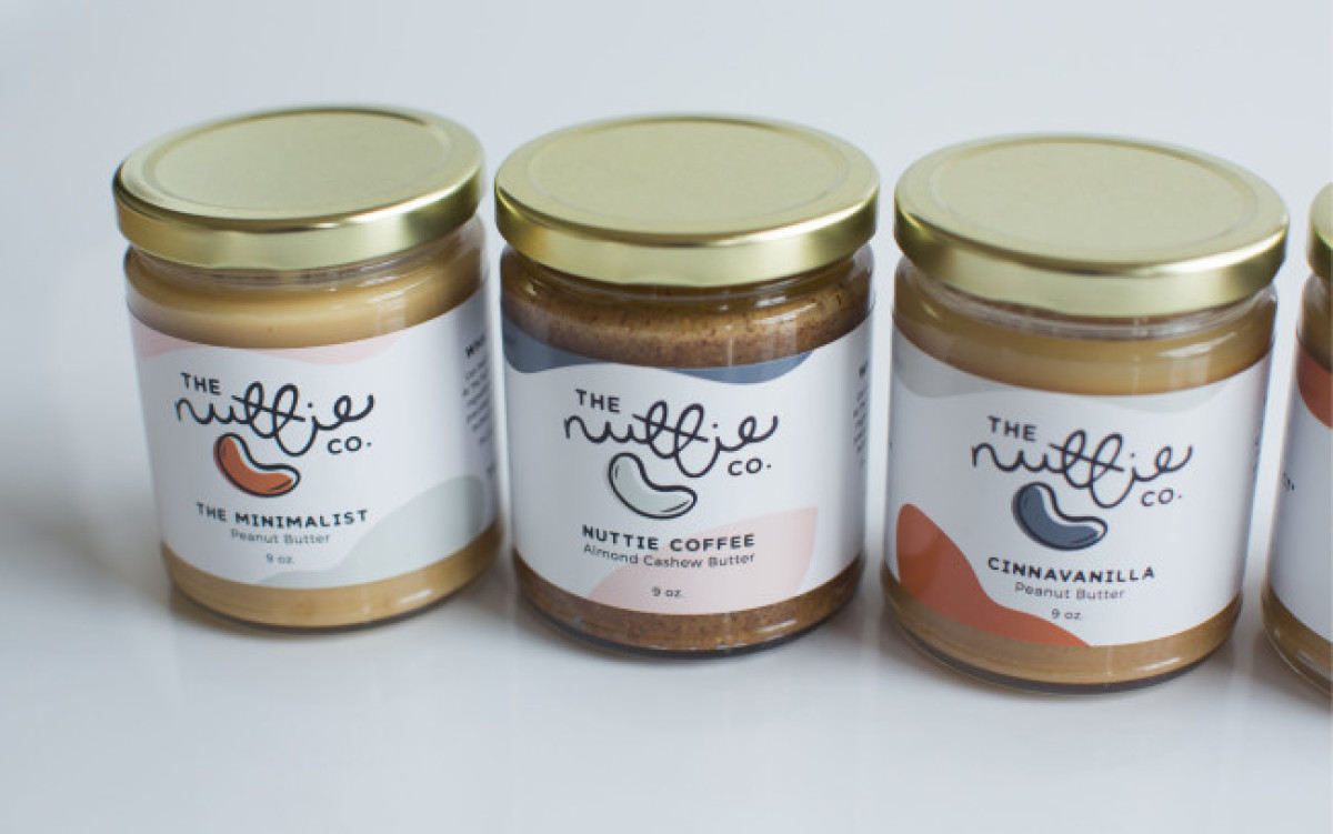
In Jenny Tod Creative's jar label design for The Nuttie Co., the playful typography and nut illustration create a vibrant and engaging visual identity. The central seed illustration and abstract shapes on the label have different colors, with each variant having a distinct color combination. This makes it easier for consumers to distinguish each flavor.
This strategy highlights the natural essence of the nut butter products and infuses a sense of fun and creativity into the packaging.
Look at some of the best minimal logo designs.
Get a chance to become the next Design Award winner.
SUBMIT YOUR DESIGN