Veuve Clicquot Is an Infamous Brand With Innovative Packaging
Veuve Clicquot is a French champagne brand known for its expensive, quality products. It’s an iconic bubbly brand known for its delicious, top-shelf and innovative designs. It’s a brand full of regal authority and mastery.
This French champagne first entered the scene in 1772 — making it 246 years old today. It’s a champagne that oozes a regal and sophisticated pride. It radiates confidence, exceptional quality and luxury.
This quintessential French brand is one of the most well-known brands out there and is known for its stellar champagne — the kind you see on celebrity Instagrams and at the top shelf of liquor stores.
When it was first created, it was marketed as a drink for the upper class. It was a bourgeois beverage only for the best of the best. And it still holds that regality and honor to this day.
In 1811, the brand created the Veuve Clicquot we are most familiar with today. It revolutionized champagne drinking, aligning the beverage as a luxury and a majestic drink. But it also changed the way champagne itself was produced and distributed.
In the 1800s, Veuve Clicquot’s founder created the riddling rack, which was vital in making the entire process more economical and more efficient. To this day, this method is still used in some capacity to create a quality champagne that’s enjoyed by millions.
Veuve Clicquot is a brand that’s no stranger to thinking outside of the box and creating exceptional products for its consumers to enjoy. They’ve been known to come up with a variety of special edition blends to reinvigorate their base and turn champagne drinking on its head. Similarly, they’ve been known to play with packaging design in a way that’s edgy, creative and fun. Most recently, they decided on an eye-catching tin packaging to highlight Clicquot Arrow — their nod to the brand and its dynamic history. The Clicquot Arrow line highlights the 29 destinations of the champagne brand, the arrow pointing there and pointing forward.
The Clicquot Arrow can point the way through a collection of 29 destinations from New York to Kyoto to Paris... and the distance separating you from Reims, the center of the House’s production. Equipped with a connected NFC chip and a QR code, this iconic metal case, is your passport to the world of Veuve Clicquot. Just grab your smartphone, scan and start your journey thanks to a 360° film. You can even live the experience with a Virtual Reality device to make it even more immersive.These tins are eye-catching, innovative and stunning. They sit all on their own. And they take package design and make it package art.

These Specialty Veuve Clicquot Containers Take On A Creative And Eye-Catching Shape
These Veuve Clicquot packaging designs use shape to dazzle, amaze and inspire in a way traditional packaging can't. And that was the goal of agency Servaire & Co. who created this mesmerizing design:
Inspired by the pioneer spirit of the house, the agency seizes on the « Journey » theme and turns it into an animation program, through two strong and universal symbols : the arrow and the destination, evoking an inspiring and personal imaginary world. The opportunity for Servaire&Co to transform a simple packaging into a memory box, a decorating reminder collector, user-adjustable. With Arrow, packaging gets to a new level of emotional design. Our creation, a range of 29 references, offers an infinite and iconic concept to Veuve Clicquot for the years to come.And the iconic brand does stand out thanks to this concept.
Not only is the medium used remarkable, but so is its shape. Using a metallic tin, these package designs get a powerful boost and are further aligned as a product that exudes strength and honor.
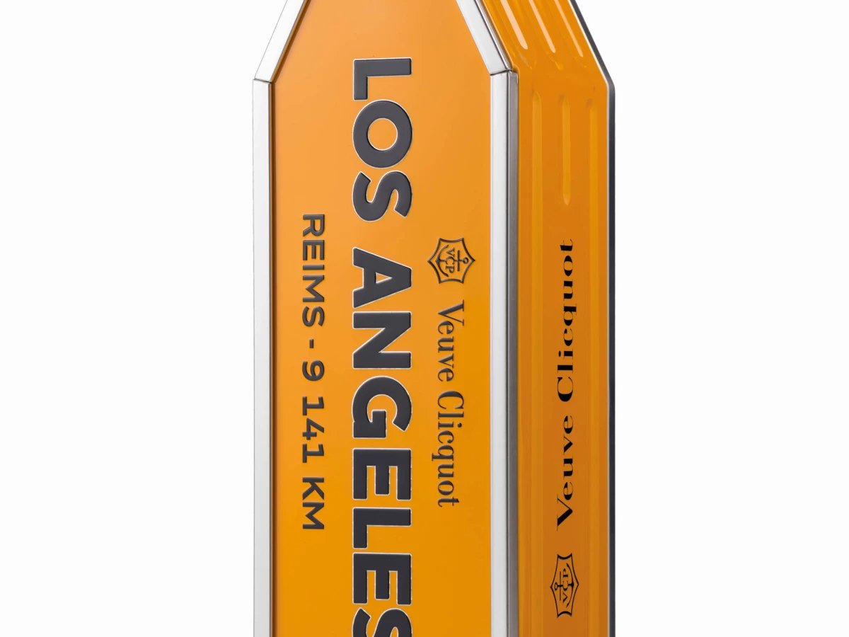
These tins take on the shape of an arrow in a clever and creative way, pointing the way to Reims from these iconic destinations.
The shape is subtle but exciting. And it brings the concept to life in a very visual and dynamic way. There is no mistaking the message behind these arrow designs. And the way in which these sleek packages say so much in such a simple and sophisticated way is equally stunning and impactful.
The champagne bottle sits so wonderfully in these designs, you’re almost surprised to see how comfortable they look.
These arrows inspire movement. They put you in these destinations and help you feel the excitement of these areas. There’s an innate regality to the way these sleek arrows point both up to the sky and across the globe.
These tins do more than just hold the champagne. They hold a message and a piece of the brand’s identity. And they sit on their own like pieces of art, elevating your home, your tastes and your drive forward.
This shaping is diverse and engaging. It stands out on the shelf and sits high above the competition. You can feel the luxury oozes out of these tins, and it urges you to pick one up for yourself to take home.

Veuve Clicquot’s Iconic Champagne Keeps Branding Consistent With Its Signature Color
Color is key when it comes to an iconic brand like Veuve Clicquot, and this limited-edition packaging does the brand justice. Branding remains consistent and sophisticated.
The iconic yellowish gold label that sits on the bottles now sits on this metallic tin design.
The tin is entirely encased in this color, and it stands out. And it brings with it a heritage, a history and an honor according to the brand:
The house continues to innovate by dressing its bottles in a yellow label, an unusual colour for the time. The ‘V.Clicquot P. Werlé’ Yellow label trademark is registered on 12 February 1877. Customers demand this distinctive, original label, which was to become one of the main distinguishing features of bottles produced by the House.This yellow is iconic for the brand. It’s a staple that promotes the brand’s standing as a leader in the champagne industry.
It’s bright and bold and daring — almost egging you on and encouraging you to buy.
Yellow isn’t a color normally seen in design. It’s bright, almost glaringly so. It’s hard to miss, and can sometimes come off ugly and obscene. But for Veuve Clicquot, it’s essential.
And thankfully, the creatives behind this design knew that they couldn’t let it fall by the wayside. In order to hold that same luxury and elegance, the iconic yellow needed to be seen throughout the Arrow collection.

These Veuve Clicquot Tin Boxes Give An Unexpected Edge To Traditional Alcohol Packaging
When you think alcohol packaging, you don't normally thing bright, bold, one-dimensional color and strict shaping. But you see that with this Veuve Clicquot packaging. And it excels.
To acknowledge the brand, its history and the many destinations across the world, this brand created the “Connected Arrow” collection to detail cities around the world and their distance from the flagship center of production.
The message here is to build new discoveries and grow the brand’s reach. And it works thanks to these clever package designs.
Instead of sitting in a traditional box or on their own, these champagne bottles are encased in a bright, sleek and playful tin. It’s structured and powerful and strong. And these tins take on the shape of an arrow, further promoting that sense of movement and far-reaching potential. The shape is soft, yet regal and sophisticated. The arrow stands pointing up to the sky, but when sat on its side, you really get a look at the copy that lives on the tin and understand more clearly the intention behind the design and the collection as a whole.
These designs are bright and shiny, encased in the iconic Veuve Clicquot yellow that exudes authenticity, authority and honor. And this yellow coloring makes it easy for the bold typography to shine through.
On the front of this design sits the iconic Veuve Clicquot emblem in a thing, sleek black font. Beneath this is a large city name in a bold, black uppercase, sans-serif font. This words almost jumps from the design and adds even more integrity to the brand as a whole.
Under this is a distance marker, noting how far this city is to the Reims home production facility.
There is little else on this tin. The logo is seen again on the sides, but other than that, this modern and moving design is minimal in nature — paying homage to the brand’s past, present and future.
This design says a lot, however. It says that it’s been around for years, and has been able to touch so many destinations. It says that it’s still learning and growing, and wants to continue to reach more audiences and inspire consumers. It says that it’s a brand with integrity, honor and class. Veuve Clicquot is a brand that knows what it’s doing and no one is going to tell it otherwise.
These tin package designs are strong and sleek, just like the French champagne brand. And they further cement Veuve Clicquot’s prominence in the world of bubbly booze. Check out our article on champagne branding examples.