Standout Features:
- Minimalist design with bold typography
- Dark, industrial color palette
- Striking automotive theme
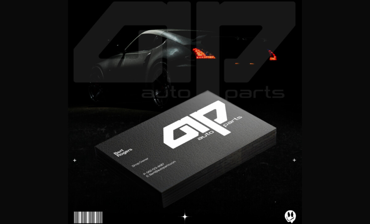
The business card design for Auto Parts by Rendom Designs presents a modern and professional identity that reflects the automotive industry’s cutting-edge nature. With its minimalist approach, bold typography, and strategic use of color and imagery, the card stands out in an industry where precision and professionalism are paramount.
The large, bold "GTP" acronym is positioned prominently on the card. The sans-serif font conveys modernity and professionalism, making it easy to read while still appearing sleek and powerful. The simplicity of the design — using only essential information — helps create a lasting impression, ensuring that the card remains memorable yet unobtrusive.
The color palette for the Auto Parts business card is inspired by the automotive industry, with deep blacks and grays that evoke a sense of durability and sophistication. This combination of colors reinforces the brand’s connection to the automotive world, creating a feeling of strength and reliability. The use of minimal color further allows the key elements — logo and contact information — to shine through without distraction.
In the design’s mockup, the subtle inclusion of a car silhouette in the background is a clever touch that ties the business card design directly to the auto parts industry. It’s a simple yet effective way to communicate the brand’s focus on automotive products while maintaining a stylish and contemporary design approach.
Rendom Designs has created a standout business card for Auto Parts that perfectly captures the essence of the automotive industry. Through its minimalist design, bold typography, and industrial color scheme, the card exudes professionalism and modernity, making it memorable to anyone who receives it.