
Capital Magazine is a quarterly magazine released by Hedeker. After rebranding the identity of Hedeker as a whole, it was only natural for them to reach out to Socio Design to help develop a new branding strategy for Capital Magazine, as well. The magazine’s sole focus is to review and summarize the behavior of the financial markets over the previous three months.
Because of this, Hedeker wanted to make sure the approach to the magazine was minimalistic so that they could place an emphasis on the importance of the content, rather than on large amounts of imagery. With this in mind, all provided images within the magazine (and on the cover) are subtle shades of black and white. These featured, simple images are either photographs or art renderings, depending on their related textual topic.
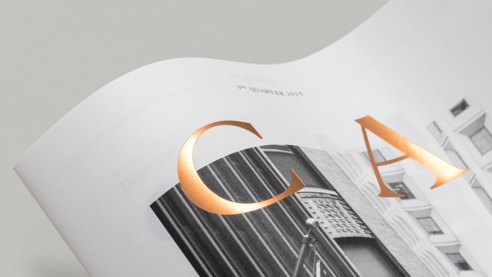
To make the title of the magazine stand out against the stark black, white and gray cover, the lettering is simplified to a single word. The typography is enlarged and spread across the entire cover page to fill up the available space. Additionally, each letter in the word, “Capital,” is embossed for a shiny gold appearance. The gleam reflects light in every direction, working to draw the reader’s attention to the cover.

With the focus on images taken away, Socio Design had to find a way to fill available white space so as to not make the brochure far too word-heavy. To accomplish this, Capital Magazine features a typographic approach that utilizes space and creates breaks between articles.
The accents and typography of each page pull from the golden coloring within the Hedeker logo design. The ways in which accents and typography are applied on each page changes, adding variety and interest with every new turn. Whether titles or statistics are enlarged on a page, the attention is always placed on a source of vital information.

Each Capital Magazine is designed in the same manner, allowing for a semblance of continuity among issues. Hedeker holds true to its professional image with the way that it presents its quarterly magazine. The glossy gold title, reminiscent of the financial market the magazine discusses, paired with elegant black-and-white imagery makes for a luxurious reading experience that readily engages the consumer.
Capital Magazine is an elegant print design in the Banking & Finance industry.


-preview.jpg)
