- Article by
- Branko Dimitrijević

#D6382C #E3D7C6 #AD6E36 #10110D
- Agency: Super Studio
- Client: DASHI RAMEN
- Category: Print Design — Food & Beverage
- Location: Trois-Rivières, Canada
- Project Brief: Develop a cohesive print design system that clearly communicates the product offering, strengthens street-level visibility, and builds brand recognition through typographic impact and graphic consistency.
Food and beverage print design often relies on literal food photography, yet Super Studio adopts a more structural, illustrative perspective.
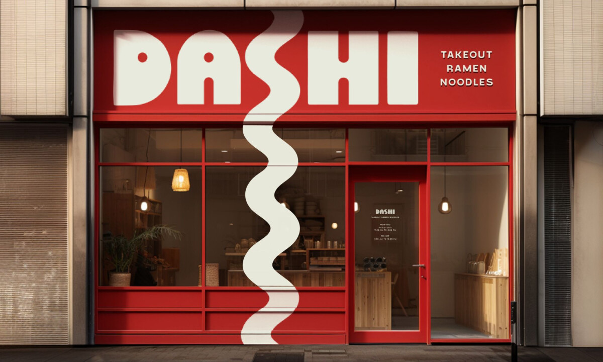
DASHI RAMEN succeeds by deconstructing the textures of the product into bold typographic experiments that prioritize high-impact visibility and brand recognition.
- Typographic Identity: Oversized, rounded letterforms function as the primary storytelling device by mirroring the softness and volume of noodles. I believe this allows the wordmark to behave as a versatile graphic element that remains legible across fast-paced urban environments.
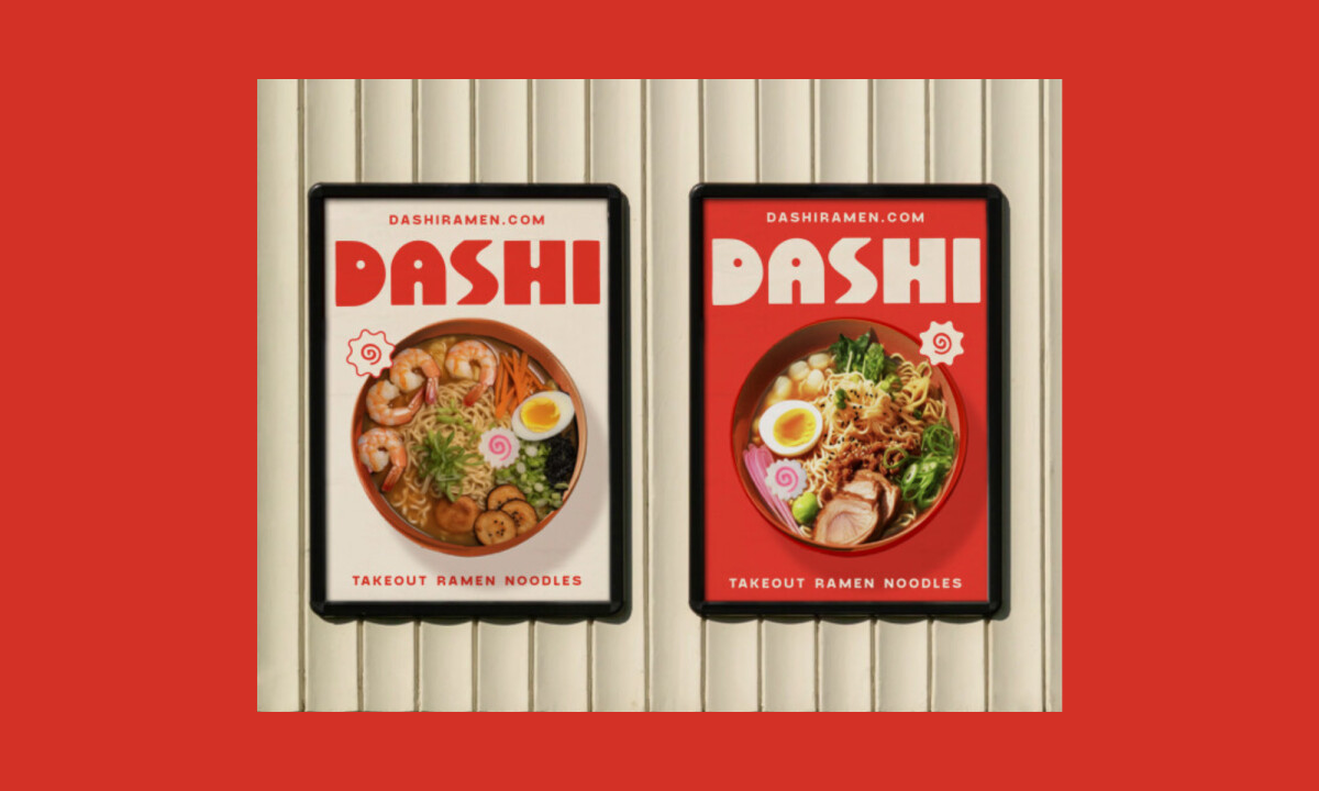
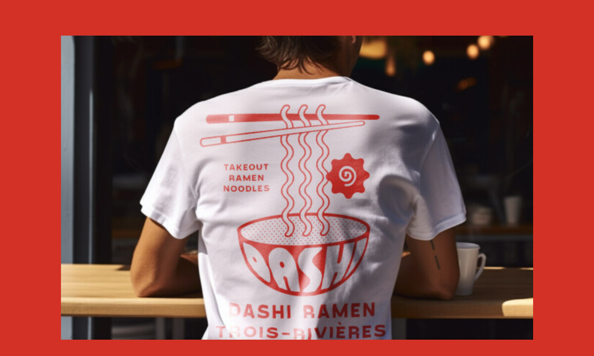
- Noodle-Inspired Language: Wavy lines and spiral motifs abstract the idea of steam and noodles to reinforce product association without photography. I find this repeatable graphic shorthand especially effective for maintaining a consistent voice from loyalty cards to large-format outdoor signage.
- Appetite-Driven Color: The restrained palette of warm reds and off-whites creates an immediate visual punch while nodding to traditional ramen cues. I think these color choices ensure the printed materials feel contemporary and brand-forward while maximizing street-level contrast.
- Touchpoint Consistency: The repetition of type and layout structure ensures every surface, from tote bags to storefronts, serves as brand reinforcement. I appreciate how the unified system turns functional print items into a cohesive visual experience rather than a collection of isolated decorations.
What Brands & Designers Can Learn from DASHI RAMEN
1. Let Typography Become the Product Metaphor
Oversized, rounded letterforms mirror the softness and volume of noodles, turning type into a storytelling device. When typography reflects product qualities, it becomes both expressive and highly functional.
2. Build a Repeatable Graphic Language
Abstract noodle- and steam-inspired motifs create a flexible visual shorthand across formats. A consistent graphic system strengthens recognition from small printed items to large urban signage.
3. Design for Visibility in Real Environments
High-contrast colors and bold forms ensure immediate impact at street level. Print design performs best when it prioritizes clarity and memorability in fast-moving, real-world contexts.
Screwfix: No Stopping You
Manual
FIFA World Cup 2026 Official Tournament Poster
KFC - Bucket For One
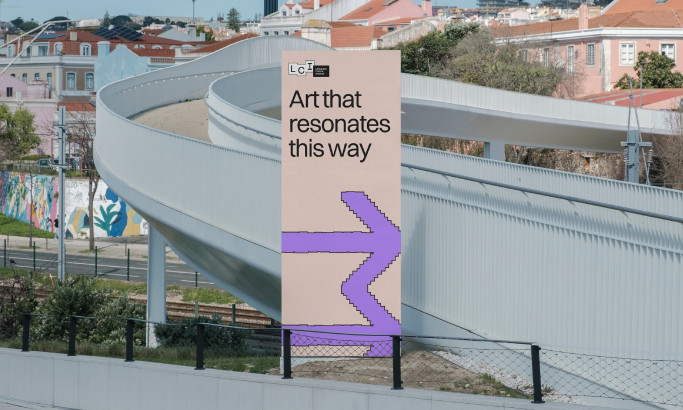
Lithuanian Culture Institute