- Article by
- Branko Dimitrijević

This website uses a colour palette of 4 colours
#DDDBDE #323C57 #558089 #32634E
Technologies & Tools
Description
Team Behind the Design
- Agency: Tink Tank Studio
- Client: Environmental Defense Fund
- Category: Print - Nonprofit
- Location: New York City, United States
- Project Brief: Design a nonprofit print magazine that communicates Environmental Defense Fund’s science-driven advocacy through clear editorial structure, compelling visuals, and credible storytelling.
When I review nonprofit print design, I often focus on how editorial structure and visual restraint can support both advocacy and credibility.
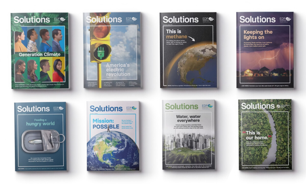
The Environmental Defense Fund— Solutions magazine demonstrates how complex, science-driven stories can feel urgent without becoming visually overwhelming.
- Visual Framing: I appreciate how consistent margins, boxed imagery, and controlled white space create order even when the subject matter carries emotional weight. The covers feel composed and intentional, which reinforces EDF’s position as solutions-oriented rather than reactive.
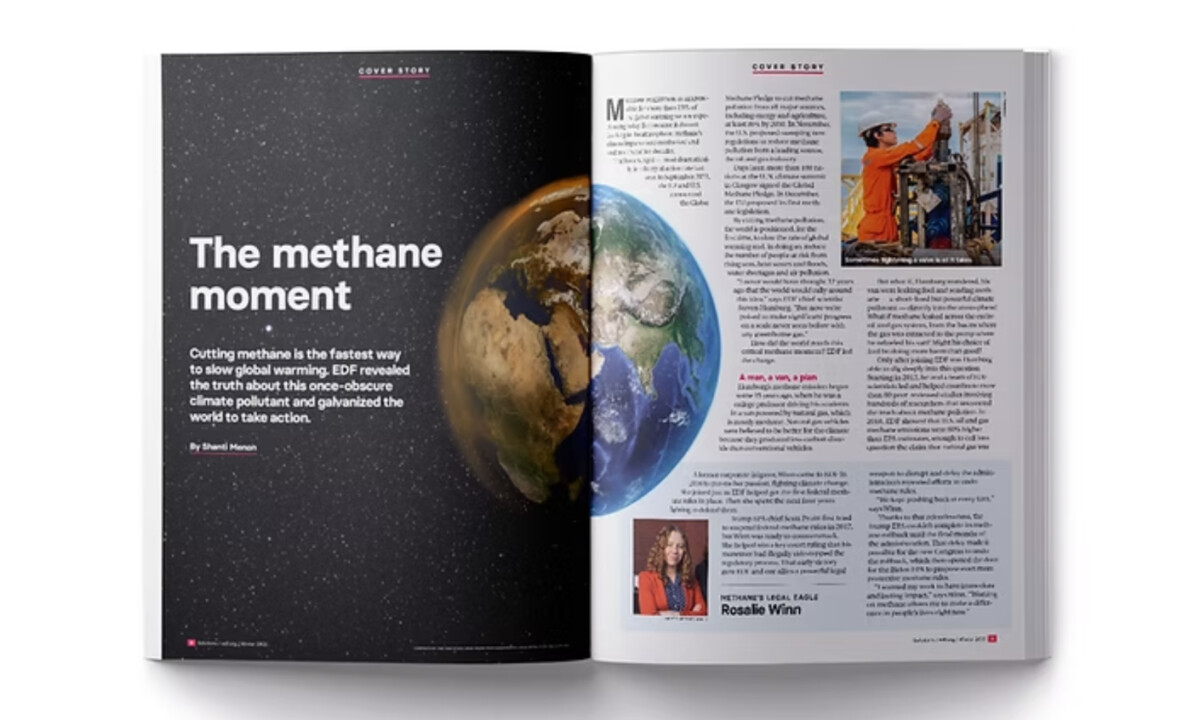
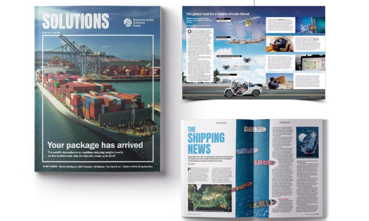
- Editorial Hierarchy: The grid system does steady, understated work throughout. I like how headlines, body text, pull quotes, and infographics are proportioned to guide readers through dense investigations without flattening complexity or slowing momentum.
- Photography & Data Integration: What works especially well for me is the balance between imagery and evidence. Large photographs set emotional context, while maps, charts, and diagrams sit directly within the narrative flow, allowing storytelling and proof to move together naturally.
- Consistency Across Topics: Even as the magazine spans very different environmental issues, the visual system remains cohesive. Typography, restrained color use, and structural patterns stay consistent, giving each issue its own focus while preserving a unified editorial voice.
What Brands & Agencies Can Learn from Environmental Defense Fund
1. Design Can Strengthen Credibility, Not Just Emotion
Editorial restraint and clear structure help advocacy-driven content feel authoritative, ensuring important messages are trusted as well as felt.
2. Let Data and Story Share the Stage
Integrating infographics directly into editorial layouts allows complex information to support the narrative instead of interrupting it.
3. Consistency Builds Long-Term Trust
Maintaining a cohesive visual system across diverse topics helps organizations establish recognition and reliability over time.
Discover more from Tink Tank Studio
York Space Systems
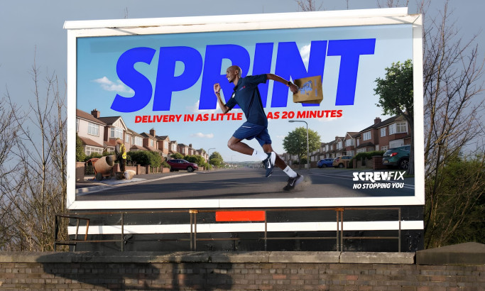
Screwfix: No Stopping You
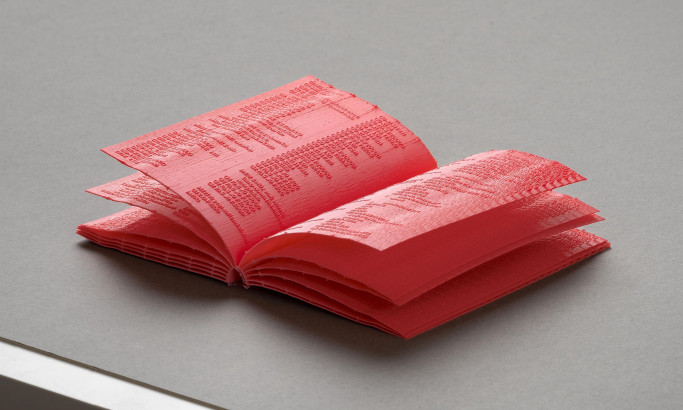
Manual
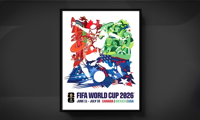
FIFA World Cup 2026 Official Tournament Poster
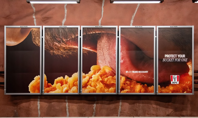
KFC - Bucket For One
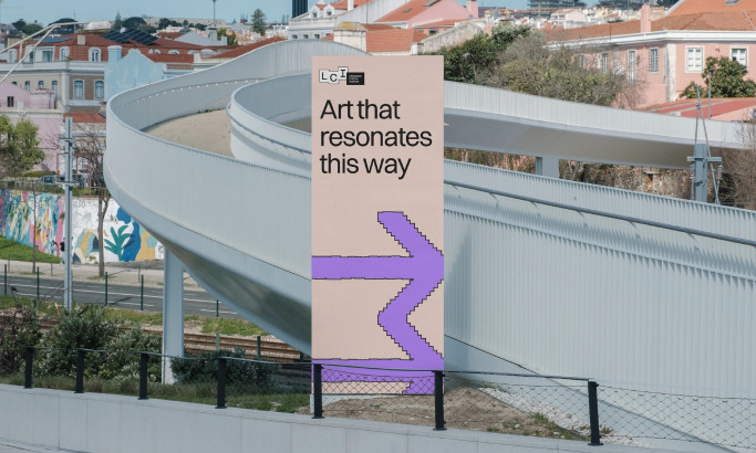
Lithuanian Culture Institute
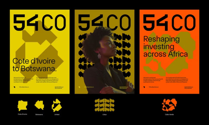
54 Collective
View All BestPrint Designs