- Article by
- Branko Dimitrijević

#3D3D3C #121212 #FFFFFF #2A2A29
- Agency: Renegadez
- Category: Print Design (Book Cover)
- Location: Toronto, Canada
- Project Brief: Create a conceptual book cover for Giovanni’s Room that translates the novel’s emotional weight and themes of duality, repression, and identity into a bold, minimal visual system.
Looking at book cover designs, I focus on how symbolism and typographic restraint translate complex literary themes into a singular visual form.
Giovanni’s Room stands out for its willingness to strip the narrative down to its core essence, allowing a bold conceptual approach to lead the entire design.
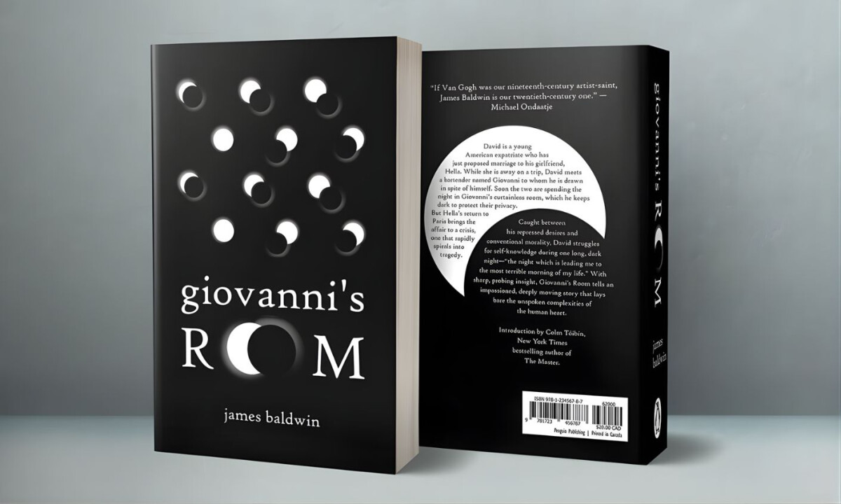
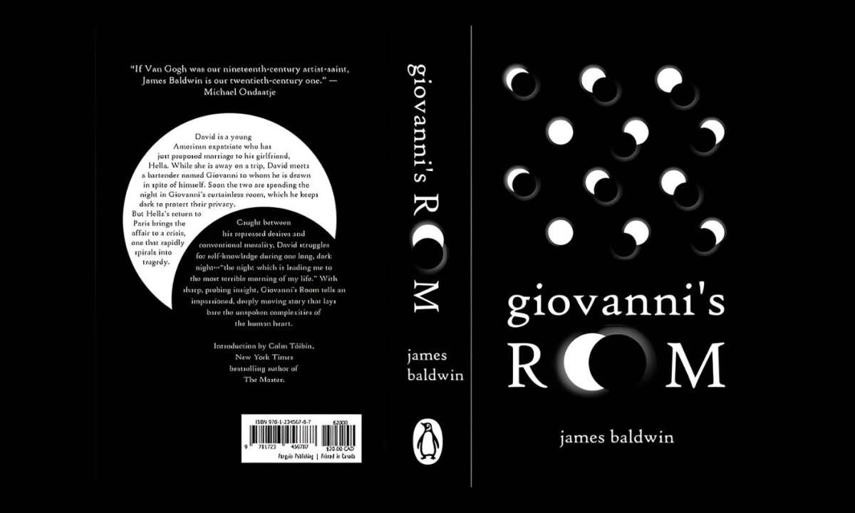
- Concept & Symbolism: The recurring moon phases serve as a powerful visual metaphor for the duality and hidden emotional states found within the novel. For me, this level of abstraction is highly effective in my eyes because it invites the viewer to interpret the themes rather than simply illustrating the plot.
- Typography & Composition: The typographic layout manipulates scale and spacing to create a sense of interruption that reinforces the story's inherent tension. I believe the use of negative space as an active element avoids unnecessary decoration and keeps the focus entirely on the structural balance of the page.
- Color & Contrast: The decision to use a stark black-and-white palette heightens the visual rhythm and forces me to focus on the pure geometry of the forms. This limited color scheme feels like a deliberate choice to mirror the moral and emotional extremes depicted in the writing.
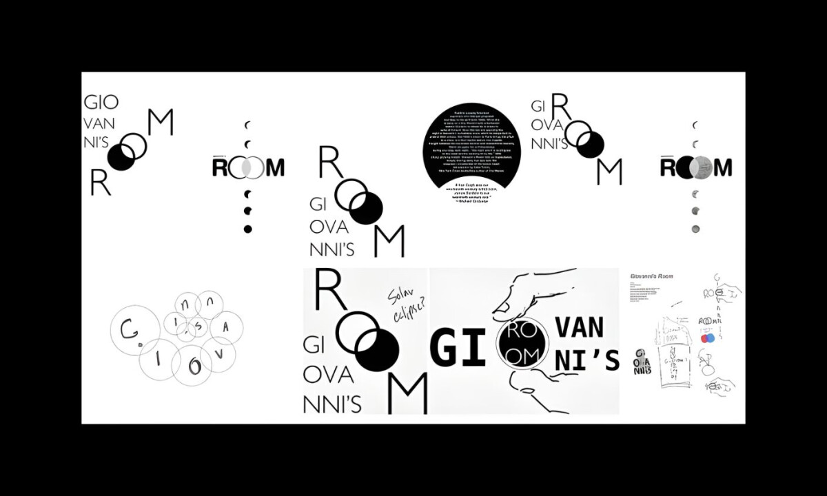
- Process & Iteration: The exploratory sketches reveal a methodical design process rooted in heavy experimentation with alignment and geometric shapes. I appreciate how the final solution clearly evolves from these early studies while maintaining its original conceptual clarity.
What Brands & Agencies Can Learn from the Giovanni’s Room
This print design demonstrates how conceptual restraint can communicate complex narratives with clarity and confidence. Here are three key lessons from the Giovanni’s Room cover design:
1. Let Concept Lead Every Design Decision
The moon-phase symbolism distills the novel’s emotional duality into a single, interpretable visual idea. Strong concepts reduce the need for explanation and invite deeper engagement.
2. Use Typography and Space as Narrative Tools
Intentional manipulation of scale, spacing, and negative space reinforces tension without visual excess. Structure itself can carry meaning when decoration is stripped away.
3. Limit Color to Strengthen Emotional Focus
The black-and-white palette heightens contrast and forces attention onto form and symbolism. Restrained color choices can mirror thematic extremes more effectively than elaborate palettes.
Ready to elevate your designs?