Standout Features:
- Organized single-page layout
- Simple yet consistent color combination
- Large fonts for better legibility
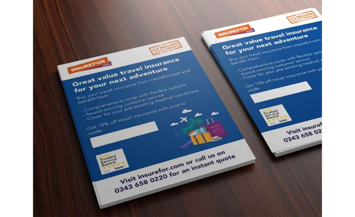
As described in their project brief, ROCK Insurance Group felt that Insurefor, their established flagship travel insurance brand, was looking a little dated against its competitors.
Because of this, they decided to tap the design services of Casper Creative in executing a full rebranding of the company’s logo, website, print and digital assets, and other marketing channels.
This leaflet design, in particular, is proof that the massive design overhaul was a total success.
They decided to go for a single-page layout, which is a smart choice in terms of design and function. Handing out one-page brochures in airports, key establishments, and other fast-paced environments is the way to go. And it makes them super easy to read!
But you know what else adds to the design’s readability? Large, sans serif fonts. A catchy slogan that reads “great value travel insurance for your next adventure” is written clearly for the user to read – even from a distance.
It is also accompanied by text descriptions and promo offers that are just as attention-grabbing as the headline. At the bottom of the page, users are ushered to connect with a representative by the contact number displayed.
These texts lie in a bed of blue and white which reflects the brand colors. This is a big YES to consistency! Also, it just makes the layout clean and easier on the eyes. In contrast, the designers added orange claim-to-fame badges as well as colored illustrations for an extra design touch.
With such details, these leaflets are sure to convert leads to actual sales!