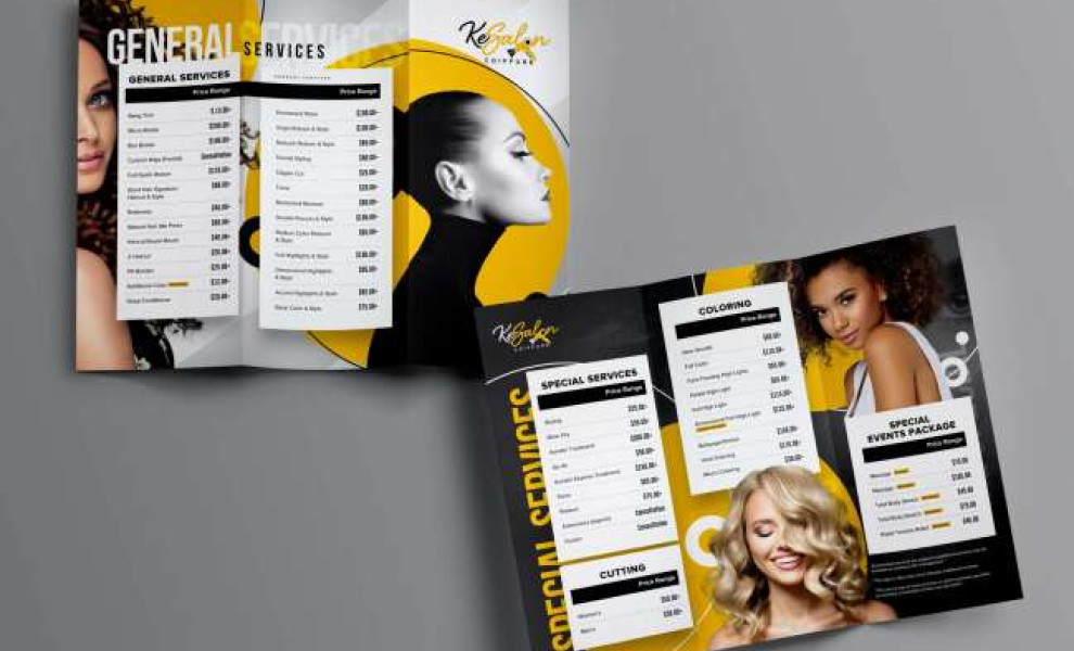
Standout Features:
- Creative play in typography
- Golden yellow exudes a luxurious feel
- Shapes and lines provide balance against content
Beauty brands often bank on models to promote products and services. KeSalon brochure design does this, too, but quite differently. Kimp.io made use of shapes, typography and colors to come up with a high-fashion look for the brand.
The brochure has three folds with prints on the front and back sides. The agency adopted the brand colors, golden yellow and black, then added gray to balance them out. Looking closely at the background, you’ll notice that these are not just plain, solid colors but with texture and humble elements.
On the gray side, the whole three-fold page has diagonal rays of white running from the upper right corner through the other end. On the flip side, you’ll see silhouettes of hair strands, creative model shots, and texts blending in on the background.
The design features four diverse models highlighted by round yellow shapes in different sizes, with thin lines accentuating the elements.
Lastly, white content blocks for services and prices pop out in this design, providing an unobstructed view for the audience.