Standout Features:
- Bold typographic overlap and fragmentation
- Minimalist black, white, and gray palette
- Integration of the colon (:) as a core visual
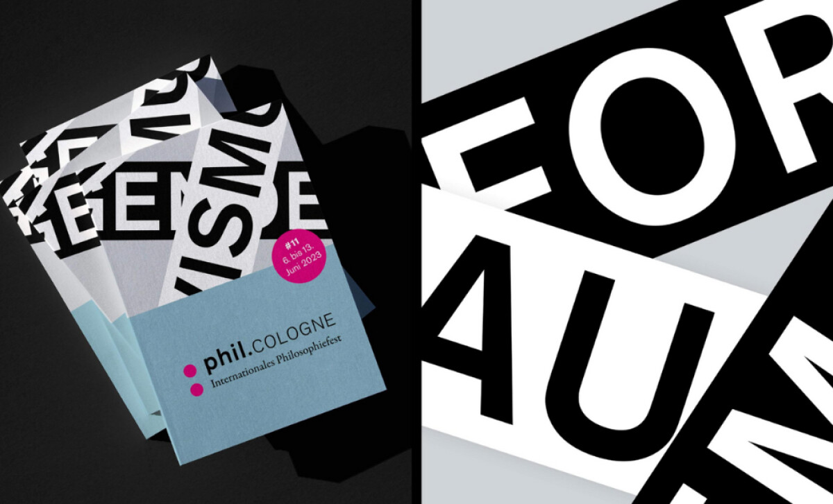
This print campaign by Studio Polylog supports the 11th edition of Phil.COLOGNE, Germany's largest philosophy festival. The refreshed visual identity was developed to align with the festival’s reputation for intellectual rigor and the lively exchange of ideas between philosophy, science, and politics.
Large-scale black-and-white typography, set in a bold sans-serif, dominates the posters. The letters are presented in overlapping, rotated strips, creating a striking fragmented effect. This design choice reflects the intellectual intensity of the festival, where different ideas intersect and build upon one another in dialogue.
The primary color scheme is minimalist — black, white, and gray — which underscores the festival's serious academic gravitas. Strategic color accents, such as a bright magenta circle for key information or a blue-gray block for branding, are used to guide the eye and add a modern corporate touch.
A distinctive aspect of the refreshed identity is the adoption of the colon as a core motif. This punctuation is featured in the "phil.COLOGNE" branding and as accent dots.
The consistent repetition of this motif is key to building a strong identity; according to industry analyses, such visual consistency across all brand materials significantly enhances recognition and the perception of a well-established, professional entity.
Studio Polylog's poster campaign for Phil.COLOGNE proves that even in academic or philosophical contexts, print design can be avant-garde and visually stimulating as it is intellectually.