Standout Features:
- Symbolic gradient palette
- Varying typography
- Adaptive design
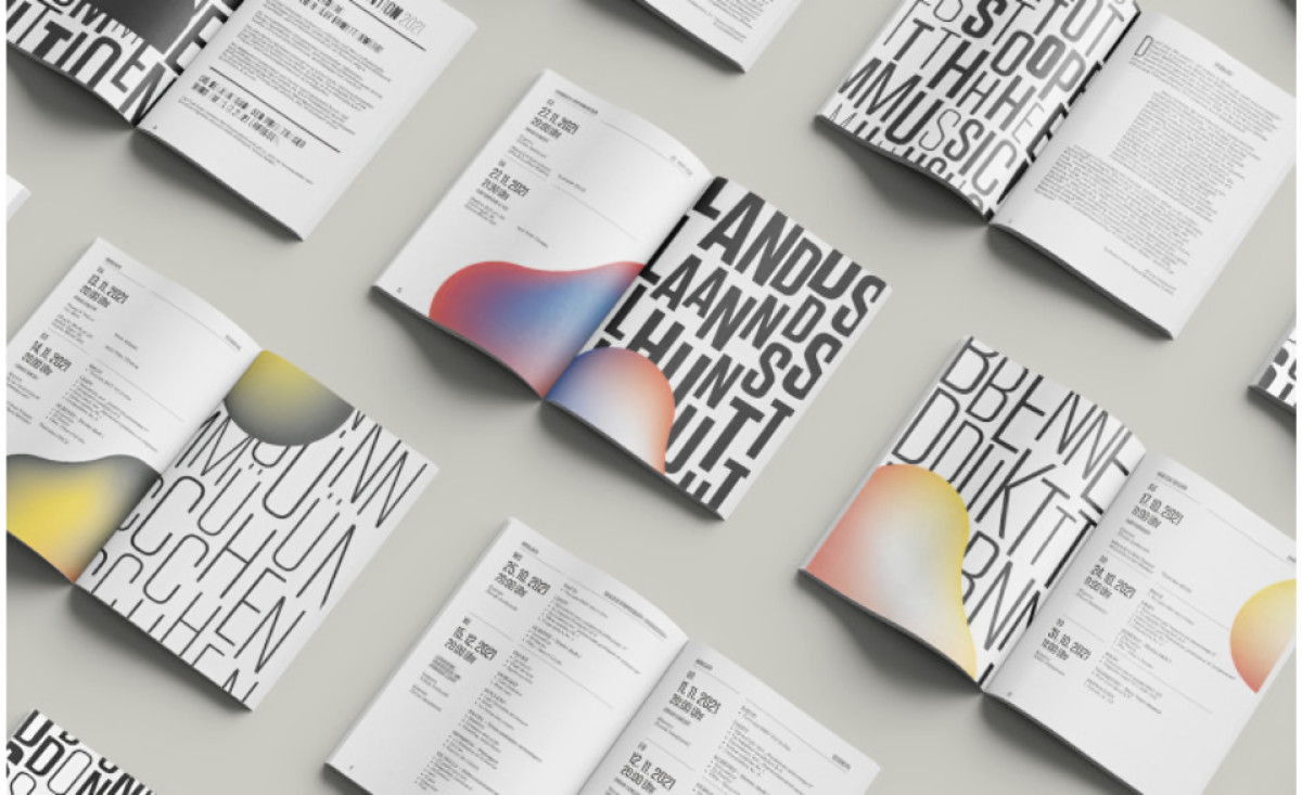
Piano Summer is a renowned cultural festival in southern Europe that attracts more and more visitors since its inception in 2014. What was once a local Serbian festival gradually transformed into a predominantly European cultural network that has so far been able to attract countries such as Germany, Italy, and South Africa as hosts.
Classical music in its focus conveys the news from the art scene from a different perspective. And different perspective is what the festival's latest print material is all about.
Using the Suisse Neue typeface as the primary font, Designliga introduces a mix of serif and san-serif, bold, all-caps, and more to create a striking pattern to match Piano Summer's goal - conveying classical music in a contemporary atmosphere.
When combined with a gradient, on-brand color elements that represent various national coats of arms, the sheer variety of these prints showcases the diversity and richness of the festival, all in one creative design.