- Article by
- Branko Dimitrijević

#B8AEA2 #9E5546 #364665 #827F78
- Agency: PAX STUDIO
- Client: World Floor Covering Association
- Category: Print Design – Magazine
- Location: Thomasville, North Carolina, United States
- Project Brief: Refresh the visual identity and editorial system of Premier Flooring Retailer to improve readability, modernize the masthead, and create a cohesive design framework that reflects the professionalism and future-facing voice of the flooring industry.
Trade publications rely on clarity, trust, and structure more than visual novelty.
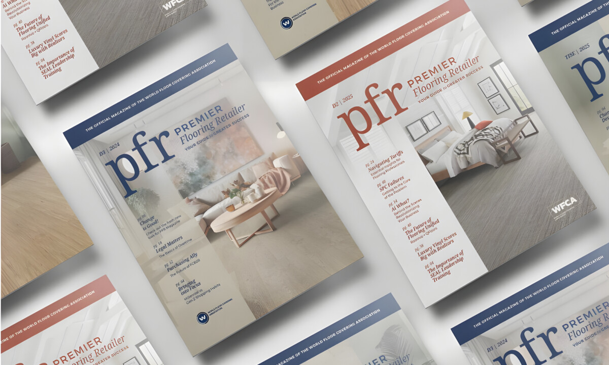
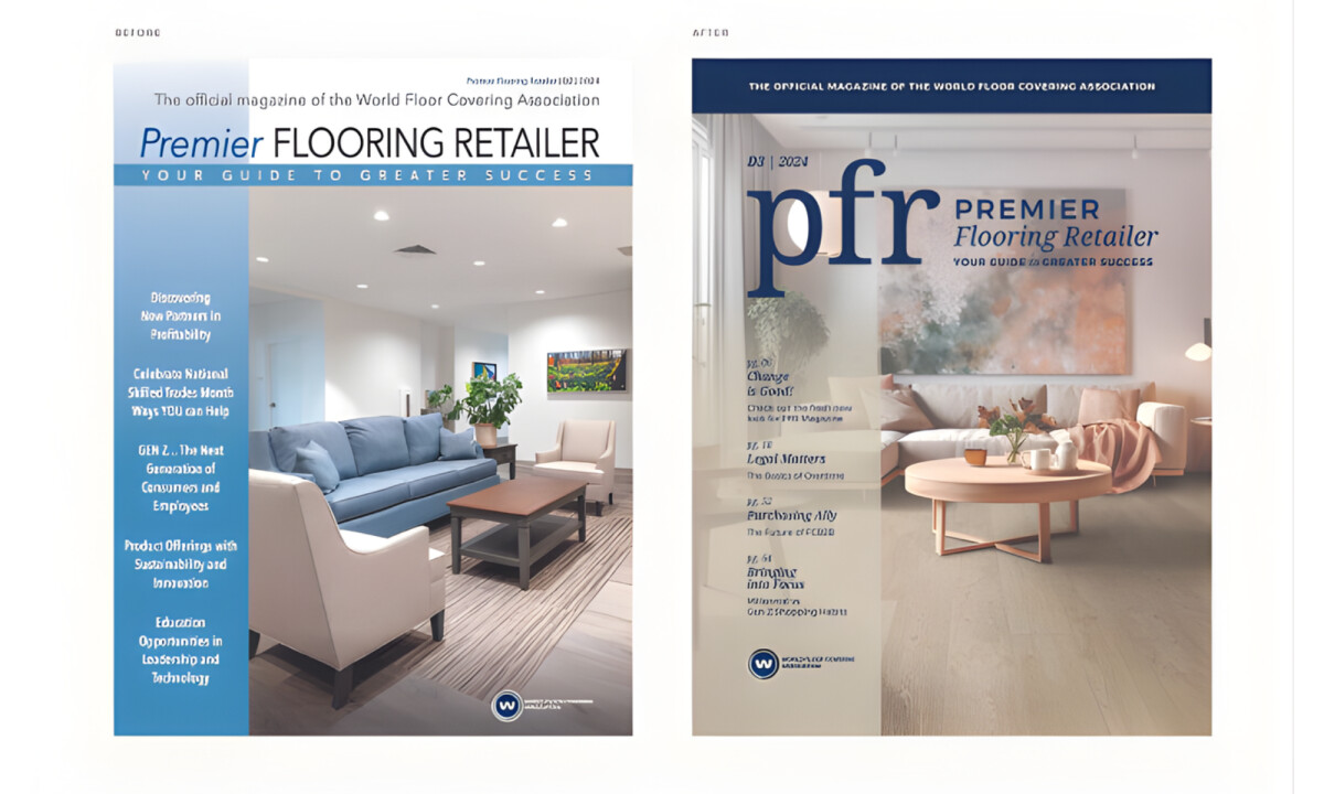
The Premier Flooring Retailer magazine print design focuses on elevating editorial hierarchy and consistency while preserving the magazine’s role as an authoritative industry resource.
- Editorial Hierarchy & Readability: A refined typographic scale and improved spacing make long-form articles significantly easier to navigate. I believe this prioritization of legibility allows readers to identify features, pull quotes, and section breaks with much more speed.
- Grid System & Layout Structure: A disciplined grid brings order to both feature spreads and recurring sections. This structure creates a consistent rhythm across the magazine while allowing necessary flexibility for imagery, data, and editorial emphasis.
- Masthead & Brand Simplification: The shortened PFR logo lockup strengthens recognition and modernizes the overall cover presence. I like how the masthead feels confident without overpowering primary headlines or imagery.
- Visual Consistency Across Issues: Color, typography, and layout rules are applied strictly across covers and interiors. I think this gives the publication a cohesive identity that can evolve seasonally without losing its core brand continuity.
What Brands & Designers Can Learn from the Premier Flooring Retailer Magazine
Here are three key lessons from the Premier Flooring Retailer Magazine redesign:
1. Prioritize Hierarchy Over Decoration
Clear typographic scales and spacing improve long-form readability and scanning. In editorial design, structure matters more than visual novelty.
2. Use Grid Discipline to Build Trust
A consistent grid system creates rhythm and reliability across features and recurring sections. Predictable structure reinforces credibility for professional audiences.
3. Simplify Branding to Strengthen Recognition
A refined masthead modernizes the publication while keeping focus on content. Brand clarity supports longevity without overpowering editorial voice.
Ready to elevate your designs?