Standout Features:
- Readable text blocks
- Bold sans-serif typography
- Eye-friendly color scheme
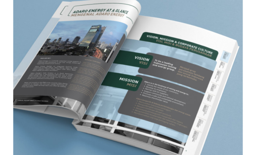
Design agency DNA Komunika created the 2019 Annual Report for PT Adaro Energy. They focused on readability and easy understanding since the report is relatively text and information-heavy.
In the report, the emphasis is on clarity and readability of information. The highly readable text blocks facilitate easy digestion of complex data, making the report user-friendly and practical. This is complemented by bold sans-serif typography, lending a modern, professional touch. Lastly, the nature-inspired color scheme ties everything together and ensures comfortable reading. (Discover the best print designs with bold fonts.)
Get a chance to become the next Design Award winner.
SUBMIT YOUR DESIGN
_82b171fd4090-preview.jpg)
