- Article by
- Branko Dimitrijević

This website uses a colour palette of 4 colours
#D76203 #9C4E2F #442E34 #8C705D
Technologies & Tools
Description
Team Behind the Design
- Agency:Jaye Thompson
- Client: sunflwr
- Category: Print - Album Cover
- Location: New York City, United States
- Project Brief: Design an album cover and vinyl packaging that visually extends sunflwr’s dreamy, avant-garde sound into a hypnotic print and motion-ready identity.
My approach to evaluating album cover print design centers on how typography, color, and composition can translate sound into emotion.
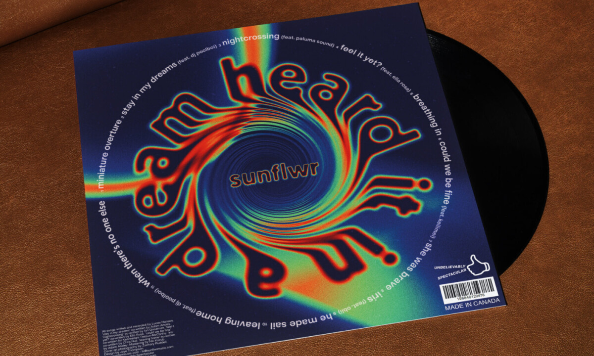
sunflwr – heard it in a dream shows how visual distortion and rhythm may echo the immersive, loop-driven nature of electronic music.
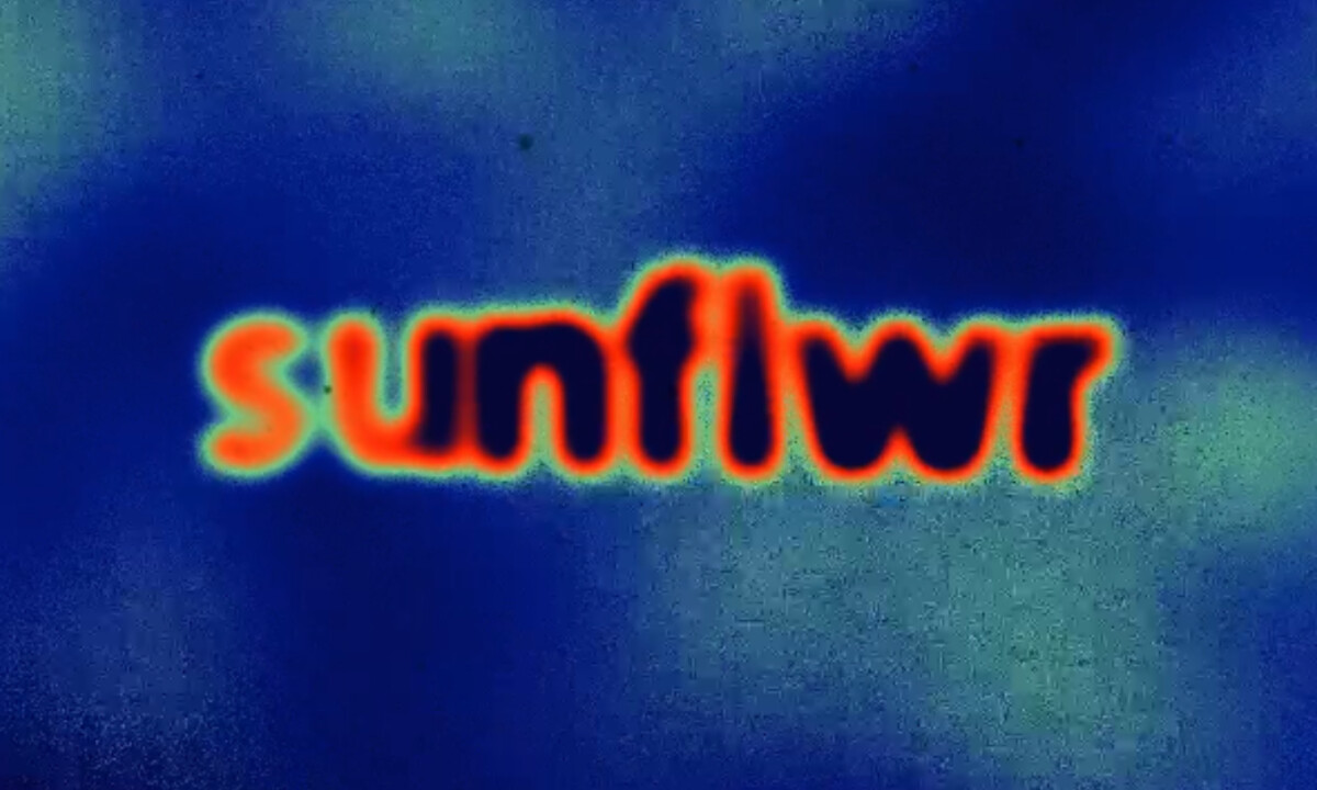
- Typography: At the center of the design, the vortex-driven type sets the tone right away. I like how the lettering bends, stretches, and fades into the spiral, turning text into movement instead of static information, which mirrors the looping, dreamlike quality of the music.
- Layout: The circular composition pulls directly from the motion of a spinning record. I appreciate how the eye is drawn inward first, then guided around the edge to read the details, making reading feel like part of the experience rather than a quick scan.
- Color & Texture: Spectral gradients carry a lot of intensity, but they feel considered rather than overwhelming. What works for me is the added grain, which softens the digital sharpness and introduces an almost analog texture that fits naturally with vinyl.
- Narrative Contrast: On the back cover, restraint plays an important role. I like how the minimal figure and open space offer a visual pause after the density of the front, echoing the quiet emotional drop that often follows immersive electronic music.
What Brands and Artists Can Learn from sunflwr
1. Let type carry the image
Typography can do more than label artwork. When letterforms become motion and structure, they shape the entire visual experience.
2. Design with the medium in mind
Vinyl encourages rotation, pause, and repetition. Accounting for those behaviors makes the object feel considered rather than decorative.
3. Use contrast to guide feeling
Balancing intensity with restraint creates rhythm. Visual pressure followed by release keeps attention engaged without wearing the viewer down.
Ready to elevate your designs?