Standout Features:
- Dynamic imagery and full-bleed photography
- Strong visual hierarchy with bold typography
- Cohesive sports-themed aesthetic
CM3/Designs created The Players Club Magazine, a sports publication focused on top athletes. The magazine presents a high-energy feel right away, stemming from its strong use of images and text design. Its clean but intense style effectively draws readers into the action and stories of the players featured.
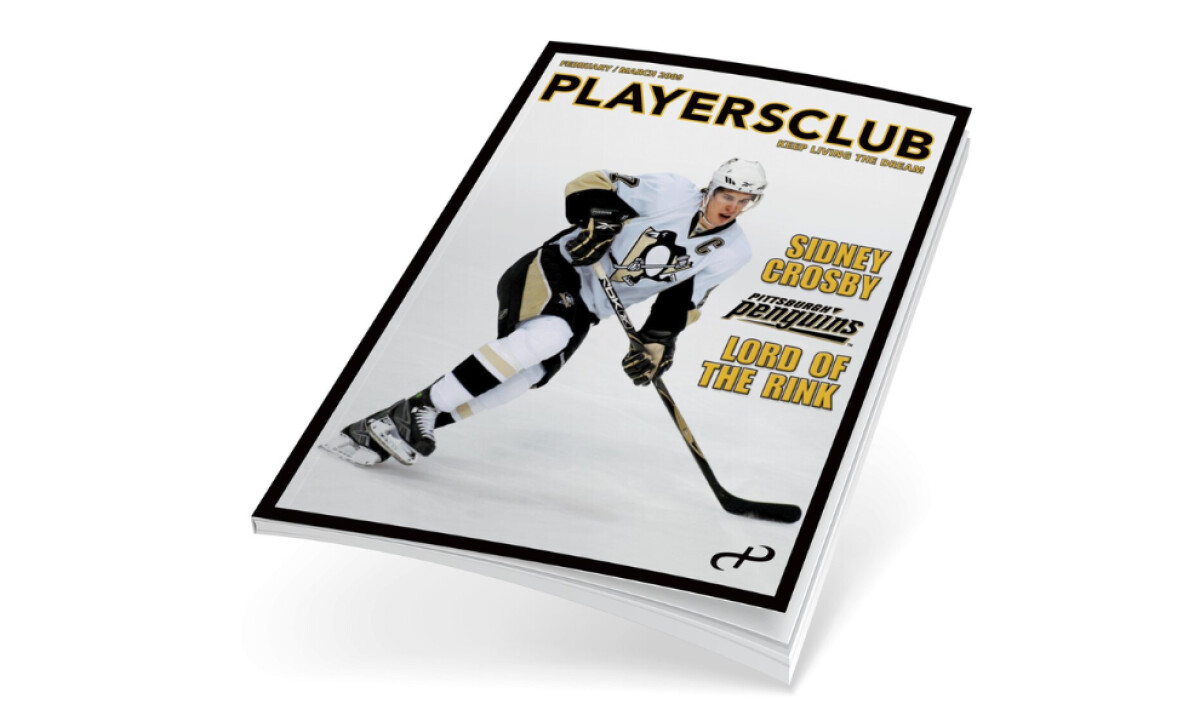
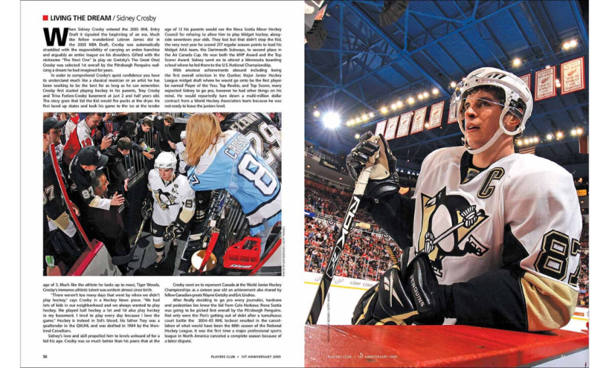
One really noticeable feature is the extensive use of full-page photos. Seeing a player like Sidney Crosby in action filling the entire spread certainly amps up the excitement. This immersive approach helps create a feeling of being right there in the game. Consequently, these big, bold images bring the magazine to life instantly upon opening.
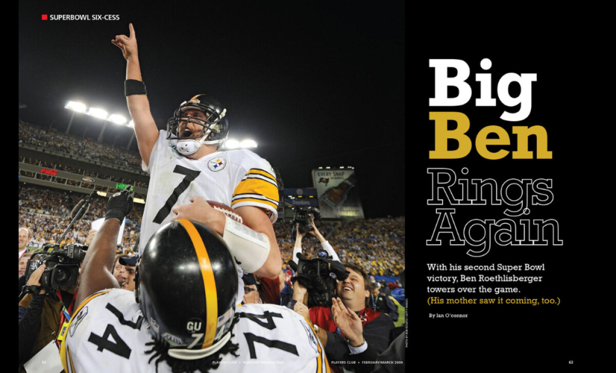
Moving through the pages, strong headlines clearly guide the reader’s eyes. Bold, likely sans-serif fonts are used in large sizes for major stories, making them pop, while smaller text for details keeps things clear. This calculated difference between headline and body text adds a dynamic rhythm and makes reading feel exciting.
The color scheme consistently uses black, yellow-gold, and white. These colors are often linked with winning and success in sports, fitting the theme perfectly. Applying them consistently in backgrounds, text, and photos ties the whole look together, giving the magazine a unified, instantly recognizable sporty identity.
Overall, The Players Club Magazine shows how thoughtful design can make sports stories more engaging. By combining full-page action shots, clear text hierarchy, and a fitting color palette, CM3/Designs crafted a publication that truly connects with sports fans.


