
The YMCA of the North Adventure Magazine Highlights the Beauty of Outdoor Adventures
The YMCA of the North Adventure magazine is a delightful resource for your next experience in the great outdoors.
Design agency cat&tonic shows the beauty of the YMCA of the North's 17 camp locations through stellar photo quality and striking cover design, which is an excellent way of exposing the younger generation, and people of all ages, to the wonders of outdoor adventures.
The designers ensured that the magazine showcases nature in an enticing way that promotes the beauty of going out and exploring the outdoors.
Indeed, this magazine achieved a remarkable blend of pictures and creative copy that most print design professionals would aim for.

YMCA of the North Adventure Magazine’s Stellar Photographs Effectively Capture Viewer Attention
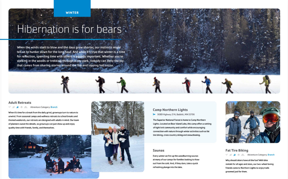
The YMCA of the North Adventure Magazine is geared towards people who want to explore the natural offerings of the North, with its snow-covered winter scapes, picturesque views, and stunning locations perfect for one-day experiences, retreats or week-long camps, and more.
Thus, the agency used unique outdoor photography to the brand's advantage by peppering the magazine with vivid shots of the lakes, fields, trails, horses, farm-and-garden spaces, and scenic overlooks in their full high-definition glory. It's like flipping through the pages of National Geographic without getting overwhelmed by the text.
Seeing these photos is enough to stimulate their curiosity and entice them into embarking on an outdoor adventure of their own.
They also used photos of people enjoying the wonderful outdoors with their loved ones, which seals the deal and persuades people to experience the happiness they see on these people's faces.
Photos effectively convey a thousand thoughts, and the design agency used them extensively throughout the magazine, from the cover to the last pages.
The Magazine Cover Showcases Eye-Catching Visuals That Stimulate People’s Emotions
The agency uses the cover to communicate what the readers should expect from reading the magazine. They used a photo of a zigzagged road weaving through hills and forests, with all four seasons represented in one photo with vivid colors and appeal.
It was a picture taken from above, showing things to a whole new level. This also symbolizes people's outdoor adventures after reading the magazine and getting inspiration from its featured articles.
The words "THE ROAD TO ADVENTURE IS ALWAYS OPEN" are emblazoned on the magazine cover, inviting people to plan their next outdoor adventure experience with the magazine's contents, much like an aesthetic poster design.

The Simple Typography Used Ensures Legibility and Ease of Reading
Another notable feature of the YMCA of the North Adventure Magazine is the font used not only in the text but also on the cover and headers.
Check out other stunning print designs with bold fonts.
The agency used a sans-serif font, offering an excellent content layout design and easy reading flow. Sans-serif fonts are perfect for magazines because they allow people to absorb the information more, thanks to their legibility.
The font used in the Adventure Seasonal Magazine is a well-balanced combination of legibility, size, spacing, weight, style, consistency, and aesthetic appeal, contributing to an enjoyable reading experience for its audience.
-preview.jpg)

-preview.jpg)
