Standout Features:
- Industrial palette with high-visibility yellow accents
- Dual-font system combining a strong wordmark logo and a clean sans-serif
- Clean geometric card and grid layouts for content organization
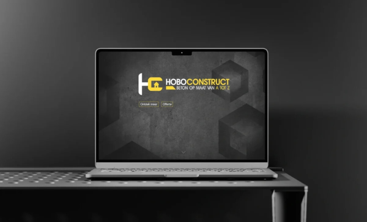
This website by Liv-IT for Hoboconstruct, a concrete construction company, creates an unapologetically solid digital identity. The design uses a bold combination of industrial textures and high-contrast colors to translate the key construction values of strength and reliability into a memorable and highly usable website experience.
The design’s foundation is a dark grey and black monochromatic scheme, featuring textures of raw concrete. A powerful, high-visibility yellow accent is strategically deployed on calls-to-action and other elements. This use of a classic industry signifier reinforces brand authenticity and creates unambiguous focal points for navigation.
The typography pairs a robust slab wordmark logo with a simple sans-serif for other text. The slab serif’s block-like quality reinforces themes of structure and permanence, key values in construction. The supporting sans-serif ensures that even detailed service descriptions are highly readable and accessible.
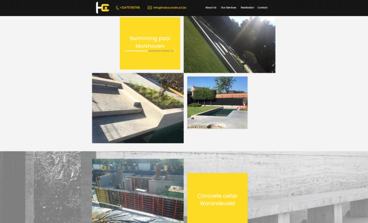
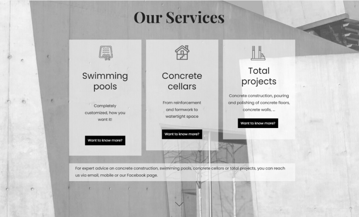
A sense of order is achieved with clean geometric layouts. Vertical cards with semi-transparent white backgrounds display the services, allowing larger black and white photography to be presented underneath. This organized approach makes content easy to scan.
This construction company website design illustrates how industrial brands can create an authentic and memorable digital presence. In a modern business environment where 71% of small businesses have a website, establishing such a distinct and professional online presence is a critical competitive advantage.