Standout Features:
- Commanding, on-theme green-on-white color palette
- Structured typography with bold anchoring
- Functional eCommerce product grid and on-hover effects
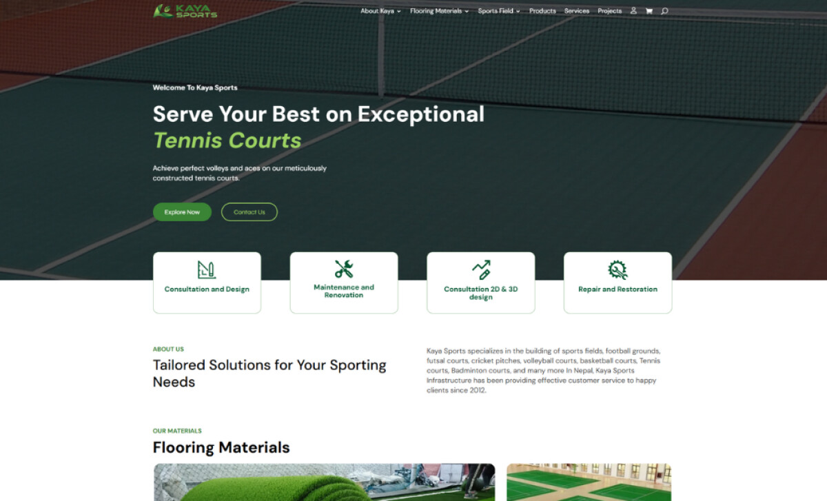
We are looking at a design that had to serve two purposes: sell products and showcase large-scale services. The website for Kaya Sports does this with a clear and cohesive approach.
The green and white combination is clean, fresh, and highly readable, creating a positive first impression, which is critical as users form this judgment in just 50 milliseconds. The colors also perfectly align with Kaya's market of sports turf.

The typography on this construction company website design blends modern sans-serif fonts with varying weights and sizes. The headlines are large, bold, and uppercase. This ensures immediate recognition and helps to guide the flow of the page.
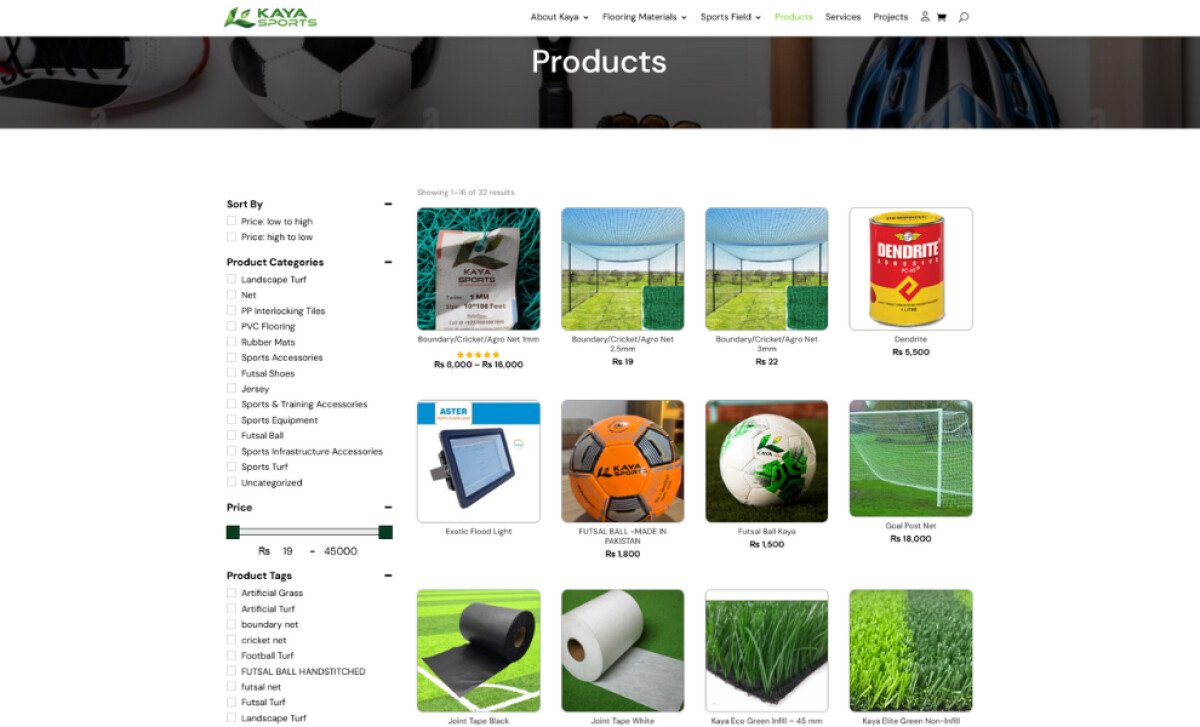
Lastly, its product listing page uses a clean, modular grid layout. The products are all shown in uniform aspect ratios. As a unique touch, on-hover effects gently zoom in on the product cards, making the user experience feel more responsive and polished.
Kaya Sports’ website by WeBajra Studio offers a strong digital foundation for the brand. The key lesson here is that a clean, functional design can effectively unite service messaging with commerce-ready UX.
It proves that a simple, clear, and well-organized website is often the most powerful tool for building a brand and driving sales.
It's a real challenge when your website needs to do two big things at once, like showcasing major projects and selling products directly.
That's why brands turn to expert partners, and our team has ranked the best agencies worldwide to make finding them simple.
Visit our Agency Directory for the Top Web Design Companies, as well as:
Our design experts also recognize the most innovative design projects across the globe. Visit our Awards section to see the best & latest in website design.