Standout Features:
- Meaningful iconography
- Custom illustrations
- Animated, interactive logo
Opium Pro is a Russian outstaff design department for IT companies looking to outpace the competition with originality. In their own words:
“We are arrogant, we are opinionated and we love pure design. We are following inspiration and that is the reason we’re awake at night. We can do things simple and that is the reason we do not give a s**t about the difficulties. We are a rarity. We know what we want. We cost dearly. You pay not for our work but the result.”
This rather unique no BS approach and philosophy is clearly embodied in the company’s website. Forgoing the classic aesthetics conventions, Opium Pro commands attention right from the get-go.
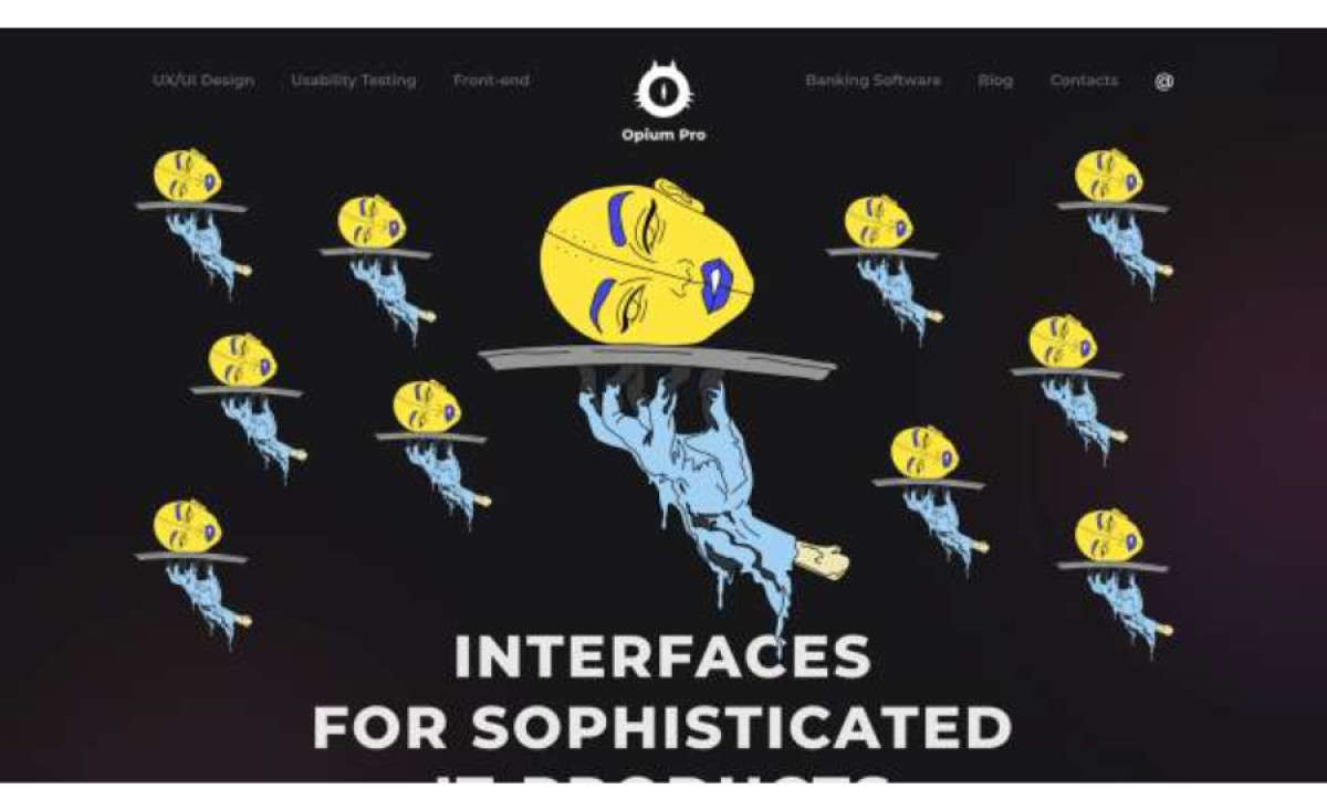
The first thing catching users’ attention is the somewhat bizarre but masterfully drawn illustrations. Complements of the Russian artist Elena Efimova, these bold, almost Opium-induced sketches reflect the deeper meaning of every stage of work and the specific nature of Opium Pro’s services. The same idea is employed for iconography. Each service is represented by a dedicated color-coded geometric shape which significantly contributes to the overall enjoyment, let alone navigation.
Despite the edgy, doctrinaire presentation, or better yet, because of it, the company’s website is a blast to go through. Both mobile and desktop users can customize their stay by switching between dark and light mode (depending on their system preferences) and stay on the page to play with interactive elements such as the Opium Pro’s company logo and background highlights.