Standout Features:
- Elegant serif typography with a soft, modern character
- Cohesive aqua-toned color palette with clean sectioning
- Service-oriented layout
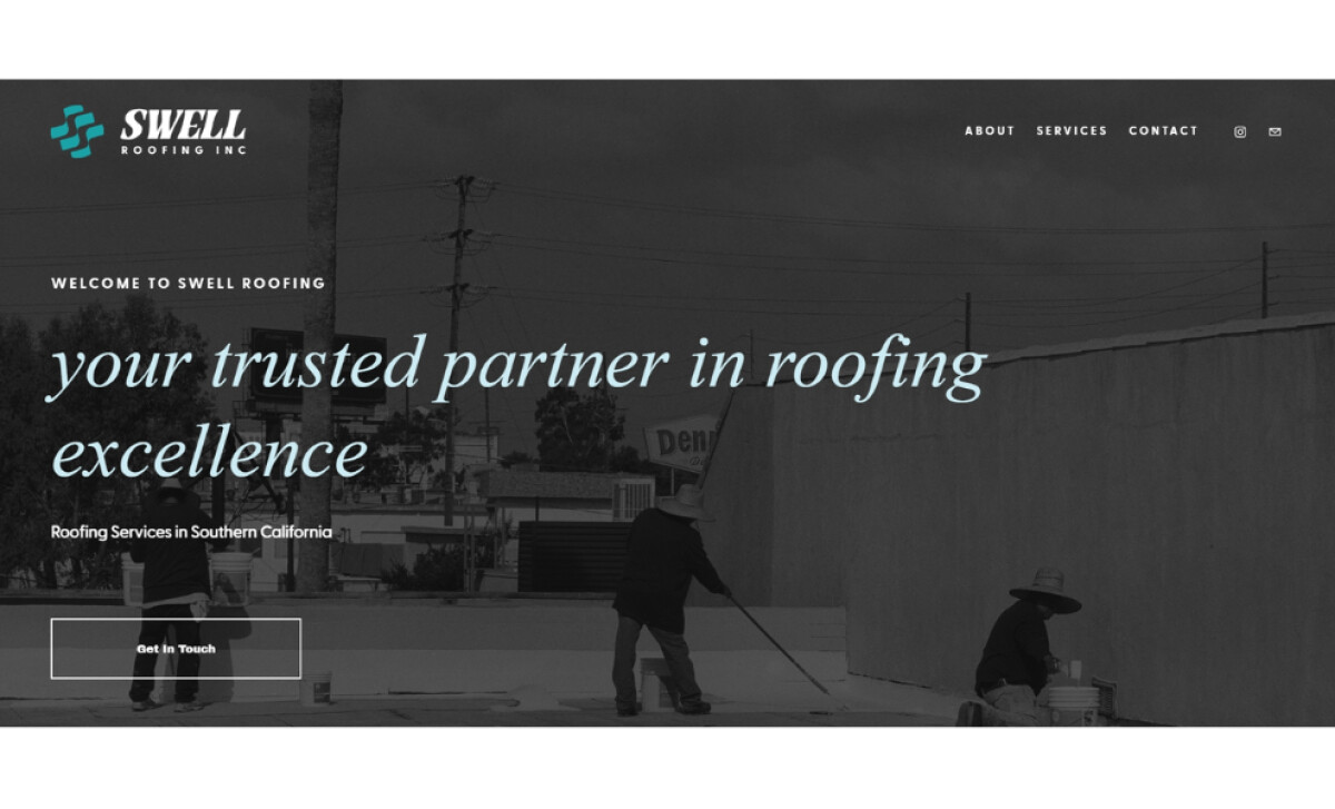
Focused on delivering tailored, long-lasting roofing solutions, Swell Roofing Inc. serves the Southern California market. Miner Creative was tasked with designing its website to embody this commitment to excellence. The site’s modern and refined visual identity is anchored in conveying trust and communicating the brand's approach.
A distinctive aspect of the site is its elegant serif font for headlines, like on the home page, which presents gentle curves and a high contrast between strokes. This all-lowercase styling brings a refined character that I find is usually absent from trade websites. It subtly positions the brand as a premium, professional service provider.
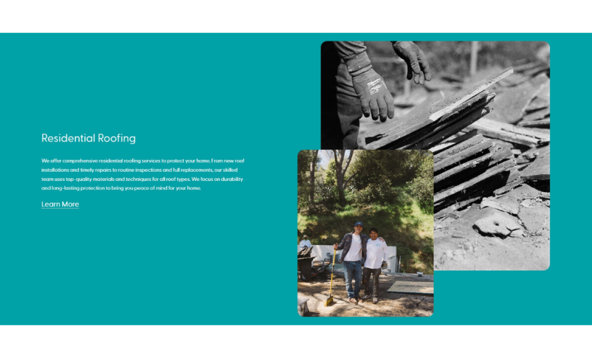
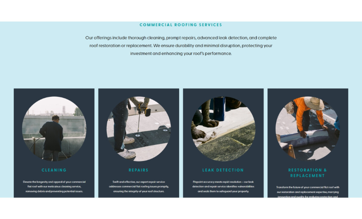
This roofing website consistently uses aqua and pale sky. Given that blue increases trust, this creates a fresh and trustworthy look. You'll notice these hues dominate section backgrounds and highlight key elements like buttons and icons. This cohesive color strategy visually separates content blocks, such as residential and commercial services.
Each roofing service is presented through a grid of clearly defined cards, featuring round-cropped images and concise descriptions. This straightforward, symmetrical layout focuses on content clarity. The inclusion of candid photos of workers on-site within the Residential Roofing section adds an authentic, human element to the presentation.
Miner Creative's work for Swell Roofing highlights that user-centric design is paramount, even in specialized trade industries. An intuitive layout, clear service articulation, and design elements that evoke trust can streamline the customer journey and improve conversion rates for businesses seeking a stronger online impact.