Makeup Ads: Key Points
- Inclusive marketing strategies like Fenty Beauty’s drove $100M in first-month sales, showing that brands that authentically serve overlooked audiences can unlock major revenue growth.
- Maybelline’s viral TikTok success, with 400M+ views and a product selling every three seconds, proves that fast, creator-first content outperforms traditional beauty advertising.
- Dior’s AR try-on campaign significantly boosted purchase intent and brand perception, showing how immersive tech enhances luxury brand storytelling and engagement.
The global beauty industry is highly competitive, and to stand out, cosmetic brands must focus their strategies on authenticity, storytelling, and smart platform use. This campaign breakdown covers the top makeup ad examples, emerging trends, and the best platforms to grow your brand.
4 Iconic and Trending Makeup Ad Campaigns To Know
Successful makeup advertising campaigns marry creative vision with strategic execution, often tapping into cultural currents and the latest platforms. Below, we analyze four standout campaigns that illustrate best practices and innovative approaches in beauty marketing.
- Fenty Beauty’s inclusive revolution
- Maybelline’s social-first viral pushes
- MAC’s pop culture collaborations
- Dior Beauty’s immersive experiences
1. Fenty Beauty’s Inclusive Revolution
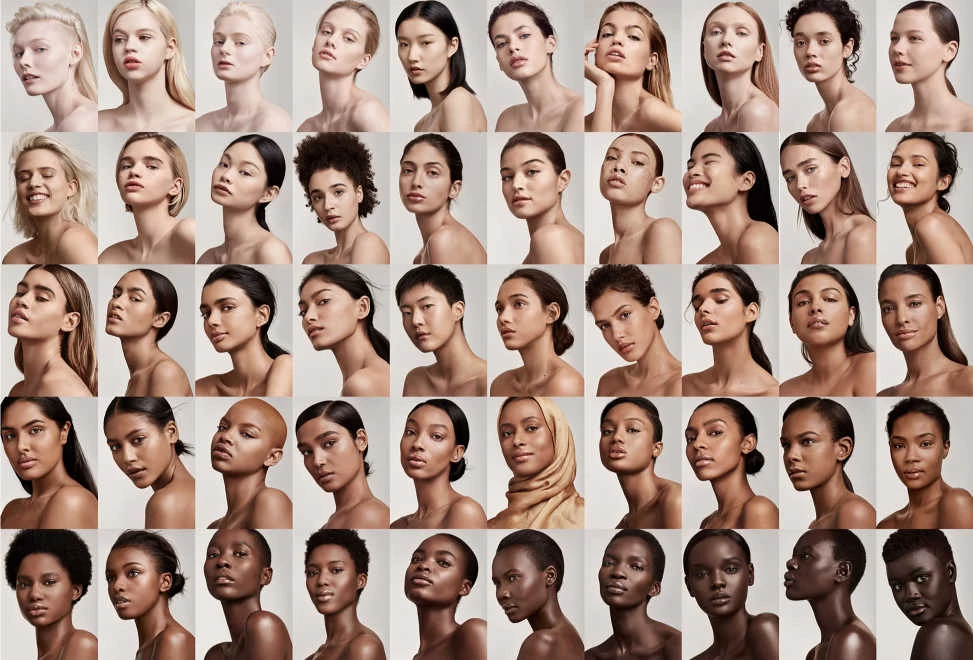
Fenty Beauty, launched by Rihanna and LVMH in late 2017, revolutionized industry norms through radically inclusive marketing. The brand debuted with 40 foundation shades catering to a wide spectrum of skin tones, showcased by a diverse cast of models in its ads. This authentic inclusivity generated enormous buzz.
Fenty Beauty's Campaign Strategy
- High-quality video storytelling featuring diverse models
- User-generated content (UGC)-fueled product reviews amplified across social platforms.
- Partnerships with creators across skin tones, geographies, and genders
The Results
- Fenty’s launch became the biggest beauty brand debut in YouTube history.
- The company reportedly amassed $100 million in sales within just over a month of launch.
- By its first full year, Fenty’s annual revenue exceeded $550 million, outpacing even established celebrity brands.
Critics initially wondered if Rihanna’s star power alone drove the hype, but Fenty’s sustained success (now often termed the “Fenty Effect”) is widely attributed to its strategy of making all consumers feel seen.
Key Lessons From Fenty’s Campaign
- Identify an underserved audience by recognizing gaps in the market where consumers feel overlooked and build products that directly address their needs.
- Resonate with genuine inclusion by ensuring that diversity is reflected authentically across product offerings, campaigns, and brand storytelling.
- Align product development (extensive shade ranges) with messaging (“Beauty for all”).
Fenty didn’t just launch a product; it shifted the narrative. By offering 40 foundation shades at launch (in 2025, the number has increased to 50) and anchoring its messaging in inclusivity, Fenty Beauty tapped into a $3 billion underserved market. Rihanna's omnipresent founder persona made the brand authentic and aspirational. The result was not only massive sales but a lasting shift in industry standards, as competitors scrambled to expand their own shade ranges in response.
2. Maybelline’s Social-First Viral Pushes
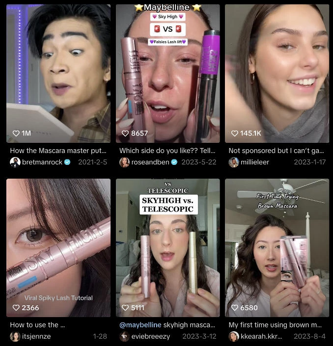
In early 2021, Maybelline demonstrated that even legacy beauty brands can thrive by leaning into social-first marketing. The brand’s Sky High Mascara became a viral sensation on TikTok, driven almost entirely by organic creator content rather than traditional celebrity endorsements.
Short-form videos showcasing dramatic lash transformations racked up hundreds of millions of views, catapulting Sky High into a must-have product status across both digital and retail shelves.
Maybelline's Campaign Strategy
- Partnering with TikTok micro-influencers for authentic product demonstrations
- Launching and promoting the #SkyHighMascara hashtag challenge to fuel UGC (user-generated content)
- Rapidly engaging with trending videos and comments, while ensuring swift retail restocks to convert buzz into sales
The Results
- Over 400 million views on TikTok under the #SkyHighMascara hashtag
- It became the #1 beauty item on Amazon at the time, with one unit sold every three seconds.
- Sky High went on to become one of Maybelline’s top-selling product launches in brand history.
Rather than treating the TikTok buzz as a lucky break, Maybelline amplified the momentum by nurturing creator communities and empowering authentic storytelling around the product. The brand’s decision to trust grassroots content without over-polishing allowed consumers to see real, relatable results, creating a powerful new pathway to purchase.
@bretmanrock How the Mascara master puts on mascara 🤪 @maybelline #skyhighmascara#maybellinepartner
♬ original sound - bretmanrock
Key Lessons From Maybelline’s Campaign
- Meet your audience where they already are by embracing the platforms and communities they naturally engage with.
- Move fast to capitalize on organic momentum and respond to viral trends and consumer excitement in real time before attention fades.
- Prioritize authenticity over perfection by spotlighting real users and genuine reactions.
By embracing TikTok’s community dynamics and user-led discovery, Maybelline proved that even established brands can thrive by adopting agile, creator-first marketing strategies.
3. MAC’s Pop Culture Collaborations
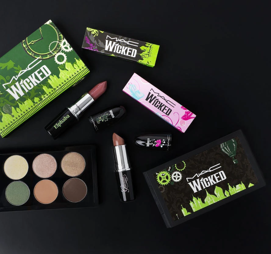
Instead of relying purely on traditional advertising, MAC teamed up with major entertainment franchises like Disney and global artists like Rosalía to spark emotional connections and drive social buzz. Each collaboration wasn’t just a product launch; it was a moment fans didn’t want to miss.
MAC’s Campaign Strategy
- Creating limited-edition collections tied to beloved icons (e.g., Disney villains, Selena, Rosalía) to trigger urgency and scarcity.
- Amplifying UGC as fans shared hauls, unboxings, and collectible displays.
- Cross-promoting through music, film, and fashion channels to expand reach beyond traditional beauty audiences.
The Results
- Many MAC collaborations (like the Selena Collection) sold out within hours of launch.
- The brand consistently topped social media trend charts around major drops.
- MAC increased brand affinity among Millennials and Gen Z by aligning with fandom-driven purchasing behavior.
MAC’s success shows that today’s consumers don’t just want great products, they crave cultural participation. Limited-edition makeup tied to a beloved story, movie, or artist gives buyers a sense of belonging and urgency that generic ads simply can’t replicate.
View this post on Instagram
Key Lessons From MAC’s Makeup Ad Strategy
- Fuse cultural currency with product creativity to sell moments, memories, and status.
- Create urgency through scarcity and turn launches into events consumers feel they must be part of.
- Think beyond “products” and ask, “What fandom, trend, or cultural wave can we authentically ride?”
4. Dior Beauty’s Immersive Experiences
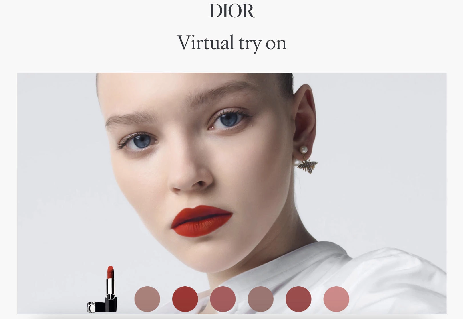
Dior Beauty has always defined luxury, but in 2023, the brand proved that prestige doesn't mean standing still. With a groundbreaking virtual try-on (VTO) ad campaign, Dior blended its couture heritage with cutting-edge augmented reality, allowing consumers to interact with $5,000 earrings and premium makeup directly through seamless mobile ads.
The result? A flawless, immersive experience that elevated both brand engagement and purchase intent without compromising Dior’s timeless image.
Dior Beauty’s Campaign Strategy
- Partnering with AR tech firms to embed virtual try-on experiences into mobile ads.
- Creating cinematic mini-films for Instagram and YouTube featuring ambassadors like Natalie Portman.
- Maintaining high-fashion editorial aesthetics across digital and print placements to reinforce luxury cues.
- Using interactive mobile ads to bridge the gap between brand storytelling and product trial.
The Results
- Dior’s AR campaign significantly boosted ad recall, purchase intent, and reinforced its premium brand perception among luxury consumers.
- The immersive virtual try-on experience drove deeper consumer engagement, keeping audiences interacting with the brand longer than traditional ads.
- By merging innovation with luxury storytelling, Dior strengthened its position as a digital pioneer among prestige beauty brands.
By seamlessly combining innovation with prestige, Dior proved that luxury brands don’t have to choose between heritage and technology — they can (and should) do both.
Key Lessons From Dior’s Playbook
- Use technology to enhance exclusivity, not compromise it.
- Design immersive campaigns that seamlessly connect emotional storytelling with product interaction to deepen customer engagement.
- Maintain a consistent luxury identity across every platform.
By letting users experience its products firsthand through AR while maintaining the aspirational allure of its couture heritage, Dior set a new gold standard for digital luxury marketing. For agencies and CMOs, the takeaway is clear: if you want to future-proof a prestige brand, innovation must feel just as premium as the products themselves.
5 Key Marketing Strategies in Makeup Advertising
As competition in the beauty space heats up, running effective campaigns today requires more than beautiful visuals. It demands authenticity, agility, and emotional resonance. These strategies drive stronger engagement, loyalty, and conversions across platforms:
- Emotional and aspirational messaging
- Influencer-driven authenticity
- Storytelling through short-form video
- FOMO-driven campaigns
- Aesthetic consistency across ecosystems
1. Emotional and Aspirational Messaging
In beauty marketing, emotional resonance isn’t optional, it’s essential. Campaigns that connect with consumers on a deeper, more personal level outperform purely product-focused ads by a wide margin.
Emotional messaging works because beauty is inherently tied to self-identity, transformation, and confidence. When brands focus on how a product makes someone feel rather than just what it does, they create loyalty, community, and virality. Especially in today’s competitive landscape, emotional storytelling helps brands cut through noise and leaves a lasting impression.
Here’s how you can accomplish this:
- Focus campaign narratives on emotional outcomes like empowerment, self-expression, or belonging — not just product features.
- Use real customer stories to demonstrate emotional transformation journeys (before/after confidence boosts, identity affirmation).
- Tie emotional messaging into broader social conversations, such as mental wellness, diversity, and self-love, to increase cultural relevance.
2. Influencer-Driven Authenticity
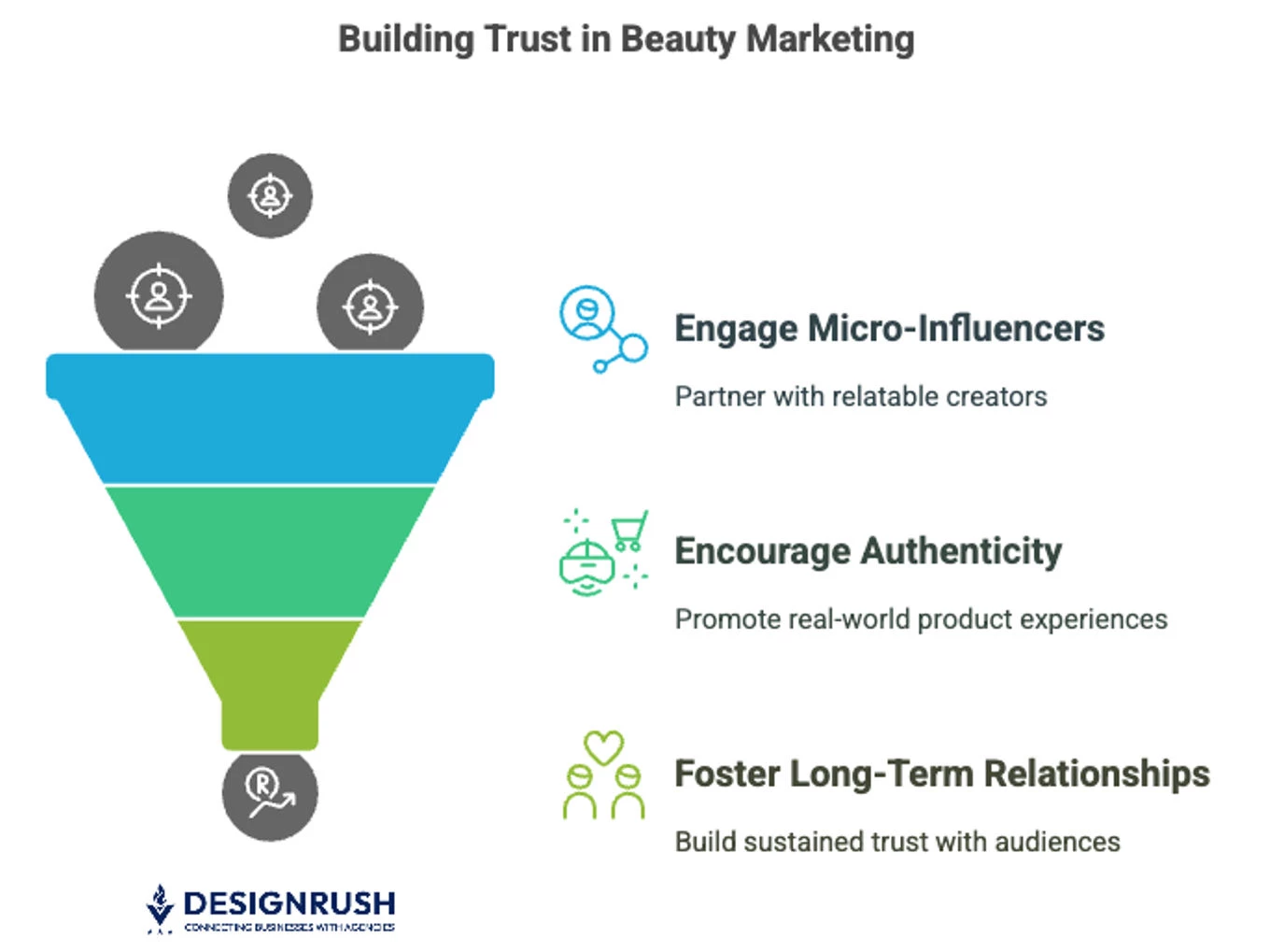
In the beauty world, trust is the ultimate conversion driver, and today's consumers place their trust in real people, not brands.
Authenticity matters because beauty is personal. Consumers are more likely to buy from someone they relate to — someone whose skin texture, lifestyle, or personal and brand values feel familiar. Partnering with genuine creators allows brands to tap into micro-communities where trust already exists, dramatically improving campaign ROI.
Here’s how you can accomplish this:
- Build relationships with micro- and mid-tier influencers whose audiences closely match your target customer profile.
- Encourage unscripted, real-world product experiences rather than overly polished sponsorships.
- Prioritize long-term partnerships over one-off posts to build sustained authenticity and trust with influencer audiences.
3. Storytelling Through Short-Form Video
Short-form video isn’t just a format shift; it’s a behavioral shift. Over 90% of TikTok users take actions on the platform after watching a beauty video, including liking the video, sending it to their friends, or following the creator.
The power of short-form video lies in its ability to demonstrate transformation quickly and authentically. It humanizes the brand, creates emotional engagement, and matches the consumption habits of Gen Z and Millennials who now prefer snackable content formats.
Here’s how you can accomplish this:
- Anchor campaigns around real user journeys (e.g., transformations, tutorials, day-in-the-life makeup routines).
- Leverage native platform features like trending sounds, fast cuts, and text overlays to blend seamlessly into user feeds.
- Incorporate authentic voiceovers and UGC aesthetics rather than heavily scripted video ads to maximize relatability.
4. FOMO-Driven Campaigns
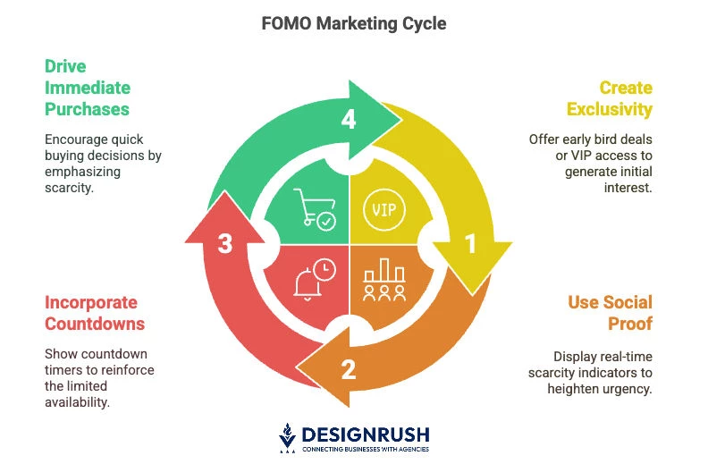
Beauty campaigns that leverage FOMO tactics, like early access codes, countdown timers, or limited shade drops, consistently deliver higher engagement and faster conversions.
The reason scarcity works so well is because it taps into emotional urgency. When consumers believe a product might run out or an opportunity might close, they are more likely to make immediate purchasing decisions, bypassing lengthy consideration stages.
Here’s how you can accomplish this:
- Create exclusivity through early bird offers, VIP access, or limited-edition releases.
- Use real-time social proof (e.g., "Only 3 shades left!") to heighten perceived scarcity during campaigns.
- Incorporate visible countdowns on landing pages, ads, and product pages to reinforce urgency.
5. Aesthetic Consistency Across Ecosystems
In an overcrowded market, cohesive branding builds immediate trust and credibility. Whether customers encounter your brand on Instagram, in-store, or through influencer-led promotions, maintaining a visually unified experience strengthens loyalty and the perception of professionalism.
Here’s how you can accomplish this:
- Conduct regular brand audits to ensure colors, fonts, imagery, and tone are consistent across web, social, packaging, and ads.
- Create and enforce a brand style guide that applies not just internally but across influencer partnerships and retail collaborators.
- Offer aesthetic consulting services for clients looking to refresh or realign their beauty branding to modern visual trends.
Best Platforms and Ad Formats for Promoting Makeup Brands
Different ad platforms serve different purposes and understanding what each one offers can make all the difference in how you position your products. Let’s dive into where your beauty brand should be showing up, and how you can make the most of each one:
- Instagram: The visual gold standard
- TikTok: The virality engine
- YouTube: The long-form credibility channel
- Pinterest: Evergreen and intent-driven
- In-store & print: Offline still matters for prestige brands
- Emerging ad formats: Shoppable posts, branded challenges, and AR try-ons
1. Instagram: The Visual Gold Standard
Instagram has long been the home of beauty influencers, visual storytelling in makeup, and brand building. If you want to drive discovery and showcase stunning products, this is still the place to be. Furthermore, it’s important to focus on consistent aesthetics to maximize performance.
Why Instagram Works
- Instagram content connects with 75% more new users on average than equivalent TikTok content for beauty brands.
- Engagement rates stay strong, with beauty posts averaging around 3.5% engagement.
- Instagram marketing strategies and tools like Stories, Reels, and Live offer creative ways to interact with audiences and drive product launches.
Best Ad Formats To Use
- Reels
- Carousel ads
- AR filters
- Shoppable posts
2. TikTok: The Virality Engine
If you're chasing viral moments, TikTok is non-negotiable. It’s where trends are born and beauty brands that show up authentically are seeing massive returns. Success here means leaning into the culture. Use trending sounds, challenges, and creator collaborations. On TikTok, perfection is out; relatability wins.
Why TikTok Works
- Beauty posts on TikTok get the highest engagement rate of any platform (around 3.0%).
- Beauty brands on TikTok are growing their followings by about 8% per month.
- TikTok Shops drove $2.5 billion in beauty sales in 2024 alone, making beauty its top-selling category.
Best Ad Formats To Use
- Branded challenges
- Influencer skits
- Sound-driven mashups and trends
3. YouTube: Long-Form Credibility Channel
YouTube isn’t just a video platform; it’s a beauty research hub. Consumers turn to YouTube for authentic product reviews, tutorials, and wear-tests before making purchase decisions. YouTube is perfect for education-heavy campaigns. If you’re launching a product with unique benefits or science-backed ingredients, longer-form storytelling builds authority.
Why YouTube Works
- According to Dash Social's report linked above, long-form YouTube content earns around 48% more views.
- Engagement is strong, with beauty videos seeing around 1.9% engagement (DashSocial).
- YouTube strengthens brand trust, especially for premium and luxury beauty.
Best Ad Formats To Use
- GRWM (“Get Ready With Me”) videos
- In-depth tutorials and product breakdowns
- Sponsored beauty guru reviews
4. Pinterest: Evergreen and Intent-Driven
Pinterest is often overlooked, but it’s a goldmine for beauty discovery, inspiration, and high-intent shoppers. Think of it as your evergreen marketing engine. Create content that's timeless, such as beauty tips, routines, and mood boards that stay relevant year-round tend to perform best.
Why Pinterest Works
- Users browsing beauty content on Pinterest are 33% more likely to try a new product compared to other platforms (DashSocial).
- It’s ideal for seasonal, event-based, or mood board-driven marketing.
Best Ad Formats To Use
- Idea Pins
- Tutorial Pins
- Shoppable product Pins
5. In-Store & Print: Offline Still Matters for Prestige Brands
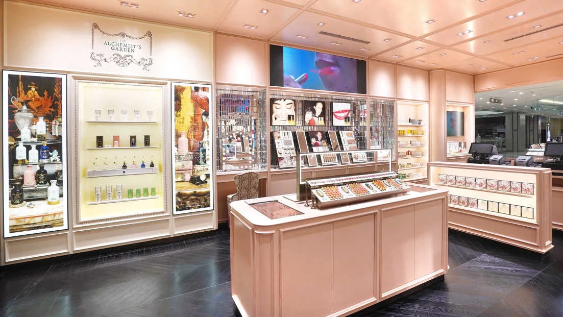
While digital undoubtedly dominates, physical presence still carries weight, especially for luxury or prestige beauty brands. Don’t think of print or retail activations as separate from your digital strategy — the best campaigns integrate both for omnichannel success.
Why Offline Placements Work
- High-impact displays at retail counters or beauty boutiques create experiential moments.
- Fashion magazines offer halo effects for brand prestige.
- QR codes and in-store activations can seamlessly connect offline touchpoints back to digital channels.
6. Emerging Ad Formats: Shoppable Posts, Branded Challenges, and AR Try-Ons
Beyond choosing the right platform, mastering the right ad format can make or break your campaign. Shoppable posts, branded challenges, and virtual try-ons are becoming must-haves for beauty brands that want to drive faster conversions and deeper engagement.
Beauty shoppers who interact with AR try-ons are 1.6x more likely to make a purchase and spend 2.7x more per session, according to brand AR studies. Invest in immersive formats early — they’re quickly becoming consumer expectations, not novelties.
Why These Ad Formats Work
- Shoppable posts let users go from inspiration to checkout without leaving the app.
- Branded challenges encourage UGC at scale, tapping into community creativity and expanding brand reach.
- AR/VR experiences like try-ons offer interactive, immersive experiences that boost purchase confidence and cut decision-making time.
Best Ways To Leverage Emerging Ad Trends and Formats
- Use Instagram and TikTok’s native shoppable features to turn inspiration into instant action.
- Launch branded hashtag challenges to drive viral engagement and community participation around new product drops.
- Integrate AR try-on experiences (like lipstick shade testers or virtual makeovers) across mobile ads, Instagram filters, or in-store mirrors to bridge digital and physical retail.
Makeup Ads: Wrap-Up
Makeup ads in 2025 are a masterclass in hybrid marketing, where emotional resonance meets data-driven delivery. From Fenty’s game-changing inclusivity to TikTok-fueled mascara virality, the future of beauty branding hinges on how well companies integrate content with commerce.
For agency leaders and CMOs, the opportunity lies in building ecosystems — not just ads — designed for conversion, connection, and cultural currency.
![]()
Our team ranks agencies worldwide to help you find a qualified partner. Visit our Agency Directory for the best ad agencies, as well as:
- Top Digital Marketing Agencies
- Top Branding Agencies
- Top Creative Agencies
- Top Full-Service Digital Agencies
- Top Video Production Companies
Our experts also recognize the most innovative projects across the globe. Given the recent uptick in video podcasting, you'll want to visit our Awards section for the best & latest in video production.
Makeup Ads FAQs
1. What makes a makeup ad successful?
Success in makeup ads comes from emotional storytelling, platform-specific content, and influencer authenticity that drives engagement and sales.
2. How do influencers drive ROI in beauty campaigns?
Influencers increase trust, create native-feeling content, and help brands tap into loyal micro-communities, improving both reach and conversions.
3. What are the top trends in makeup ad formats?
AR try-ons, TikTok challenges, live shopping, and personalized product ads are among the fastest-growing ad formats in beauty.