- Designer: Liana Drozd
- Client: 7shifts
- Category: App Design — Android & IOS
- Location: Saskatoon, Canada
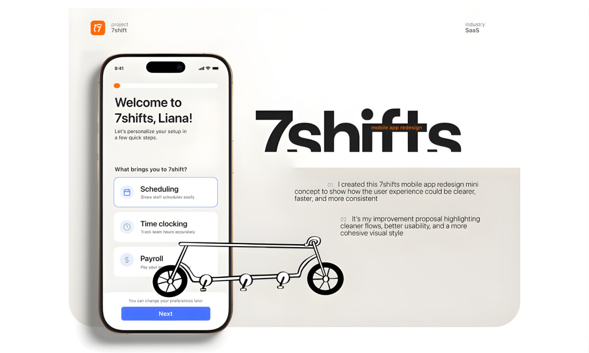
- Project Brief: Identify key usability challenges within the 7shifts mobile app and propose design improvements that enhance clarity, efficiency, and overall user satisfaction, while aligning the app more closely with the 7shifts brand system.
Android & iOS app design should translate complex operational workflows into a singular, balanced interface that remains functional across all devices.
The strategy for 7shifts centers on reducing cognitive load by breaking complex tasks into clearer, more digestible steps, allowing users to move through scheduling and setup with confidence.
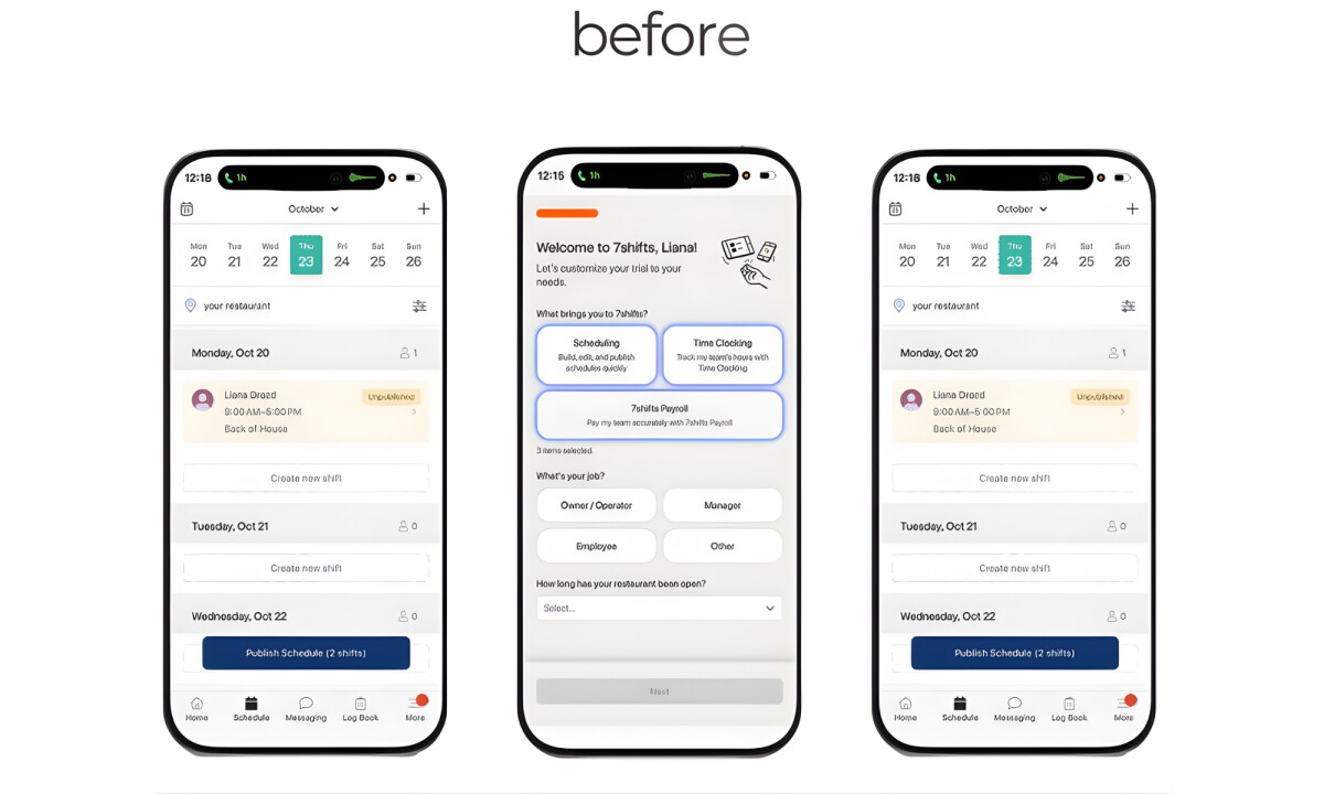
- Usability Strategy & Friction Reduction: I like how the strategy centers on reducing cognitive load by breaking dense layouts into clearer, digestible steps. This approach allows users to navigate scheduling tasks with confidence, effectively eliminating the hesitation caused by competing visual priorities.
- Information Hierarchy & Flow: I appreciate the decision to reorganize key actions into a more natural progression for onboarding and shift management. Surfacing primary actions earlier while de-emphasizing secondary inputs creates a faster, more intuitive experience for both new and returning users.
- Visual Simplification: The introduction of more visual air especially effective for improving scanability and reducing user overwhelm. Streamlining and reusing components consistently across screens reinforces familiarity, making high-frequency interactions feel predictable and rapid.
- Brand Alignment & Tone: I like how the redesign aligns the mobile interface with the 7shifts website through strategic typography and color usage. This consistency strengthens brand cohesion across platforms while maintaining an approachable tone that feels modern and suited to daily operational use.
What Brands & Designers Can Learn from 7shifts
1. Reduce Cognitive Load Through Task Segmentation
Breaking complex workflows into clear, sequential steps builds user confidence. Simplicity in structure is key when users manage operational tasks daily.
2. Design Hierarchy Around Real User Priorities
Surfacing primary actions earlier streamlines onboarding and shift management. Clear flow helps both new and experienced users move faster with less friction.
3. Use Visual Consistency to Increase Speed
Reusable components, added white space, and aligned brand styling make interactions predictable. Familiar patterns turn frequent tasks into effortless habits.