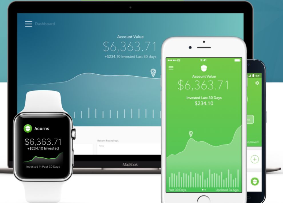
The barrier to getting involved with investing can be too much for some to overcome. Investing can feel daunting and complicated. Acorn uses sleek mobile apps to help users understand the overall process and start saving money. Their applications remove the difficulty that some see in the investment system.
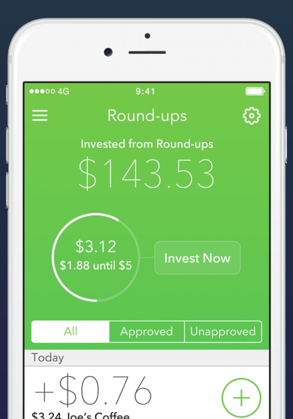
Acorn makes it simple for users to quickly invest money how and when they want to. The app is very clean. The typography is simple, the infographics are kept to a minimum, and you won’t find any stock symbols or tickers here. The app is simply meant to show how your money is being investing and performing. Simplicity is the key to the Acorn application.

Bright colors dominate the screen, while white text and infographics stand out against the background. The design is very modern and minimalist—exactly what Acorn was aiming for. Their service is meant to be easy to understand, so their interface should match that. Users that choose Acorn do so because they want to save without feeling overwhelmed by the seemingly complicated aspects of investing.
The result is a sleek, easy-to-use app that makes investing simple. Acorn has found a niche among people who want to start saving but don’t want to dive deep into the complicated world of investments. Their app perfectly reflects their brand identity, and it helps build upon it. The app is clean and fun to use. Watching your money grow is pretty nice, too.
Acorns is a modern app design in the banking & finance industry.