- Agency: Dasha Wagner
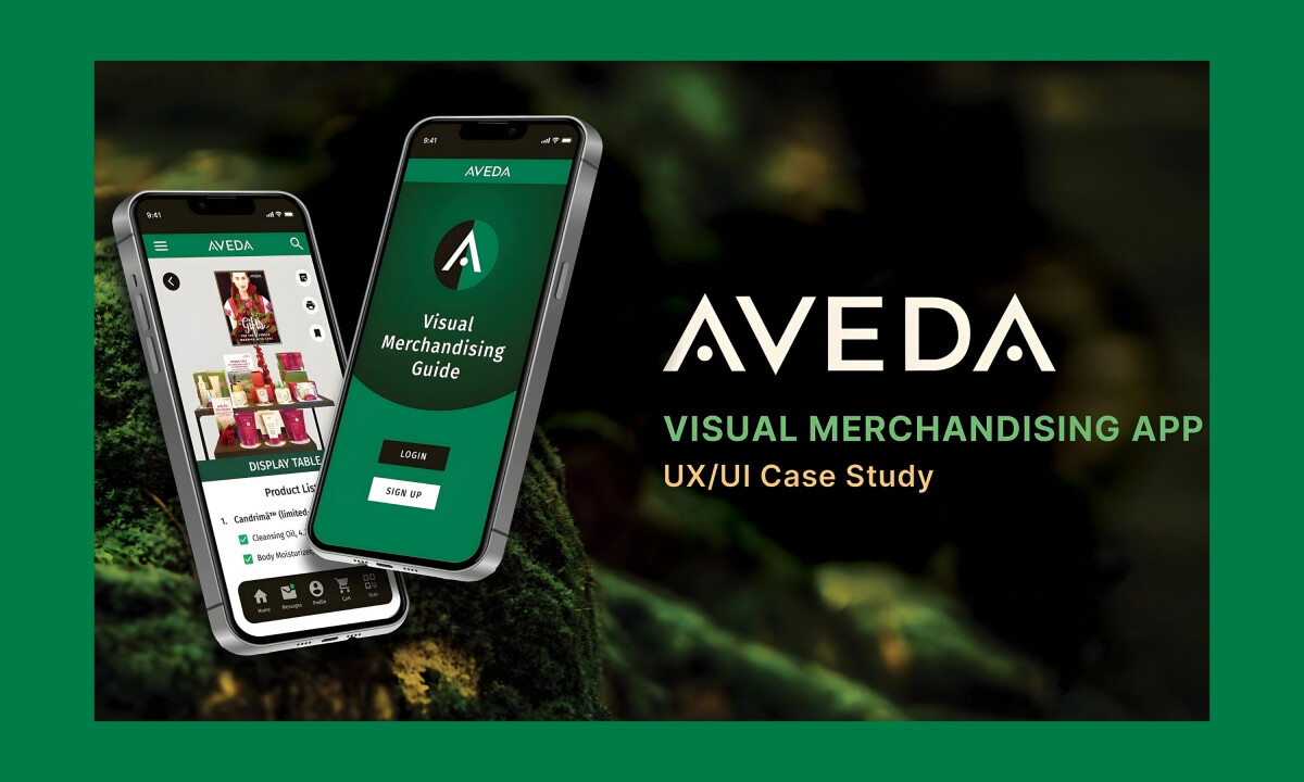
- Client: Aveda
- Category: App Design
- Location: Cleveland, Ohio, United States
- Project Brief: Design a mobile app that enhances global visual merchandising execution with intuitive navigation, multilingual support, and centralized brand guidelines across Android and iOS devices.
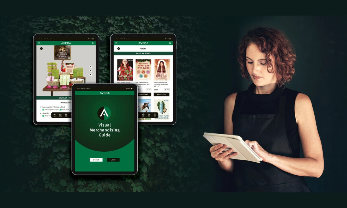
An Android and IOS app for a global beauty brand must balance accessibility with control. This app translates Aveda’s visual merchandising standards into a structured digital format, helping teams execute displays accurately across markets and regions.
Why This Is A Winning Design
- Visual Identity: Aveda’s signature green palette anchors the interface and signals the brand’s nature-driven positioning. A restrained color system keeps the experience calm and professional while maintaining clear contrast for everyday retail tasks.
- Typography: Clean sans-serif type supports legibility across mobile screens and tablets. Clear hierarchy between headers, labels, and product details help store managers scan instructions and merchandising updates quickly.
- Structure: The interface relies on modular components and card-based layouts. That structure breaks complex merchandising guidelines into clear sections, turning display instructions, product lists, and documents into content that’s easy to navigate.
- Iconography & UI System: A consistent icon set and standardized UI components support usability. Buttons, progress indicators, and navigation patterns create a predictable system that helps users move through tasks like ordering materials or reviewing display guides.
- Brand Translation: The app carries Aveda’s premium retail identity into a practical store tool. Brand consistency stays intact while the interface supports daily merchandising work across global locations.
‘’Pretty visuals offer an engaging environment, clear actions and prompts entice the user to interaction. Wonderfully directed to target audience with a complete understanding of their need.’’
- Andrea Owsinek-Brucker: DesighRush Juror