Standout Features:
- Clean and intuitive layout
- Thoughtful use of vibrant, consistent color schemes
- Engaging micro-interactions and iconography
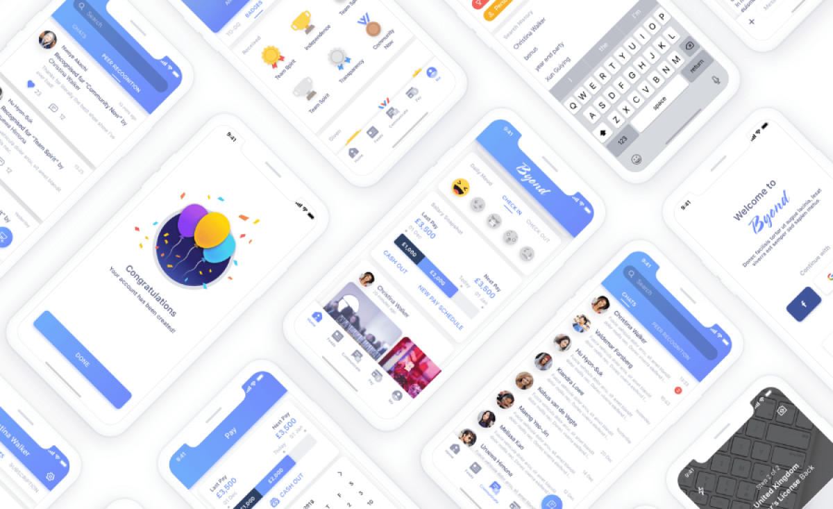
The Byond app, designed by UX Circles, sets a high standard for user-friendly and visually cohesive mobile app design crafted for workplace environments. Aimed at enhancing communication and productivity, the app combines clean aesthetics with highly functional elements, delivering a standout user experience.
One of the most impressive features of the app is its clean and intuitive layout. Byond’s interface is designed with clarity in mind, featuring well-organized sections that make navigating tasks, messages, and updates effortless. The use of white space further enhances readability, while a simple bottom navigation bar ensures accessibility across all app features.
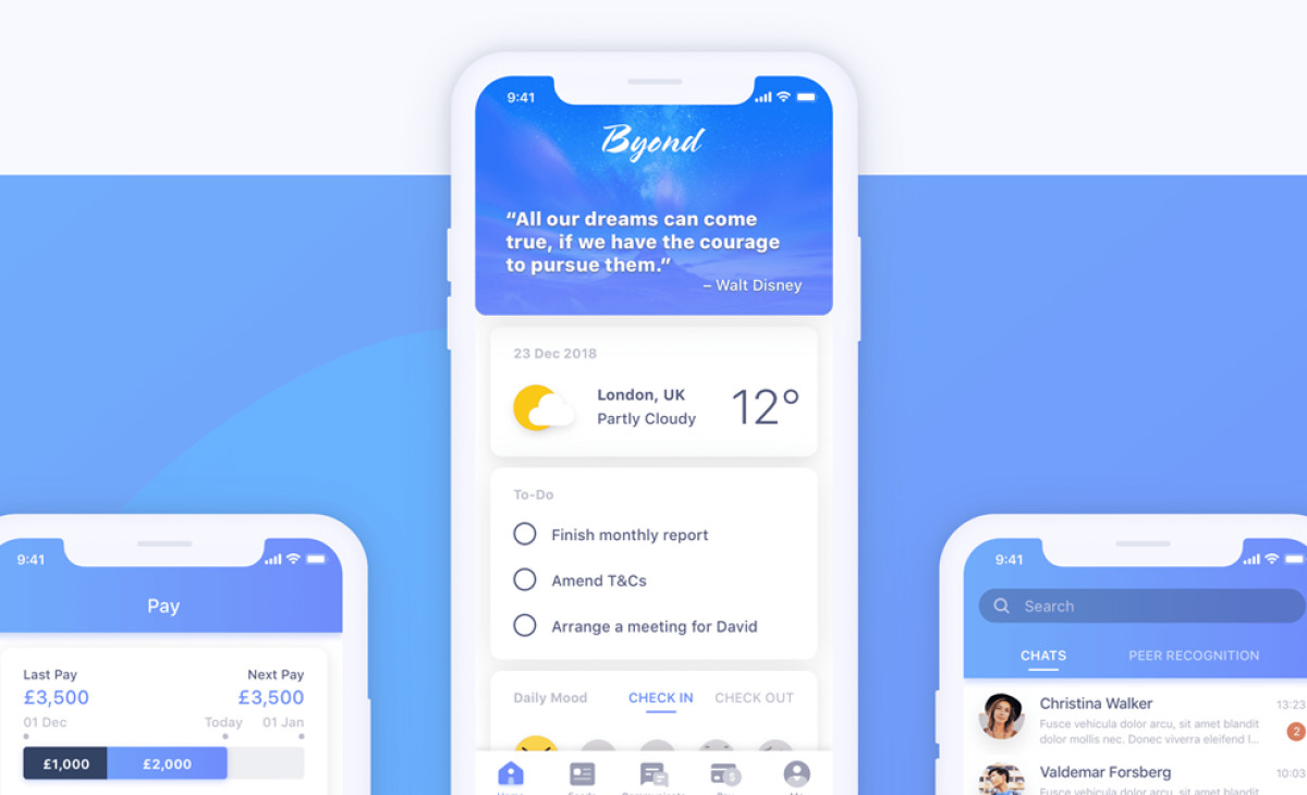
The app’s thoughtful color scheme plays a significant role in creating a cohesive user experience. Shades of blue dominate the design, evoking trust and calmness while maintaining a professional look. This consistent palette, paired with contrasting elements like white text and icons, guides users’ attention and adds to the app's polished feel.
Engaging microinteractions and well-designed iconography elevate the user experience further. From the subtle animations in peer recognition features to the cheerful visuals celebrating user achievements, every detail is designed to delight. These interactions add a human touch to the app while reinforcing its focus on collaboration and positivity.
UX Circles has designed an android and IOS app that excels in both form and function. By combining a clean layout, an inviting color scheme, and engaging interactions, the agency created a seamless experience for users looking to stay productive and connected. It’s a prime example of how thoughtful UX and UI principles can enhance engagement and usability.