- Agency: Selma Digital
- Client: Museum of Earth
- Category: App Design — Education
- Location: New York City, New York, United States
- Project Brief: Design a mobile app that enhances visitor engagement through immersive storytelling and seamless interaction across touchpoints.
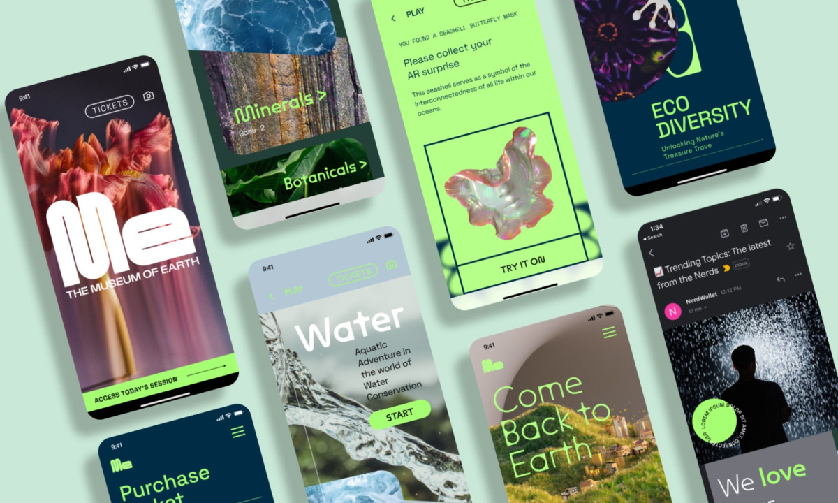
Most museum apps are digital brochures with a map and a ticket button. Selma Digital's education app for the Museum of Earth is closer to a nature game. The design treats the visit as a quest rather than a tour.
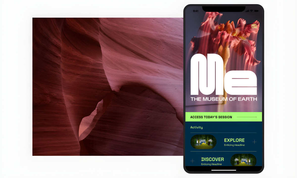
The home screen opens on a full-bleed nature photograph behind the "Me" wordmark (the museum's initials doubling as a first-person pronoun). Below it, an "Access Today's Session" button in neon green and an activity feed split into "Explore" and "Discover" entries. The information architecture prioritizes doing over reading.
The gamification layer is the design's real ambition. Users collect AR discoveries during their visit. One screen shows "Found a geode!" with GPS coordinates, a 3D-rendered turquoise geode floating in a framed viewfinder, and an "Open It" button in neon green.
The app turns specimens into collectibles, giving visitors a reason to move through the museum rather than standing at the first exhibit they like.
The color system runs neon green on deep teal, with nature photography filling every background. The palette signals something closer to a nature documentary app than a traditional museum guide. That's a deliberate positioning choice. A museum about the Earth shouldn't look institutional. It should look alive.
Selma Digital built a museum app that gives visitors something to do, something to collect, and a reason to come back. The design treats environmental education the way games treat progression: one discovery at a time.