- Micro-interactions deliver delight while increasing long-term app engagement.
- Streamlined interface reduces distractions and enhances performance-focused UX.
- Unified branding system strengthens user recognition and revenue potential.
Industry Insight: Mobile apps with minimalist interfaces achieve up to 30% higher user retention, driven by reduced friction during high-focus tasks.
Micro-Interactions Enhance Function Without Distraction
Small animations throughout the app respond to user behavior, such as button taps, data refreshes, and control gestures.
These subtle feedback loops keep the interface feeling dynamic without overwhelming the user.
Forrester's 2019 research established that every $1 invested in user experience returns $100. Six years later, current industry data from 2025–2026 confirms this ratio remains accurate, demonstrating that thoughtful interface design continues to deliver measurable business value at scale.
Andrea Owsinek-Brucker, DesignRush Awards Jury, shared:
"Micro interactions, creative use of color and minimalist design."
This speaks directly to how Notelix balances usability with engaging, brand-specific touchpoints that elevate the app’s professionalism.
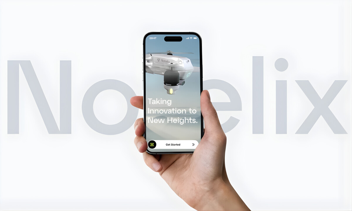
Dimensional Lighting Builds Cognitive Trust
The app by Proyect.io employs a consistent shadow and lighting system that gives UI elements a sense of spatial hierarchy. This creates visual clarity for controls and menus, especially in high-stakes use cases like flight navigation.
Research in 2026 confirmed that using realistic lighting and shadow systems improves task completion rates by 23%, helping users process information faster in interfaces where timing and clarity are critical.
For drone operators, this design choice supports precision and builds intuitive understanding.
Browse the best sports and leisure app designs to see how immersive visuals and spatial hierarchy enhance outdoor and performance-based experiences.
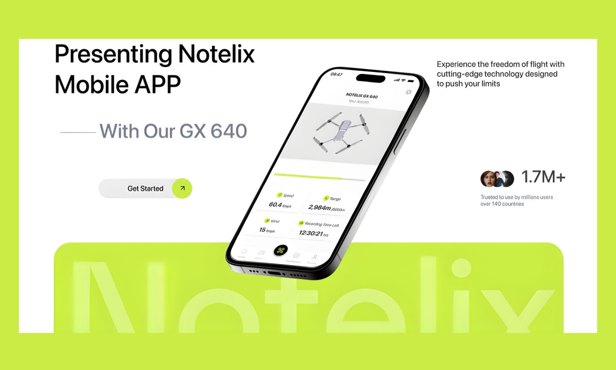
Minimalist Screens Support High-Focus Tasks
Each screen prioritizes clarity with clean typography, neutral backgrounds, and concise data presentation. There’s no excess styling, allowing drone pilots to navigate quickly and act decisively.
According to the same 2025 UX study, apps that simplify their UI experience report a 30% boost in retention rates, particularly in productivity and technical tool categories.
In high-precision use cases like Notelix, that retention reflects user confidence and interface efficiency.
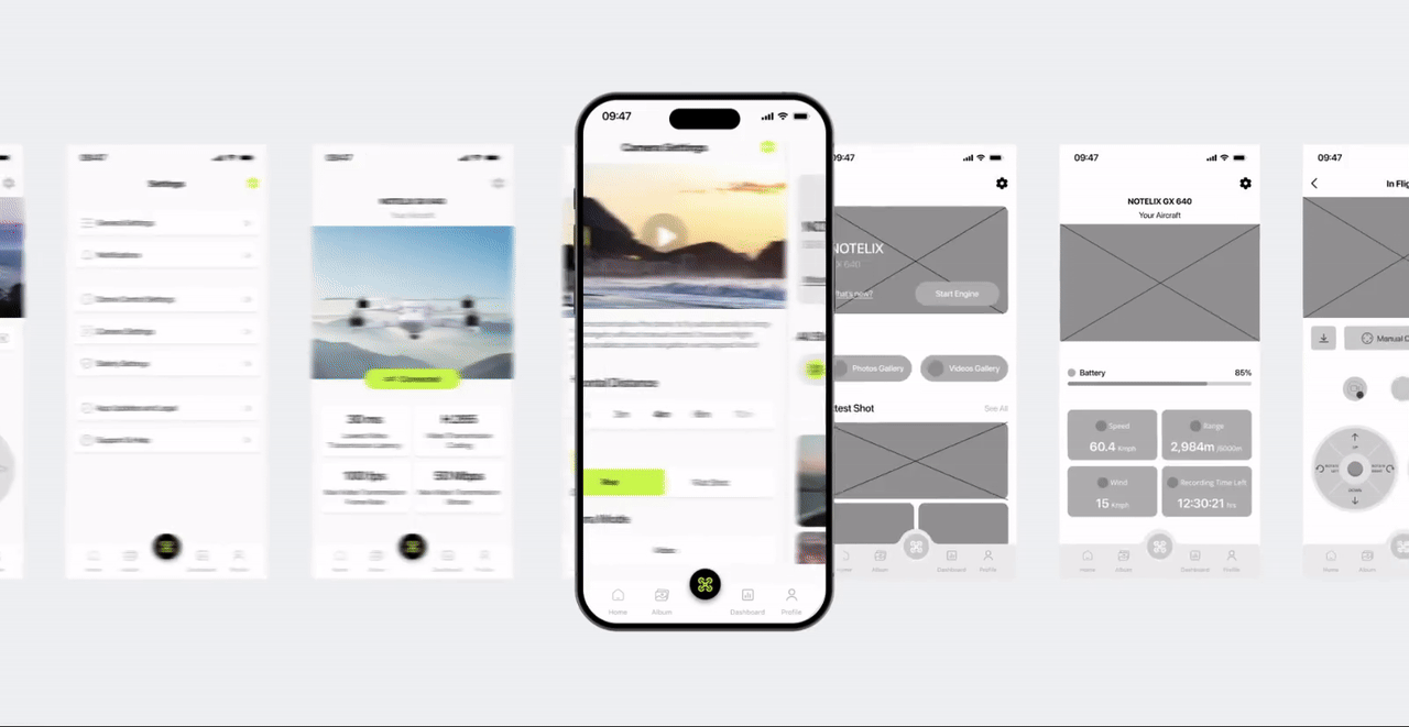
Unified Brand System Reinforces Credibility
From iconography to typography and button styling, the entire app adheres to a consistent design language. This coherence builds user trust and makes the app feel like a native extension of the Notelix ecosystem.
A report by Lucidpress indicates that consistent brand presentation across platforms can increase revenues by up to 23%, underscoring the value of seamless brand alignment in digital experiences.
Proyect.io’s approach ensures that every interaction reinforces brand identity and product quality.
Learn how design constraints can foster innovation and maintain brand consistency in high-performance application development.
What Brands & Designers Can Learn from Notelix
Here are three concise takeaways from the Notelix app design:
1. Design Minimalism for High-Focus Performance
Stripping away visual noise helps users operate confidently in precision-driven tasks. Minimal interfaces are especially effective when attention and timing matter.
2. Use Micro-Interactions to Reinforce Control
Subtle animations and feedback loops add clarity without distraction. When motion responds directly to user intent, it increases trust and engagement.
3. Build Credibility Through System Consistency
Unified typography, lighting, and component behavior make the app feel reliable and professional. Consistent systems strengthen brand recognition while improving long-term usability.