- Agency: Suffescom Solutions Inc.
- Client: Trap House
- Category: App Design — Streaming
- Location: New York City, New York, United States
- Project Brief: Design a live streaming app that enables creators to broadcast, engage with audiences through real-time interactions, and monetize content using virtual gifts, AI-powered recommendations, and integrated payment tools.
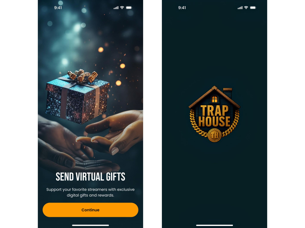
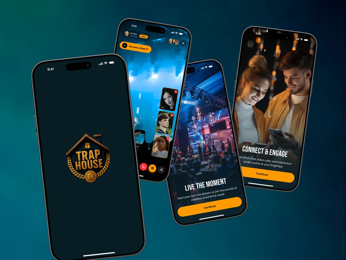
Most streaming apps drop you into a wall of live thumbnails and hope one catches. Trap House opens on a single logo, then three cards that explain the platform before it asks for anything.
Those three cards do one job: they teach the money loop. Streamer, viewer, gift. A newcomer learns that a gift is income for the person on screen before they ever enter a room. This matters because a streaming economy dies the moment users think tips are just decoration, and most apps never bother to explain otherwise.
The home feed sorts by crowd, not by catalog. Category chips sit above a grid where every stream wears a live tag and a viewer count. That number is doing quiet work. Nobody wants to be the only person in a stranger's room, so the count tells a user where it is safe to walk in before they commit a single tap.
Events add a second way to spend that gifting alone cannot cover. Each listing shows the date, the time, and the ticket price in coins upfront, and the detail screen ends on one button: "Secure your spot." The user sees the full cost before the paywall, so nothing ambushes them at checkout.
PK battles are where spending stops feeling like spending. Two streamers split the screen, a tug-of-war meter tracks gifts in real time, and the support buttons turn a donation into a vote for a side. The value is not the mechanic. It is the reframe. People who would never tip a stranger will happily pay to win, and the Create PK Battle flow lets a host trigger that in three taps: pick a duration, pick an opponent, challenge.
The wallet treats money as the product, not the plumbing. A bright balance card leads with the total, sets "Add Balance" against "Payout," and splits history into credited and debited with a date filter. The profile carries the same logic, giving wallet and earnings their own rows beside follower and gift counts. A user's balance reads as identity here, not an afterthought buried in settings.
The design holds that logic everywhere. Every screen shortens the distance between watching and paying. The onboarding, the viewer counts, the ticketed events, the battle mechanics, and the front-and-center wallet all point at one idea: an app where spending is how you take part, not what interrupts it.