- Designer: Seth Lukin
- Client: Twinby
- Category: App Design — Android and IOS
- Location: New York City, New York, United States
- Project Brief: Design a scalable dating app experience that reduces user anxiety during onboarding, encourages profile completion without pressure, and supports long-term product evolution through a reusable, developer-friendly UI system.
In a mobile landscape often defined by shallow interactions, the Twinby app anchors its identity in emotional intelligence and systemic fluidity.
This Android and IOS app design succeeds by balancing a non-judgmental UI with a rigorous underlying design system, creating a professional digital environment that feels personal, scalable, and deeply trustworthy.
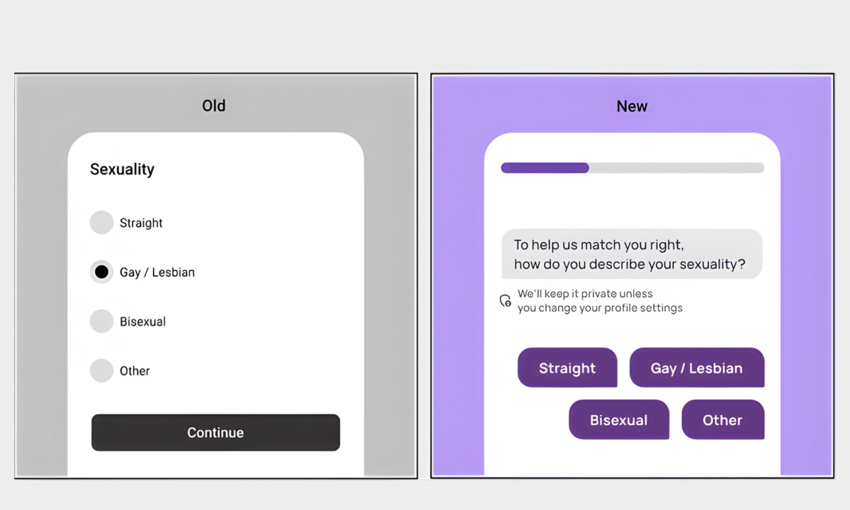
- Onboarding & Friction Reduction: The experience uses lightweight, conversational steps that acknowledge user hesitation through reassurance prompts and progress indicators. I find this approach especially effective at addressing common privacy concerns without sacrificing the quality of the data collected.
- Interaction & Micro-Guidance: Subtle animations and contextual nudges guide users through profile completion. Rather than blocking progress with rigid requirements, the interface gently encourages better behavior, which I believe turns platform compliance into a collaborative effort.
- Visual System & UI Consistency: Soft gradients and rounded components create a non-judgmental atmosphere that contrasts with the typical vulnerability of dating apps. I think the modular UI kit ensures that spacing and typography remain cohesive, establishing a reliable sense of trust from the first screen.
- Design System & Scalability: A documented UI kit organizes components and interaction rules to ensure a smooth transition from design to development. I appreciate how this system-first approach reduces iteration loops while maintaining visual integrity as the product scales.
What Brands & Designers Can Learn from Twinby
1. Reduce Friction by Acknowledging User Emotion
Conversational onboarding and reassurance prompts address hesitation instead of ignoring it. Designing for emotional comfort builds trust without compromising data quality.
2. Guide Behavior Through Collaboration, Not Enforcement
Subtle animations and contextual nudges encourage better participation without blocking progress. When guidance feels supportive, users are more willing to engage fully.
3. Use Visual Softness to Establish Psychological Safety
Rounded components, soft gradients, and consistent spacing create a non-judgmental environment. A calm, cohesive UI can significantly lower anxiety in high-vulnerability experiences like dating.