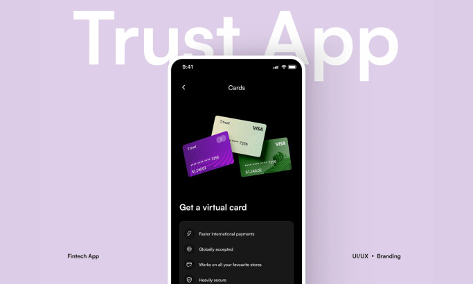
Standout Features:
- Modern 2D illustrations
- Fluid navigation and accessibility
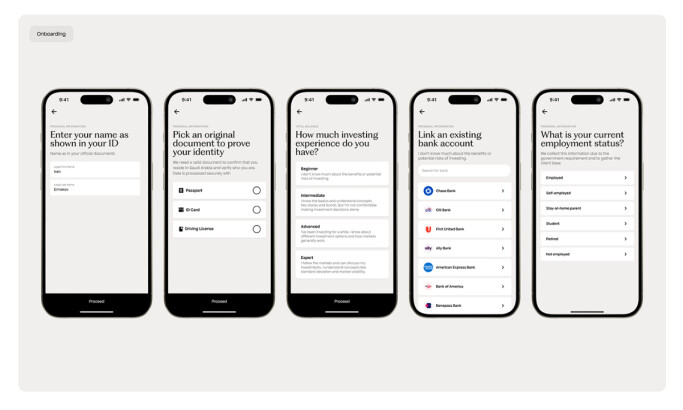
- Streamlined onboarding and user flows
Piyush Rai’s redesign of the Venmo app successfully revitalizes its user interface, making it more feature-rich while maintaining a minimalist layout.
The design utilized the app’s original color scheme to preserve brand recognition. However, new 2D illustrations and vibrant contrasts are integrated to attract user attention.
The new UI improves the app’s navigation by replacing the cluttered hamburger menu with a bottom navigation bar. This change places essential features like recent activity and quick transaction options directly within users' reach.
Simplified onboarding screens and refined user flows further streamline the experience. This way, new and returning users can effortlessly navigate the app!
Get a chance to become the next Design Award winner.
SUBMIT YOUR DESIGN