- Article by
- Jermaine Dela Cruz

#000000 #FFFFFF #FDB65A #EBEBE9
- Agency: Nixtio
- Client: World Time
- Category: App Design — Productivity
- Location: Miami, Florida, United States
- Project Brief: Design a world clock app that helps users track multiple time zones through a clear and intuitive experience.
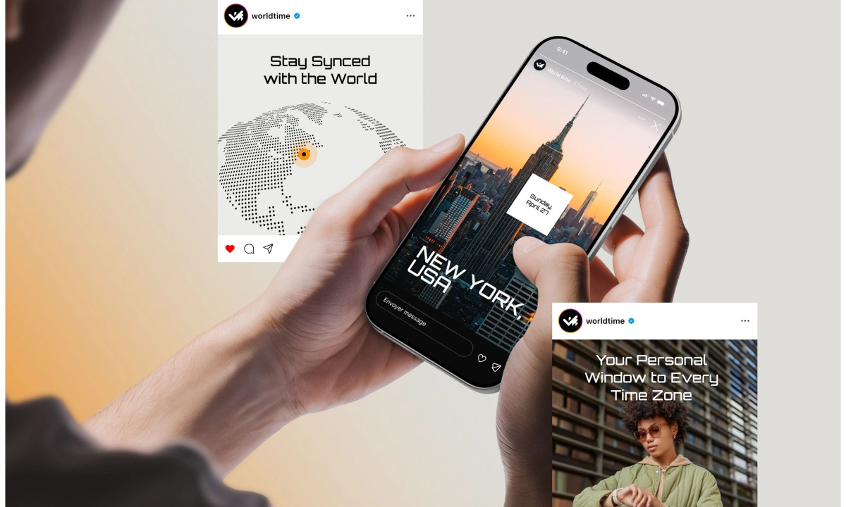
Most productivity apps treat the clock as a utility nobody looks at twice, and World Time bets the opposite. The Nixtio concept turns a basic world clock into a product with real presence, built on oversized numerals, strict grid logic, and location-based imagery.
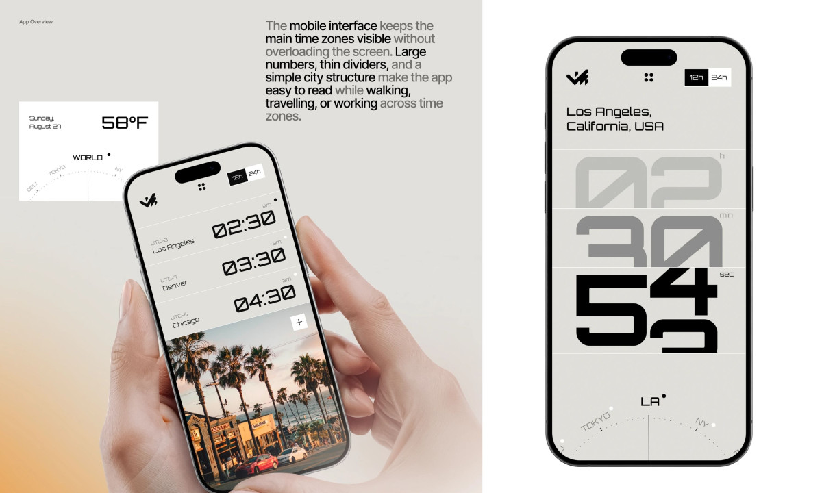
Type carries the whole interface. On the detail view, the hours, minutes, and seconds for a city stack at giant scale in a custom techno face, fading from gray to black so the live second reads first. It is an unusual choice for a time app, and it gives the screen a confident, almost editorial weight.
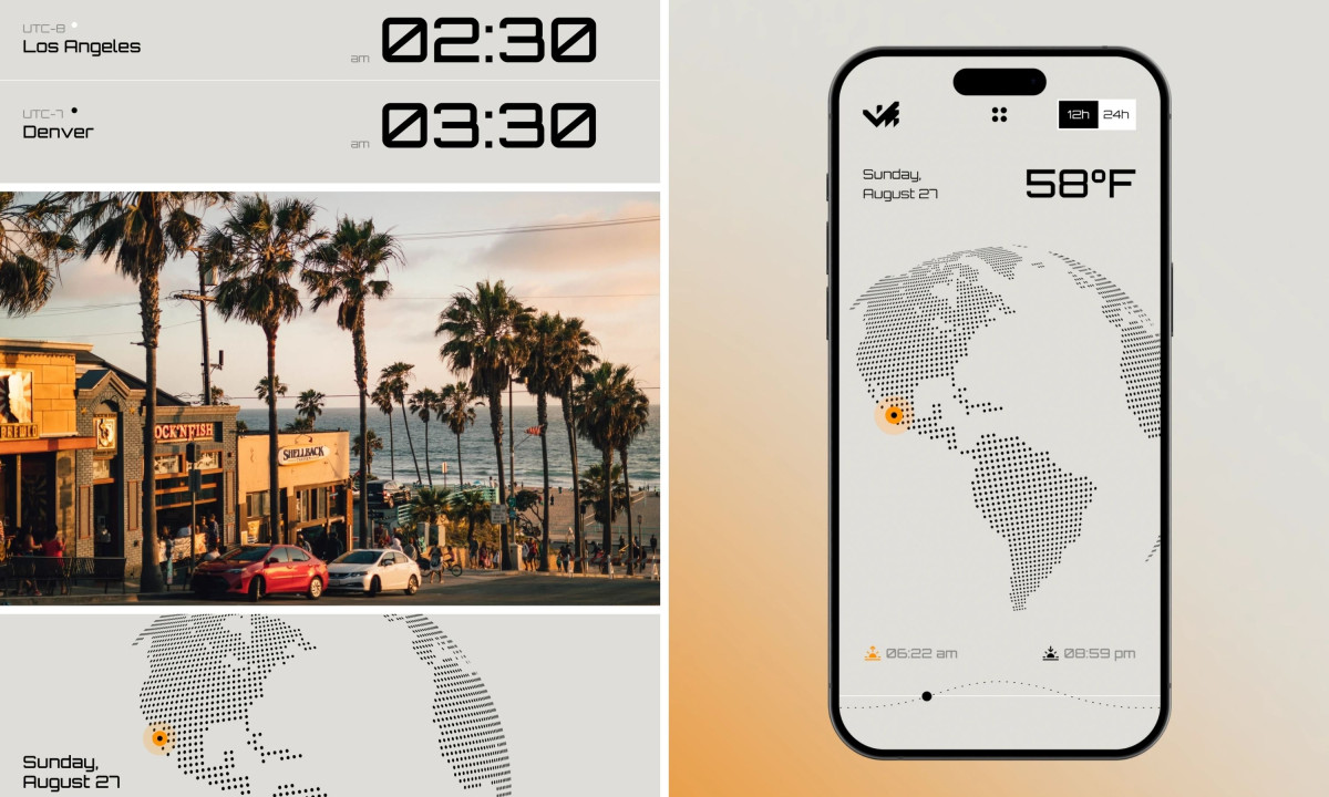
The structure stays calm underneath that boldness. The main list keeps Los Angeles, Denver, and Chicago visible with thin dividers and small UTC labels, so several zones sit on screen without crowding, which matters when you are checking it on the move.
Supporting details round out the premium feel without clutter. A dotted globe, a sunrise and sunset readout, and a 12h/24h toggle give the app range while holding one clean visual language across mobile and brand materials. For a category full of forgettable tools, the standout move is simply making time look worth looking at.

World Time
Airofit
AI OS
Veri Health
MyRide