Data is everywhere, but without the right presentation, it’s just noise. By-the-numbers infographics cut through the clutter, transforming raw stats into clear, compelling visuals that inform and persuade.
Unlike storytelling-driven infographics, these are pure information powerhouses — built for precision, not fluff. Industries like finance, healthcare, and market research rely on them to distill complex data into digestible insights. Bold typography, sharp charts, and a focus on hierarchy ensure clarity without distraction.
More than corporate reports, they dominate social media, sports analytics, and pop culture trends, proving that numbers don’t just inform — they engage. Let's explore eight by-the-number infographic formats and their stunning examples.
1. Print or Editorial Reports
Most corporate reports test attention spans — endless tables, dense text, and generic templates that bury key insights. But turning them into visual stories like infographics? Now that's a different story.
Blending bold typography with magazine-style storytelling, by-the-numbers infographics transform financials into compelling narratives. Revenue trends, earnings breakdowns, and market performance are presented with clarity and impact — designed for decision-makers, not data hunters.
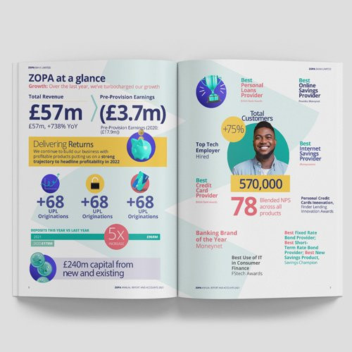
Example: ZOPA’s Report by Navig8 UK
Zopa’s annual report, crafted by Navig8 UK, is everything traditional reports aren’t — engaging, scannable, and impossible to ignore. Key figures like £57M revenue, 570K customers, and a 78 NPS score are the first things you see. No walls of text, no buried insights — just data that speaks for itself.
Color plays a strategic role: yellow highlights performance, blue signals growth, and red emphasizes customer satisfaction. This visual hierarchy ensures that the most critical takeaways stand out at a glance.
Best For: Corporate reports, industry insights, employer branding, and content marketing that needs to inform while making an impression.
2. Brutalist Style
Born from mid-20th-century architecture, Brutalism rejects ornamentation in favor of stark, unfiltered functionality. In design, it’s aggressive, high-contrast, and unapologetically direct—prioritizing impact over aesthetics.
Brutalist infographics take the same approach. Forget polished layouts and delicate typography — these visuals demand attention. They use oversized, blocky fonts, high-contrast color schemes, and asymmetrical, almost chaotic layouts to strip data down to its rawest form.
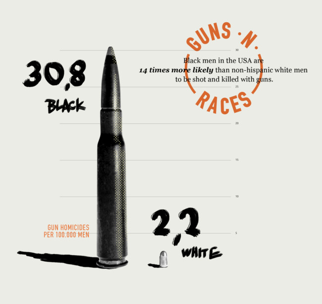
Example: Guns n Races by tillnoon
If traditional infographics are PowerPoint slides, Till Noon’s Guns n Races is a protest sign. It visualizes racial disparities in gun homicides not with neat bar graphs but with bullet sizes — a literal, visceral representation of disproportionate violence. The design choices — gritty textures, DIY-style typography, and oversized elements — turn statistics into statements.
Tillnoon’s ChitChart project (where we found Guns n Races) takes this ethos further, using Brutalist principles to present hard-hitting data on race, violence, and inequality. With jarring imagery and bold contrasts, their work makes statistics impossible to ignore.
Best For: Climate crisis warnings, human rights statistics, income inequality — issues that don’t need decoration but confrontation.
3. Animation

Numbers alone inform, but animated numbers engage. Motion guides the eye, builds momentum, and transforms raw data into a dynamic experience — whether election night results flashing on the screen, financial trends surging upward, or sports statistics coming alive in real-time.
Example: Strava’s Year in Sport by Giant Ant
Giant Ant’s work on Strava’s Year in Sport is data storytelling done right. Instead of a static summary, they craft a fully animated, shareable highlight reel, making each user’s fitness data feel cinematic and personal. Every milestone, achievement, and trend unfold seamlessly, immersing users in their own progress.
By integrating animation, Strava turns performance stats into something more than numbers — it becomes a celebration of effort and persistence. And because it’s customizable and social-friendly, it doubles as brand advocacy. Users aren’t just reading their data; they’re proudly sharing it.
Best For: Digital-first content where static visuals fall short — social media campaigns, sports analytics, election results, financial reports — anywhere engagement and storytelling matter as much as the data itself.
4. Isometric Style
Isometric is a good type of by-the-numbers infographics that take data beyond flat charts and two-dimensional layouts, adding depth, dimension, and structure. By organizing information within a three-dimensional grid, they create immersive visuals that make complex data easier to digest while maintaining clarity and hierarchy.
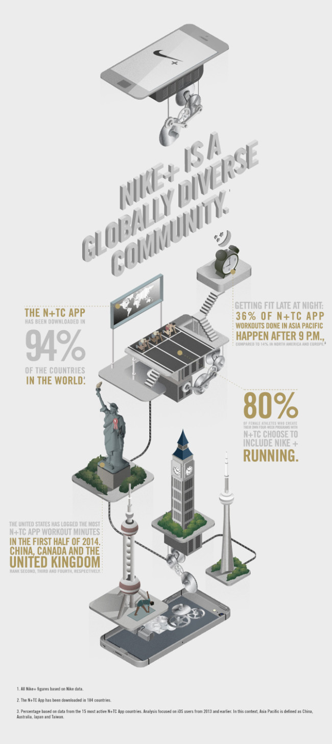
Example: Nike+ Ignites Movement by AKQA and Jing Zhang
Nike+ Ignites Movement by-the-numbers infographic developed by AKQA and illustrated by Jing Zhang turns workout data into an interactive world. Instead of static numbers, the design builds a layered ecosystem where athletes climb stairs, gears churn, and a hovering smartphone reinforces Nike+ as the movement engine. Each floor represents a key metric— workout completion rates, total miles logged — transforming raw data into a journey.
This approach doesn’t just look visually compelling; it makes information more intuitive. Numbers interact with their environment — a lightbulb signals energy expended, a conveyor belt pushes runners forward, and a spinning globe contextualizes total distances. The isometric perspective guides the viewer through the data seamlessly, making it engaging without sacrificing clarity.
Best For: Industries that thrive on structure, movement, and process visualization — engineering, logistics, architecture, gaming, and tech. Isometric infographics elevate brand storytelling, as seen in Nike+, where data isn’t just displayed — it’s brought to life.
5. Hand-Drawn Illustrations
The hand-drawn approach in by-the-numbers infographics trade digital precision for an organic, tactile feel. The imperfections — uneven strokes, freeform layouts, and ink-like typography — make them compelling. They don’t just convey data; they build trust, evoke warmth, and tell a story.
The strength of this style lies in its ability to humanize data. Numbers, especially in consumer trends and lifestyle reports, can feel distant and impersonal. In data visualization, this approach softens hard numbers, making statistics feel less like an algorithmic output and more like a conversation.
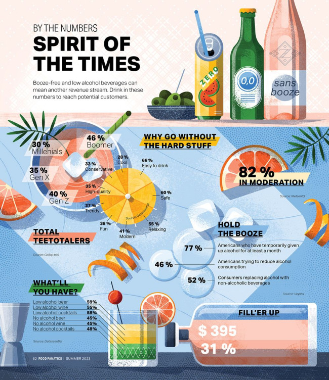
Example: Spirit of the Times by Adrian Bauer
Adrian Bauer’s Spirit of the Times exemplifies this approach by blending textured illustrations with dynamic, fluid typography. Rather than rigid bar graphs, we see citrus slices doubling as pie charts and ice cubes floating among statistics, creating an interplay of structured yet spontaneous elements.
This style softens the analytical edge of data, making insights more accessible and engaging. Inspired by craft cocktails, the muted color palette reinforces the thematic connection to low-ABV and non-alcoholic beverages. The result? A narrative-driven infographic that feels less like a stat sheet and more like a conversation.
Best For: Editorial features, sustainability reports, and indie brands looking for an authentic, handcrafted aesthetic that stands apart from mass-market design.
6. Geomapping Data
Sometimes, data needs a map to tell its full story. Geomapping is an excellent example of by-the-numbers infographics that ground statistics in reality, making trends instantly recognizable across different locations. Whether global beer prices, carbon footprints by country, or internet speeds worldwide, this style transforms raw data into spatial storytelling.
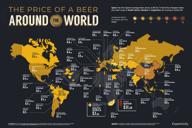
Example: The World Beer Index by NeoMam
NeoMam’s World Beer Index is a prime example of geo-data visualization done right. By mapping the average price of a 330ml beer across different countries, it turns price disparities into an easily digestible visual.
A heatmap gradient highlights extremes at a glance — Qatar’s staggering $11.26 per bottle contrasts sharply with Argentina’s $1.79. The dark background adds a premium aesthetic, while golden hues subtly reinforce the beer theme. With intuitive color coding, strategic typography, and clean data integration, this infographic proves that maps beat spreadsheets every time location matters.
Best For: Economic comparisons, travel trends, global market analysis, and any dataset that benefits from a bird’s-eye view of regional differences.
7. Non-Traditional
![[Source: The Almighty Dollar by Column Five Media]](https://designrush-media.nyc3.digitaloceanspaces.com/tinymce_images/780571/conversions/good-infographic-the-almighty-dollar-_-mapping-distribution-of-income-by-religious-belief-1-content.jpg)
Not all infographics have to follow a linear path. Non-traditional formats, such as circular, radial, or layered structures, offer a fresh way to visualize complex relationships. These layouts are particularly effective for illustrating cycles, hierarchies, and proportional comparisons, creating a more intuitive flow of information.
Example: The Almighty Dollar by Column Five Media
A stunning example of a non-traditional infographic is Column Five Media’s The Almighty Dollar. It offers a 180-degree view of complex data, emphasizing relationships without overwhelming the viewer. The semi-circular structure gives a sense of flow, allowing comparisons across multiple categories while maintaining a unified visual hierarchy.
It’s efficient, structured, and aesthetically dynamic. Non-traditional by-the-number infographics also lend themselves well to layered color coding, making categorical distinctions instantly clear.
Best For: Demographic breakdowns, economic distributions, hierarchical structures, and any dataset benefiting from proportional comparisons.
8. Minimalist and Monochromatic
Color is great — until it distracts. Monochrome infographics strip things back to essentials, using only shades of one color to guide focus. They’re sleek, modern, and highly effective for data-heavy visuals that demand precision.
It takes the conventional idea of corporate data visualization — often running the risk of appearing cluttered, overwrought, and drenched in unnecessary color — and refines it into a system of stark contrasts, structured layouts, and surgical precision. By stripping the palette down to black, white, and selective use of one color — they provide data in a manner that’s clean, direct, and least likely to misinterpret.
Example: Women Remain Behind in Tech by Pentagram
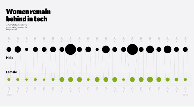
Pentagram’s work proves that in a world oversaturated with color and visual clutter, the smartest design move is often subtraction. The typography-heavy approach allows hierarchy and structure to shine. The restrained use of color is a functional highlight, guiding focus without distraction. Negative space isn’t just empty — it’s intentional, leading the viewer’s eye exactly where it needs to go.
Notable examples include Nicholas Felton’s TIME magazine visualizations and Jarrett Fuller’s 2016 Annual Report, where a single accent color — hot pink — adds vibrancy to an otherwise stark, text-driven composition. The result? A clean, direct, and authoritative design that transforms data into a seamless, engaging narrative.
Best for: Trends, industry, or marketing reports where numbers need to take center stage, but its adaptability makes it just as compelling for sports stats, creative resumes, or even UX case studies — where storytelling is as crucial as the data itself.
By-the-Numbers Infographic Ideas
Data alone doesn’t tell a story — how you present it does. The best by-the-numbers infographics transform raw figures into insights that engage, persuade, and inspire action. Whether celebrating team wins, summarizing survey results, or showcasing event highlights, these visuals make your message stick.
Here are a few powerful ways to use them:
1. Highlight team achievements
Numbers mean little without context. A well-designed infographic turns team milestones—projects completed, goals exceeded, revenue earned — into a visual story that boosts morale and momentum. Instead of a text-heavy report, imagine a sleek breakdown of key wins, making every success feel tangible.
2. Turn survey data into visual insights
Surveys without storytelling are just data dumps. A by-the-numbers infographic transforms raw numbers into meaningful patterns, revealing key takeaways at a glance. Whether it's customer feedback or industry trends, smart visual design ensures the most impactful insights stand out — driving real action instead of getting lost in spreadsheets.
3. Showcase event highlights
No one remembers a long list of stats, but a well-crafted infographic makes event data engaging. From attendance breakdowns to key moments and engagement metrics, a by-the-numbers visual recap builds credibility, excitement, and a lasting impression — perfect for reports, social media, and investor updates.
Pro Tips for Designing By-the-Numbers Infographics
Here’s how to make sure your data doesn’t just exist but actually lands.
1. Use data visualization tools (but don’t rely on them)
Platforms like Figma, Infogram, and Adobe Express make it easier to create infographics, but automation isn’t an excuse for lazy design.
Templates can help structure your content, but storytelling is what makes it work. Data is dry, and your job is to shape it into something people want to engage with.
2. Focus on accessibility (because if it’s not readable, it’s useless)
Your infographic isn’t just for people with perfect eyesight on a 27-inch monitor. Use high-contrast colors, readable fonts, and alt text for images. Avoid color-coded confusion because not everyone sees red and green the way you do. A good rule of thumb? If someone can’t skim it in five seconds, it’s too complicated.
3. Test for readability (because fancy doesn’t always mean functional)
Designing on a desktop is one thing; consuming it on a smartphone in bad lighting is another. Font sizes should be big enough to read at arm’s length. Text should never blend into the background. Spacing should guide the eye, not force it to work harder.
Before publishing, test your infographic on multiple screens and ask yourself: Does this make sense, or am I just impressed with my design?
4. Work with professionals (because bad design undermines good data)
A great infographic isn’t just about data. It’s also as much about trust, impact, and persuasion. If your visuals are cluttered, misaligned, or just plain boring, your audience won’t stick around long enough to care.
Hiring a design agency or professional designer means you get a tailor-made visual story that works. Professionals bring expertise in layout, typography, color psychology, and user experience, ensuring your data doesn’t just inform but convince.
By-the-Numbers Infographics: The Bottom Line
Data isn’t persuasive on its own — it’s just numbers on a page. But when designed with precision, intent, and a bit of creative flair, numbers stop being statistics and start becoming stories, the strategic kind.
But that said, here’s the real question: Will your data be another forgettable spreadsheet, or will it shape decisions, influence opinions, and be remembered? The choice isn’t in the numbers. It’s in how you present them.
So whether you’re using an infographic template or working with a design agency, the goal is the same: reduce complexity and amplify impact. Keep it focused, keep it visual, and most importantly, ensure the data serves the story, not vice versa.
By-the-Numbers Infographics FAQs
1. What is a by-the-numbers infographic?
A by-the-numbers infographic is a data-driven visual that distills complex statistics into an easy-to-digest format. Instead of overwhelming the audience with raw numbers, it uses charts, typography, color coding, and design elements to make insights stand out instantly.
2. What are the best use cases for by-the-numbers infographics?
By-the-numbers infographics shine in corporate reports, election data, healthcare statistics, social media summaries, and financial overviews. Anywhere you need data to tell a clear and compelling story, it’s good to make this format your default go-to.
3. How do I design a by-the-numbers infographic that works?
Start by simplifying the data, choosing a strong visual hierarchy, and avoiding clutter. Use contrast, scale, and motion (if animated) to guide attention. The goal is not to let your audience think too hard to understand your infographic.
4. Should I use a template or hire a professional designer?
By-the-number infographic templates are great for speed, but nothing beats a custom-designed infographic tailored to your data and audience.
Professional designers ensure your numbers aren’t just accurate but visually compelling, brand-aligned, and built for maximum impact. If your data matters, it deserves to be designed well.