
Leadership is a concept people love to overcomplicate. They write bloated think pieces, build entire industries around management seminars, and create PowerPoint presentations that could put a toddler hopped up on sugar into a coma.
But good leadership isn’t about jargon or endless theory. It’s about clarity, decisiveness, and knowing how to get people moving in the right direction. And the best way to communicate that? Leadership infographics. Let’s look at the top examples.
1. Follow the Leader Infographic by Top Management Degrees
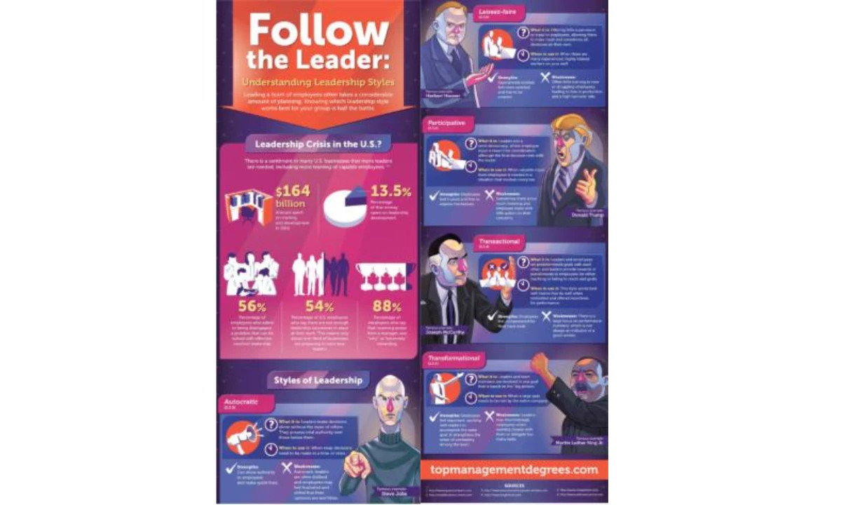
Key Features That Make It Click:
- Clean, Q&A-style breakdown
- Hard stats paired with engaging illustrations
- Real-world references
Good leadership is about clarity, and so is good design. This leadership styles infographic does both. Here, you get a clear, visual breakdown of the 5 major styles — transformational, participative, autocratic, transactional, laissez-faire — so you can figure out where you stand (or where you need to be).
Each leadership style is then broken down logically and concisely, answering four critical questions: What is it? When should you use it? What are its strengths? What are its weaknesses? The real-world leader examples make it tangible, and the color-coded sections ensure effortless navigation.
2. Command and Control vs. Servant Leadership by Ben Crothers
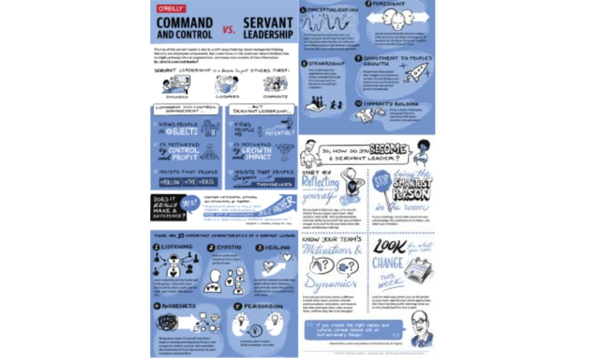
Key Features That Make It Click:
- Split-screen layout
- Simple, expressive sketches
- Reflection and actionable next steps
At its core, the command vs. servant leadership infographic example works because it follows a clear, compelling structure: contrast → explanation → action. It’s designed for impact, not just information. Instead of abstract definitions, it uses direct comparisons, structured insights, and real-world applications to show why servant leadership matters.
This infographic plays into how our brains actually process information — fast, visual, and comparative. Instead of forcing people to wade through abstract definitions, it frames leadership as a series of behaviors, making it feel more tangible and achievable.
The bold headings and simple illustrations act as cognitive shortcuts, helping us categorize leadership styles effortlessly. The palette of blue and white tones evokes trust, openness, and approachability, reinforcing the ethos of Servant Leadership.
But the real brilliance is at the bottom. Reflection prompts and action steps tap into behavioral nudges, pushing leaders to move from passive understanding to active change. By breaking leadership into small, doable steps, it sidesteps the common trap of good intentions with no follow-through.
3. Atomic Habits Visual Summary by TKSuited
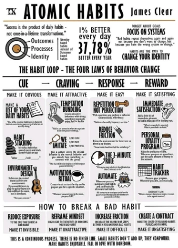
Key Features That Make It Click:
- A layout that mirrors all four stages of behavior change
- Icons for quick association
- Pairing a concept with an actionable step
Behavior change is hard; not because people lack motivation, but because they rely too much on it. This Atomic Habits infographic understands that habits are not built through willpower alone, but through systems that make change inevitable. Instead of lofty self-improvement advice, it breaks behavior down into a structured, science-backed framework: cue, craving, response, and reward.
The brilliance here is twofold. First, the 1% better everyday concept immediately reframes progress as a compounding effect, removing the pressure of instant results. Second, the design mirrors the process it teaches — clean, structured, and frictionless. The use of illustrations helps reinforce key concepts, while actionable steps (like habit stacking and the 2-minute rule) lower the barrier to starting.
4. Strong Leadership in the 21st Century by Guthrie-Jensen Consultants
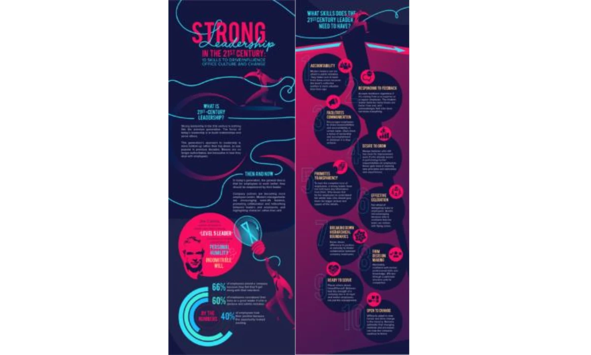
Key Features That Make It Click:
- Visual flow that mirrors leadership growth
- Data-backed leadership evolution
- The bold mix of energetic and modern color palette
Leadership is a tricky thing, not because we lack information, but because the way we absorb and apply leadership principles is often inefficient. This infographic succeeds because it shifts leadership from an abstract concept to a structured, behavior-driven model.
It doesn't stop at defining what good leadership is; it also quantifies and contextualizes it with statistics, modern workplace expectations, and a skills-based approach.
The visual flow is particularly effective. The design plays with hierarchy, movement, and contrast, ensuring that the eye naturally follows the progression from leadership philosophy to actionable skills.
Instead of presenting a rigid, corporate view of leadership, this infographic acknowledges the evolution of leadership values: humility, collaboration, and adaptability. The addition of research-backed statistics grounds the discussion in behavioral insights, making the case for why modern leadership is about building relationships, not enforcing hierarchy.
Ultimately, this infographic works because it frames leadership as a dynamic, evolving skillset, rather than a title or authority granted by seniority. It reinforces that great leaders don’t just manage people — they understand and empower them.
5. Collective Decision-Making Process by Sonaksha Iyengar
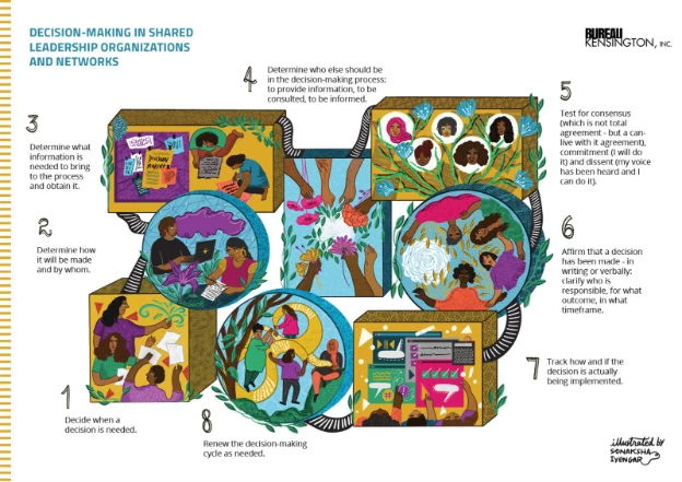
Key Features That Make It Click:
- Organic structure and flow
- Illustrative storytelling
- Warm, earthy color palette
Decision-making in most organizations is a paradox: everyone wants a voice, but nobody wants the chaos that comes with it. The typical approach? Endless meetings, vague consensus, and a process that feels more like herding cats than structured leadership.
This infographic offers an alternative: a step-by-step framework for shared decision-making that prioritizes clarity, accountability, and action.
What makes it work? It visually dismantles the myth that good decisions happen in a vacuum. Instead of a top-down directive, it maps out decision-making as a collective process where information, consultation, and responsibility are clearly distributed. It shows how leadership is collaborative and diverse, not hierarchical.
The design itself reinforces the message — decisions aren’t isolated moments; they’re interconnected steps in an ongoing cycle.
What Makes an Effective Leadership Infographic?
Want to know a secret? The best leadership infographics follow a predictable formula: clarity, engagement, structure, and action.
Here’s how to make it work:
1. Make Leadership Digestible
Good design removes friction, ensuring that leadership principles are instantly understandable.
- Stick to concise wording. Leadership concepts often get buried in jargon — strip it down to what actually matters.
- Use hierarchy wisely. The most critical points should stand out through bold headings, large fonts, or contrasting colors.
- Avoid cognitive overload. A cluttered infographic is just a bad PowerPoint slide in disguise. Each element should serve a purpose.
2. Design for Readability and Impact
Color, icons, and typography aren’t just aesthetic choices — they’re cognitive tools that guide attention, reinforce key messages, and enhance recall.
- Use color psychology strategically. For example, blue conveys trust, red signals urgency, and green implies growth. Choose wisely based on the message.
- Icons create instant recognition. A simple visual cue (e.g., a handshake for collaboration, a lightbulb for ideas) speeds up comprehension.
- Typography should aid, not distract. Stick to two or three font styles max, ensuring readability across all devices.
3. Organize Data for Quick Understanding
Humans process information in patterns; a well-structured infographic mirrors that natural flow. People should be able to scan it quickly and grasp key points in seconds.
- Follow a logical sequence. Start with the big picture (e.g., why leadership matters), then break it down into digestible steps.
- Use visual hierarchy to establish flow. Numbered steps, arrows, or progressions help guide the eye.
- Think mobile-first. Most infographics are consumed on smaller screens—ensure elements are spaced for easy reading.
4. Nudge Behavior, Not Just Thought
A great leadership infographic doesn’t just make people nod in agreement; it nudges them toward action. Without a clear next step, the infographic loses its potency and effectiveness. How to make it actionable:
- End with a call-to-action. Whether it’s “Apply this leadership style in your next team meeting” or “Evaluate your strengths using this checklist,” make next steps explicit.
- Use real-world examples. Abstract principles don’t stick — show leadership in action through relatable scenarios.
- Make information skimmable but meaningful. People should be able to scan and immediately pull insights they can use.
If you want to break down complex leadership principles in a way that actually sticks, great graphic design shouldn’t be an afterthought; it should be the whole game.
How to Create Your Own Leadership Infographic
If you want an infographic that teaches, influences, and sticks in people’s minds, follow this step-by-step framework to make sure your design works the way human brains process information.
Step 1: Choose the Right Leadership Design Template
Starting from scratch can be overrated. The best infographic designers don’t create everything from the ground up; they start with a solid foundation and build from there. Pre-made templates do the heavy lifting by giving you a structured layout, ensuring that your leadership infographic is organized, readable, and visually compelling.
When choosing templates, ask yourself:
- Is this infographic explaining a process (e.g., decision-making framework) or comparing ideas (e.g., leadership styles)?
- Will it be read top-to-bottom, side-by-side, or in sections? (Spoiler: Humans read top-down naturally, but comparison infographics work best in split-screen layouts.)
- Does it allow room for visuals? Because no one wants to read a leadership textbook disguised as an infographic.
A well-chosen template doesn’t just make your job easier — it ensures your message lands. Slap your ideas onto a messy, unreadable layout, and folks will abandon it faster than a sinking steamboat. But pick the right structure — one that’s clear, sharp, and easy on the eyes — and suddenly, your leadership wisdom isn't just words on a page; it’s a story people want to follow.
Step 2: Use Data-Backed Insights (Opinions Don’t Make a Leader — Facts Do)
For a great leadership infographic to be substantial and effective, it needs to be rooted in reality. Use hard data, research, and statistics to support key points.
- Cite real-world studies (e.g., “66% of employees say they stay at a job because of a great leader”).
- Use numbers to simplify complex concepts (e.g., breaking leadership styles into percentage-based effectiveness).
- Visualize data properly: pie charts for proportions, bar graphs for comparisons, and bold callouts for statistics that matter.
Step 3: Maintain a Logical Flow
No one enjoys reading an infographic that jumps from “What is leadership?” to “How to design an infographic” with zero transition. Structure matters.
- Start with a hook: Why does leadership matter?
- Move into definitions and breakdowns: Explain leadership types, styles, or techniques.
- End with takeaways: How can the reader apply this information immediately?
- Think of it like leading a team: If you don’t give clear directions, don’t expect anyone to follow.
Step 4: Get Creative with Layout and Storytelling
The best leadership infographics present facts and tell a compelling story. Here’s how:
- For Leadership Development Programs: Use progression-based layouts (e.g., a roadmap or pyramid) to show how leaders evolve.
- For Executive Coaching: Try a cause-and-effect design to highlight how different leadership styles impact teams.
- For Personal Branding: Think minimalist, bold visuals that make key leadership traits stand out.
Want to showcase the evolution of leadership? Try a timeline layout. Need to compare different management approaches? A clean side-by-side grid. Trying to make dry data not feel like a punishment? Go for an illustrated roadmap.
And if leadership is about guiding people toward clarity, then the design itself should lead the reader from one insight to the next with zero confusion.
Design Principles for an Engaging Infographic
Even the best data falls flat if it’s wrapped in bad design. Engaging infographics use:
- Icons to reinforce concepts (e.g., a handshake for collaboration, a lightbulb for innovation).
- Color psychology to evoke emotions (e.g., blue for trust, red for urgency, green for growth).
- Consistent typography for readability (because 10 different fonts = a migraine).
- White space to prevent visual clutter — if everything stands out, nothing stands out.
Step 5: Use the Right Tools
The best ideas in the world are useless if they’re poorly executed. You need the right tools to turn your leadership insights into a compelling visual format.
- Canva: Great for beginners, offering ready-made templates and drag-and-drop simplicity.
- Piktochart: Ideal for data-heavy leadership infographics with professional styling.
- Adobe Illustrator: The gold standard for high-end, fully customized infographics.
Pro tip: Start simple. If you’re not a designer, Canva or Piktochart will get you 90% of the way there. If you want pixel-perfect control, Illustrator is the way to go.
Leadership Infographics: The Bottom Line
The reality of modern communication is that people are drowning in information, skimming instead of reading, tuning out instead of engaging. And that’s precisely why infographics aren’t just useful; they’re necessary.
Leadership infographics do something that textbooks, PowerPoints, and even well-intentioned speeches fail to do: they simplify complex ideas, transform abstract theories into visual roadmaps, and make learning feel less like a chore and more like an instant unlock.
So, here’s your next move: Explore leadership infographic examples. Steal (okay, borrow) the best ideas. Adapt them. Use templates to create your own.
Whether you’re training new managers, refining your own leadership approach, or trying to make sense of different styles, a well-designed infographic doesn’t just inform — it changes how people think and act. And if an infographic helps you do that, why wouldn’t you use it?
Leadership Infographics FAQs:
1. What is a leadership infographic?
A leadership infographic is a visual cheat sheet for leadership concepts. Instead of wading through a 30-page report on management theory, you get everything you need to know in a clean, digestible format. Leadership styles, decision-making frameworks, key traits of effective leaders—it’s all there, no fluff, no filler.
2. How can I use leadership infographics in my business?
Infographics make leadership concepts impossible to ignore. They are perfect for employee training, executive coaching, or making your LinkedIn post scroll-stopping. They simplify the complicated and keep people engaged.
3. Where can I find a leadership infographic template?
You could hire an agency or a designer, or you could grab a ready-made template and tweak it to fit your needs. Platforms like Canva, and Piktochart have plenty of options that let you skip the design headaches and focus on what actually matters — the content.
4. What are the key elements of a successful leadership infographic?
Clarity. Structure. A design that doesn’t look like a PowerPoint from 1998. The best infographics use sharp visuals, strong typography, and a logical flow to make even the most complex leadership principles easy to grasp. If it doesn’t communicate something clearly, quickly, and compellingly, it’s just decoration. And leadership deserves better than decoration.