Timeline Infographics: Key Points
- Infographics Drive Real Business Results: Timeline infographics improve comprehension, engagement, and memory recall, enabling brands to communicate complex information with clarity.
- A $1.2B+ Market with Strong Growth Potential: The global market for infographic tools hit $1.2B in 2023, with 88% of marketers planning to increase or maintain investment. Timeline infographics are increasingly seen as high-value communication assets across content, sales, and investor relations.
- Productization Opens New Revenue Streams for Agencies: Agencies like Lemonly and Superside monetize timelines not just as visuals, but as strategic deliverables. Packaging formats for startups, SaaS, and enterprise (e.g., growth maps, compliance timelines) creates repeatable, pitch-friendly service offerings.
- Multi-Channel Flexibility Boosts Asset Lifespan: A single timeline can fuel multiple client touchpoints: UX onboarding, investor decks, landing pages, social carousels, or explainer videos. This modularity enhances ROI and positions agencies to upsell motion design, content strategy, or storytelling services.
Quick listen: How timeline infographics evolved into strategic tools for clarity, growth, and high-margin agency services.
Forget static timelines and filler graphics. The best timeline infographics today are built to do more than just markmomentS. They clarify strategy, compress complexity, and drive outcomes across content, communications, and brand storytelling.
From investor pitch decks to educational campaigns, these infographics are showing up in UX flows, landing pages, keynote slides, and editorial media, not just reports or retrospectives.
The key is visual sequencing with purpose. Smart brands and agencies are using timeline design to:
- Streamline narratives for internal and external stakeholders
- Demonstrate traction, transformation, or thought leadership
- Build content that’s reusable across web, print, and motion
- Turn strategic moments into high-retention visual assets
- Productize timeline creation as a repeatable agency service
What Is a Timeline Infographic?
A timeline infographic is a visual format that maps events or milestones in chronological order. Unlike traditional charts or static timelines, it blends narrative structure with graphic storytelling, making it easier to scan, remember, and emotionally connect with the information.
What sets timeline infographics apart is their dual function: they convey time-based sequences while also reinforcing brand identity, emotional tone, or subject focus through visual design.
7 Types of Timeline Infographics (with Examples)
Let’s break down the most effective timeline infographics into 7 primary categories, illustrated by 18 real-world examples. Each section unpacks how structure, visual format, and business application come together, so design and marketing teams can build timeline content that informs, engages, and converts.
1. Brand and Product Evolution Timelines
Brand history timelines are a staple for companies aiming to reinforce credibility, showcase innovation, or celebrate heritage.
Aston Martin – Legacy Timeline
A cinematic timeline tracking Aston Martin’s vehicle evolution, brand identity, and performance milestones from 1914 to 2014. Alongside the model timeline is a logo evolution strip and a sales chart, reinforcing how brand and performance intersect.
Strengths: Set against a dark, premium backdrop with metallic accents and dramatic lighting, the design oozes luxury and performance.
High-quality renders of each vehicle model convey product detail while maintaining visual harmony. Including a logo evolution and sales trendline rounds out the narrative with brand and business data.
Business/Strategic Impact: This timeline reinforces the premium legacy of Aston Martin as both a cultural icon and a high-performance automaker.
It appeals to collectors, enthusiasts, and investors alike, tying emotional value (e.g., James Bond quote) to product history and market data.
Best Uses:
- Heritage storytelling for luxury brands
- Brand presentations and pitch decks
- Interactive microsites for milestone campaigns or exhibitions
Mashable – The Apple Tree
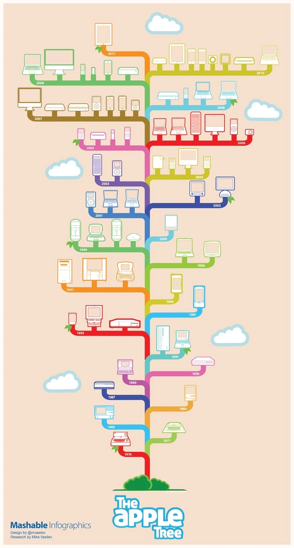
This infographic traces the evolution of Apple products in the form of a literal tree, mapping releases from 1976 to 2011. Each product category is represented by a unique branch color, and devices are arranged chronologically from root to canopy.
Design: This is a clever design because it successfully fuses concept and content: the Apple product timeline visualized as a literal apple tree.
The metaphor reinforces brand recognition while making chronological data more engaging and accessible.
Color-coded branches, minimalist illustrations, and vertical growth mimic Apple’s product evolution, making complexity digestible.
Cloud icons and rounded corners keep the tone light and modern.
Business/Strategic Impact: For Mashable, this serves as evergreen content with long-term shareability.
It capitalizes on brand nostalgia and Apple fandom, driving high engagement, backlinks, and SEO performance. It also demonstrates Mashable’s strength in data-driven storytelling.
Best Use:
- Brand evolution visuals for tech companies
- Long-scroll infographic content on digital media sites
- Social media microcontent for legacy product reveals
“Smoke-Free Journey” (PMI)
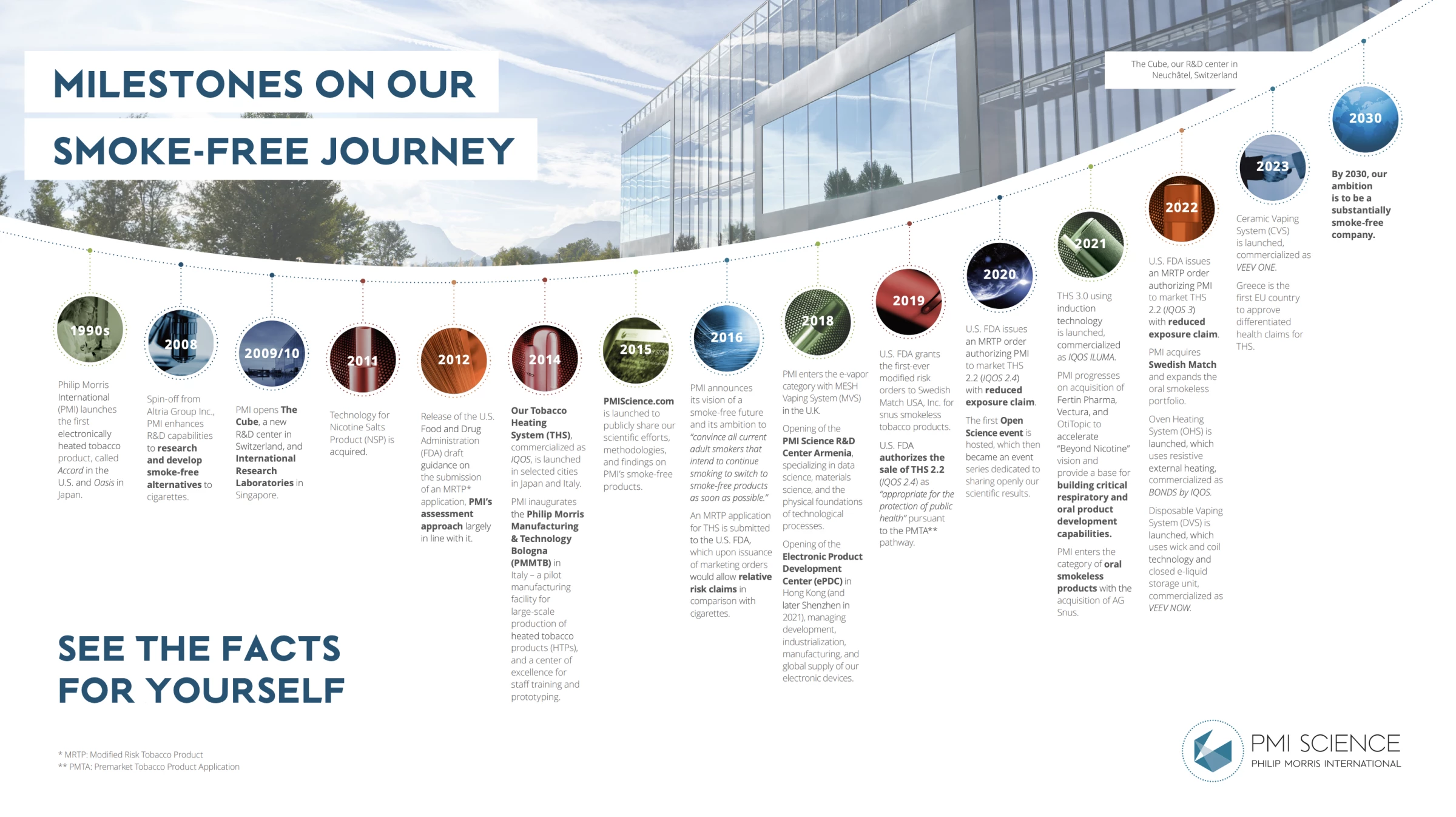
This arc-shaped infographic charts PMI’s transformation from a traditional tobacco company into a smoke-free science-led enterprise, covering milestones from the 1990s through its 2030 ambition.
The timeline visually sequences product launches, regulatory breakthroughs, R&D center openings, and strategic acquisitions to show multi-decade innovation at work.
Design: The curved layout suggests forward motion and long-term vision. Each year is anchored with a capsule-shaped marker using distinct colors to denote pivotal phases (science, product, policy).
The clean typography, environmental backdrop, and consistent visual rhythm keep the dense content accessible without overwhelming the viewer.
Business/Strategic Impact: More than a corporate history, this timeline acts as proof of transformation.
It frames PMI’s smoke-free shift as deliberate, science-backed, and globally coordinated, positioning the brand as future-ready.
It communicates credibility to regulators, investors, and the public by visually aligning science, strategy, and scale.
Best Use:
- Transformation narratives for enterprise brands
- Regulatory engagement and investor relations
- Annual reports, ESG storytelling, and corporate microsites
2. Corporate and Organizational Growth Timelines
Growth timelines are more than just company milestones, they can act as proof of vision, resilience, and scale.
Practicus – “Our Story” Infographic
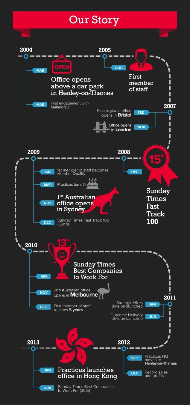
Source: Practicus via Pinterest
This timeline by Practicus chronicles the consultancy’s evolution, highlighting key milestones, service launches, and client engagement highlights.
It’s narrative-forward, positioning the firm as both agile and enduring.
Design: A vertical timeline layout reinforces progression while incorporating corporate icons and color-coding to distinguish service areas.
Thoughtful typography and whitespace keep the viewer oriented.
Business/Strategic Impact: For a consultancy, this doubles as both a recruitment and client acquisition asset. It reinforces institutional knowledge and growth trajectory, two key decision points for enterprise clients seeking long-term partners.
Best Use:
- About Us sections or pitch decks
- Employer branding in recruitment collateral
- Corporate anniversary or annual impact reports
CRANN – Road Map Report Timeline
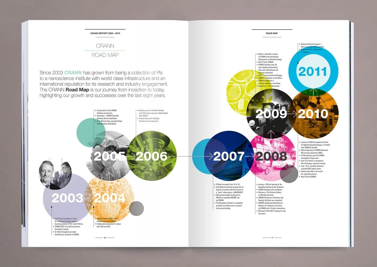
Source: CRANN Annual Report (2011, Archived)
CRANN’s “Road Map” is a two-page print spread showcasing the evolution of its nanoscience institute from 2003 to 2011. Each year is represented with color-coded, overlapping circular motifs, showing progress via visual segmentation and academic milestones.
Design: The use of bold color circles and an asymmetric layout creates an energetic, forward-looking visual rhythm.
The blend of photography, micrograph-like textures, and clean typography balances credibility with visual dynamism, ideal for scientific and academic institutions.
Business/Strategic Impact: For a research-focused organization, this timeline makes complex growth more accessible.
It highlights institutional progress, industry partnerships, and research breakthroughs, key for grant funders, academic collaborators, and policy stakeholders.
Best Use:
- Annual reports for research institutions
- Grant applications and policy-facing presentations
- Science communication tools for industry partnerships
Virgin Timeline – by Esti le Roux
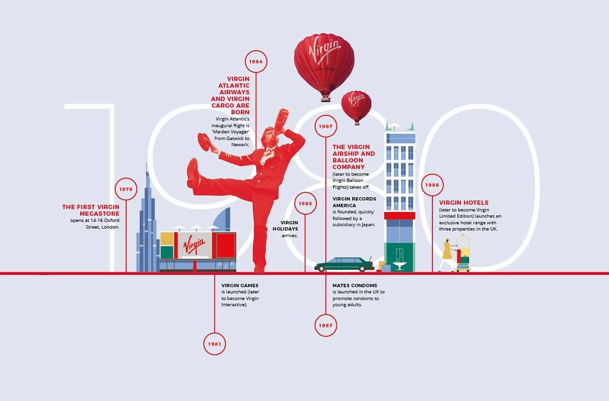
Source: Esti le Roux for The Jupiter Room (2011)
This infographic captures the entrepreneurial journey of the Virgin brand through the 1980s, mapping out new business ventures from megastores to airlines and balloon companies.
It uses a vertical layout fused with illustrations to tell a dynamic corporate expansion story.
Design: Bold red accents unify the brand identity, while isometric illustrations of buildings, balloons, and people inject playfulness.
The combination of linear and narrative storytelling allows each milestone to feel part of a larger, energetic vision. It feels distinctly “Virgin.”
Business/Strategic Impact: This timeline is a compelling branding tool.
It visually underscores Virgin’s adventurous, risk-taking DNA, resonating with both consumers and partners. It reinforces the company’s legacy of diversification, encouraging trust in its capacity to innovate across industries.
Best Use:
- Brand storytelling for heritage brands
- Culture-building content for internal use or recruiting
- PR assets during anniversaries or leadership keynotes
Nokia Rollout Timeline
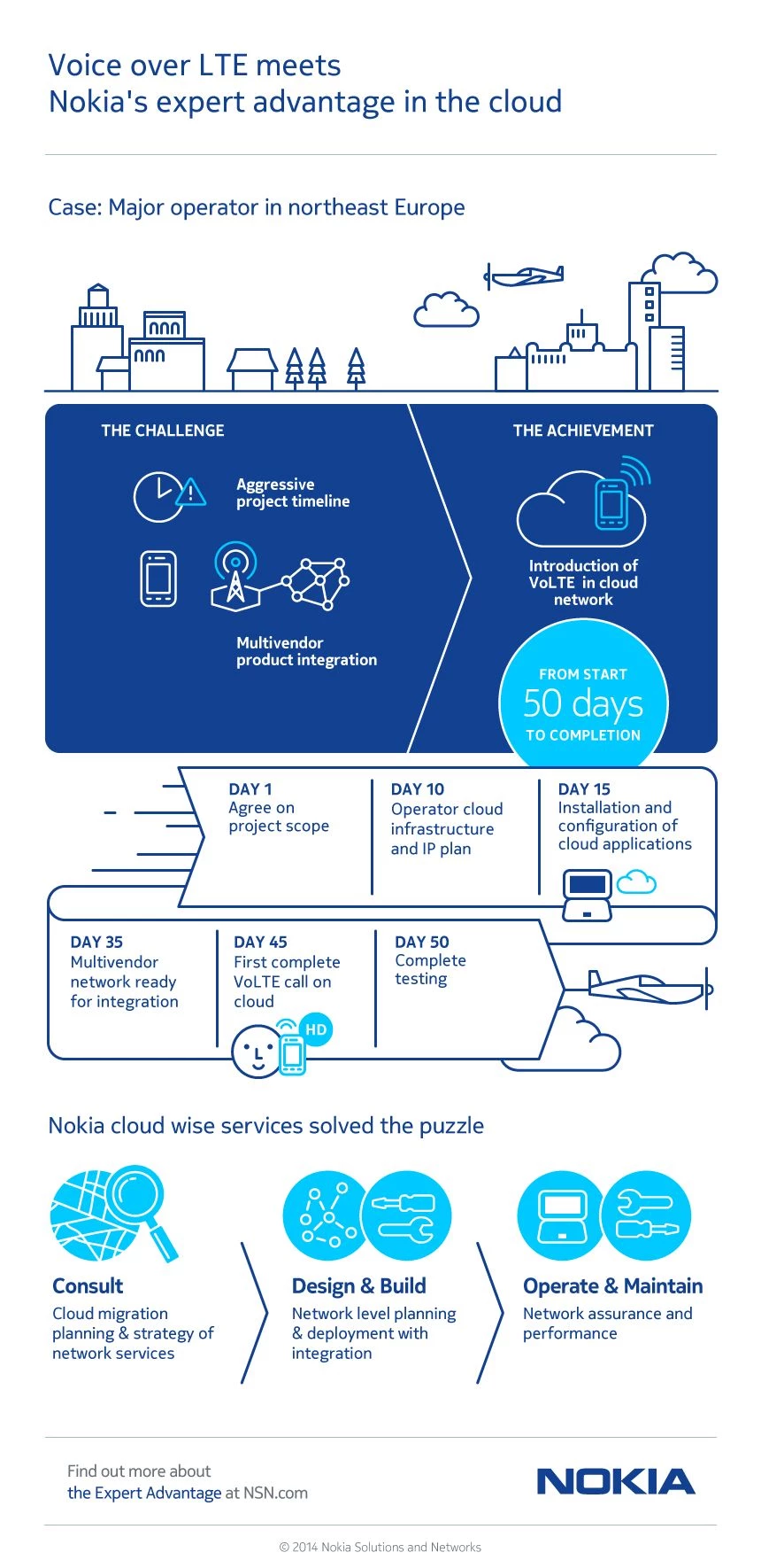
Source: NOKIA (2014, Archived)
This infographic visualizes Nokia’s rollout across global markets, pairing corporate growth milestones with product releases and market entries.
Though less stylized than others, it emphasizes business expansion and innovation milestones clearly.
Design: A utilitarian horizontal layout mirrors Gantt charts and project timelines, reinforcing Nokia’s technical credibility.
Iconography and product visuals are sparse but effective, allowing the focus to stay on dates and rollout logic.
Business/Strategic Impact: This is a clear fit for investor communications or legacy branding.
It highlights operational scale and speed to market, reassuring stakeholders of past dominance and execution capabilities.
Best Use:
- Investor decks or milestone retrospectives
- Corporate anniversary collateral
- Technology showcase events or legacy brand exhibits
3. Entertainment and Cultural Timeline Visuals
Pop culture thrives on storytelling, and timelines that tap into nostalgia or fandom become instant content magnets.
Dorkly’s Marvel Cinematic Universe
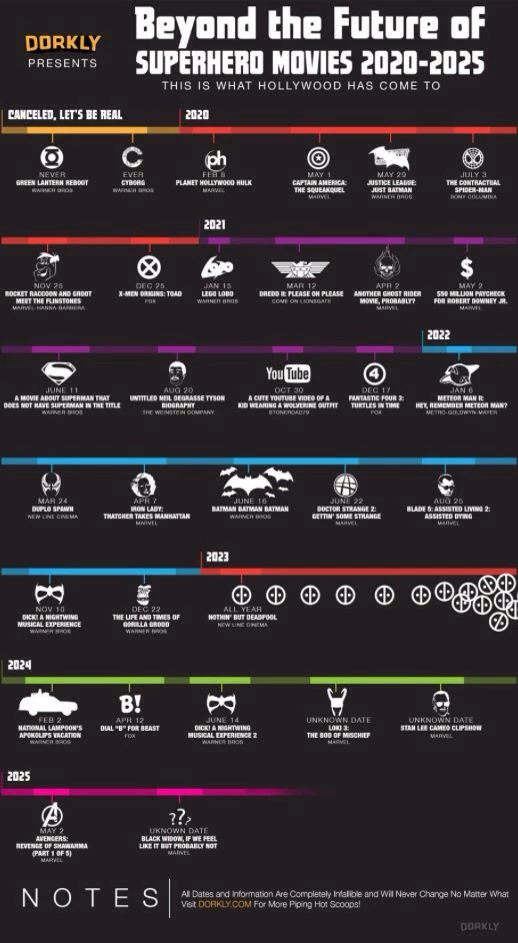
Source: Dorkly (2014)
This vertical infographic from Dorkly presents a cheeky, pop-culture-fueled breakdown of the Marvel Cinematic Universe timeline, cleverly untangling the complex chronological order of Marvel films.
It leans into humor and visual wit to illustrate the difference between release date and in-universe story sequence, guiding readers through parallel timelines and character arcs.
Design: The piece uses color-coded timelines, stacked visual paths, and minimal illustrations to highlight divergence across major MCU characters.
Simple icons, silhouette-style characters, and captioned pathways help the reader navigate the chaos with clarity. The vertical layout makes room for dense data without feeling overwhelming.
Business/Strategic Impact: For Dorkly, this infographic demonstrates mastery of pop culture analysis and fan-centric content.
It drives engagement from Marvel superfans while serving as evergreen content that spikes during every major MCU release.
The comedic voice helps differentiate the brand while fueling organic social sharing and backlinks.
Best Use:
- Entertainment timelines for film, TV, or book franchises
- Pop culture content designed to go viral on social and Reddit
- Fan-oriented editorial content for media publishers and blogs
George Harrison Timeline – Milenio NTMX
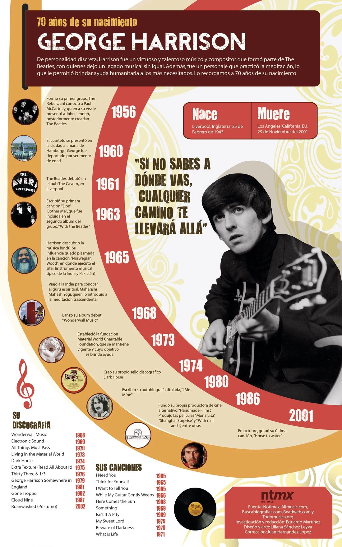
Source: Milenio
This editorial-style infographic honors George Harrison’s musical legacy, spotlighting his career from The Beatles through to his solo work and humanitarian efforts.
Designed for print and digital by Milenio NTMX, the timeline balances cultural depth with visual simplicity.
Design: The horizontal layout and bold type treatment mirror vintage concert posters, reinforcing its rock-and-roll roots.
A red-toned palette connects emotionally while maintaining legibility. Date anchors and key milestones use typographic hierarchy to guide readers without visual fatigue.
Business/Strategic Impact: For a media publication, this timeline functions as both tribute and shareable content.
It deepens reader engagement through nostalgia and cultural relevance, ideal for social virality, editorial authority, and entertainment journalism.
Best Use:
- Editorial content for music, pop culture, or entertainment news
- High-engagement social media posts or limited-run magazine features
- Commemorative timelines for public figures or musicians
4. Geopolitical and Policy-Oriented Timelines
Timelines that explain conflict, diplomacy, or legislation require a delicate balance of neutrality, clarity, and authority.
Timeline to Brexit – Norton Rose Fulbright
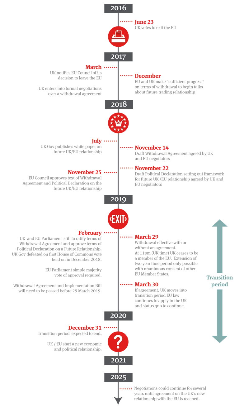
Source: Norton Rose Fulbright
This infographic by international law firm Norton Rose Fulbright maps out the complex regulatory and legal journey of the UK’s departure from the EU.
It simplifies intricate events into a clean legal timeline, guiding businesses through the phases of transition and compliance.
Design: The infographic uses a Gantt chart-like layout to indicate concurrent actions and overlapping deadlines.
Icons, date markers, and colored bars organize the otherwise overwhelming timeline into digestible segments. The use of red and gray adds visual discipline while reinforcing the brand’s legal authority.
Business/Strategic Impact: This timeline doubles as both a marketing asset and a client advisory tool.
It positions Norton Rose Fulbright as an expert guide in navigating post-Brexit regulation. By visualizing uncertainty, it reassures corporate clients and builds trust in the firm’s strategic oversight.
Best Use:
- Legal firm explainer content for regulatory transitions
- Client-facing guidance documents on compliance timelines
- Executive briefings for multinational business strategy
China-Russia Political Relations Timeline
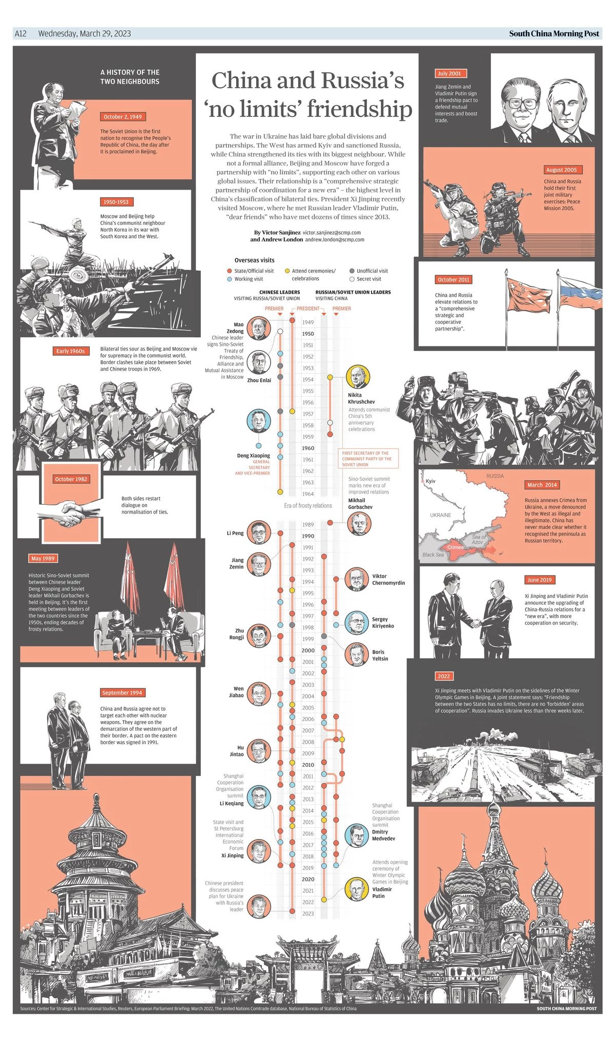
Source: South China Morning Post (2023)
This infographic traces the diplomatic and strategic relationship between China and Russia over time, highlighting key summits, treaties, and cooperative milestones. It visually documents the timeline of economic, military, and political engagement between the two powers.
Design: A combination of national flags, photographic backgrounds, and muted tones lends the graphic a serious tone befitting the subject matter.
Milestones are arranged on a clean horizontal axis, with events grouped by decade and categorized by theme (e.g., defense, trade).
Business/Strategic Impact: For policy think tanks or global affairs publications, this infographic works as a data-backed explainer on geopolitical shifts.
It provides historical context to current events and supports credibility by illustrating trends over time. Its academic style makes it a valuable tool for classroom or editorial use.
Best Use:
- Educational material for international relations or history courses
- Political briefings, research papers, and media publications
- Strategic intelligence decks or geopolitical risk analysis
5. Explainer and Educational Timelines
Timelines in science and health must simplify without dumbing down.
Street Anatomy – Medical History Timeline by Mariana Silva
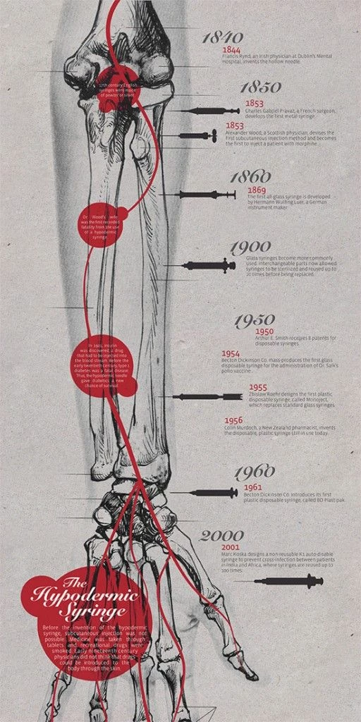
Source: Mariana Silva via Street Anatomy
Mariana Silva’s timeline infographic takes a bold turn by fusing medical illustration with street art aesthetics to map the evolution of human anatomical understanding.
Design: This hybrid visualization blends graffiti textures with anatomical overlays, creating a visually arresting piece that defies conventional science infographics. It retains chronological clarity while offering a stylized take on a traditionally clinical subject.
Business/Strategic Impact: Perfect for academic outreach or public engagement campaigns, this design breaks the “dry science” mold.
It turns passive content into visual storytelling that sparks curiosity and broader reach, especially among younger or design-savvy audiences.
Best Use:
- Museum installations or academic exhibitions
- Educational awareness campaigns with artistic slant
- Print collateral for health-focused NGOs or educational institutions
Everlane – Production Timeline: The Backpack
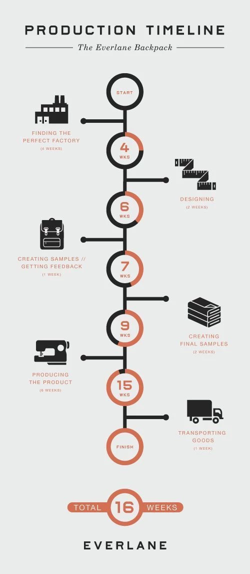
Source: Everlane via Piktochart
This infographic maps the full 16-week production cycle of Everlane’s backpack — from factory sourcing to product shipping. Each step is marked with an icon and labeled duration, creating a precise, vertically aligned visual narrative of ethical manufacturing.
Design: The vertical alignment and minimalist palette reinforce Everlane’s transparent, no-frills brand ethos.
Strategic use of icons and soft red callouts maintain interest and guide the eye down the timeline with functional clarity.
Business/Strategic Impact: Everlane’s commitment to “radical transparency” is perfectly embodied here.
This timeline isn’t just operational, it's brand storytelling. By revealing the full production lifecycle, it builds consumer trust, reduces skepticism about pricing, and reinforces Everlane’s ethical positioning.
Best Use:
- Transparency campaigns for DTC or ethical fashion brands
- E-commerce landing pages or product education
- Onboarding materials for suppliers or internal teams
6. Political Campaign and Movement-Based Timelines
CureFit Product Timeline – Vineet Gedam
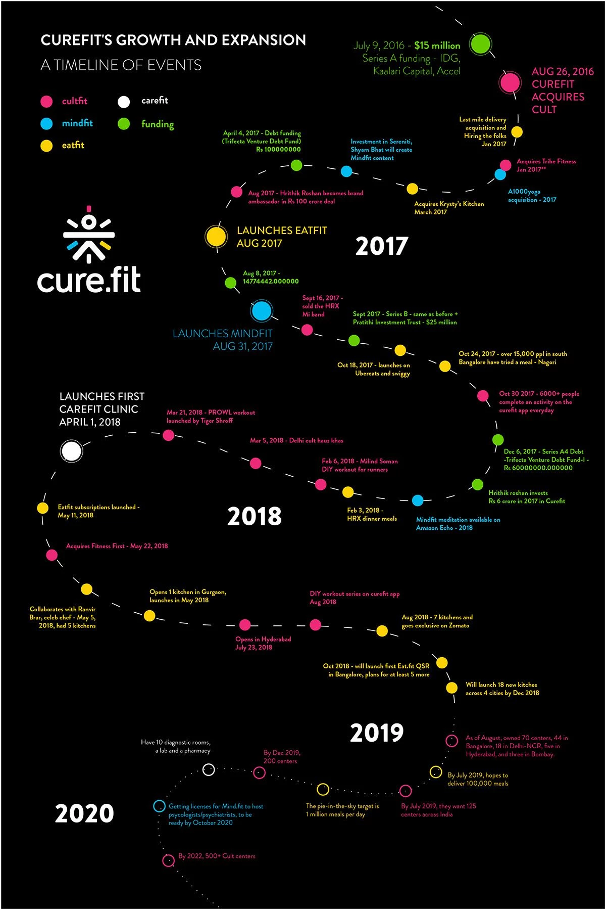
Source: Cult.Fit (formerly Curefit)
This design charts the health-tech company CureFit’s major product rollouts and strategic pivots, offering a chronological view of innovation and expansion across fitness, food, and medical services.
Design: With a clean vertical timeline, vibrant icons, and modular layout, the design makes each product or feature launch instantly recognizable.
Subtle typography and consistent icon sizing keep it visually tidy and hierarchy-driven.
Business/Strategic Impact: For startups, this is a powerful visual artifact that communicates momentum, product depth, and adaptability.
It reassures investors and customers alike that the company has a strong innovation pipeline and knows how to scale responsibly.
Best Use:
- Investor pitch decks or funding presentations
- Startup landing pages that need to show traction
- Product marketing timelines for user education
The 2025 Philippine Elections Timeline
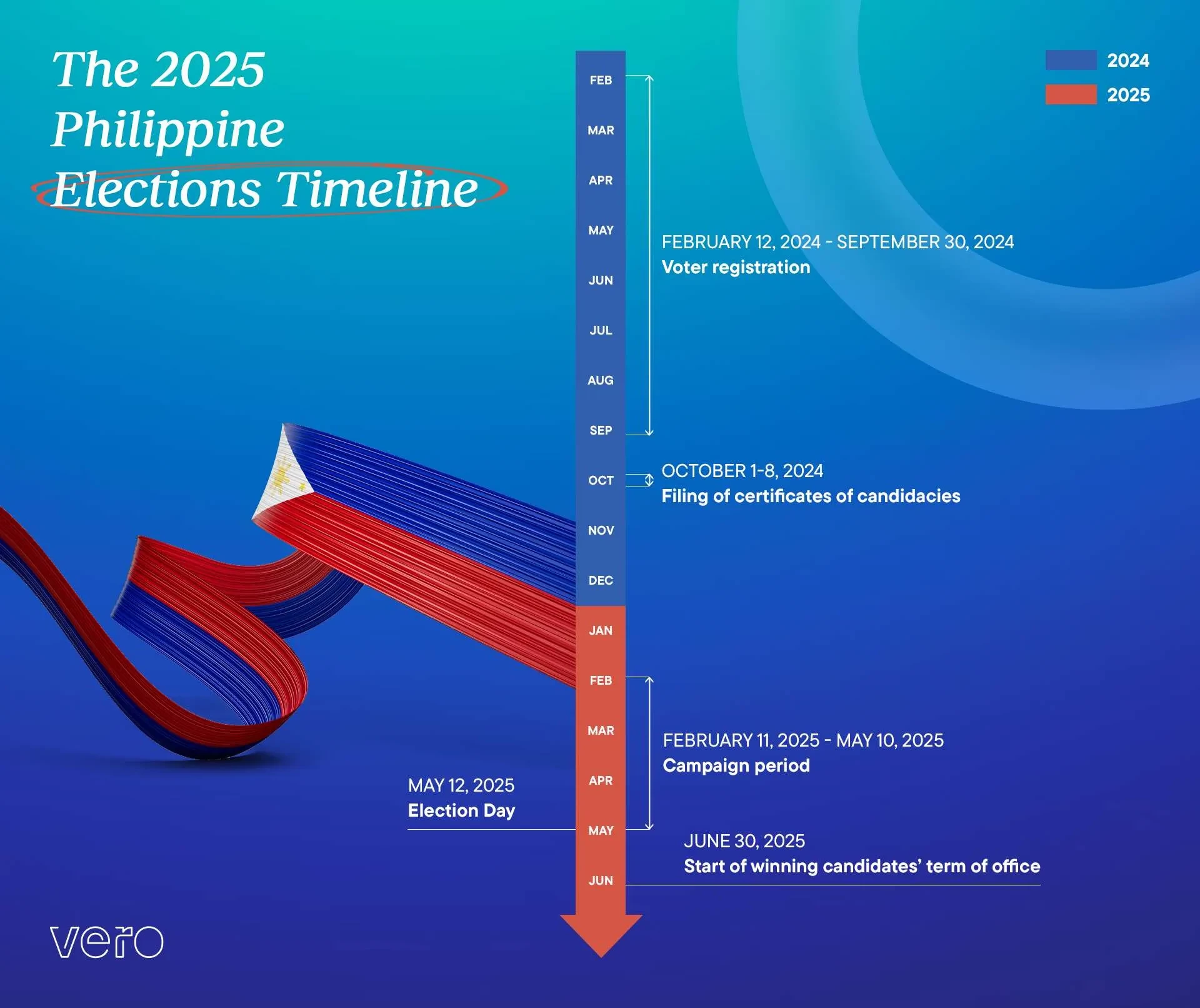
Source: VERO
This vertical ribbon-themed infographic maps the official timeline for the 2025 Philippine elections, laying out key dates from voter registration through to the assumption of office. The design uses a color-coded dual-year system (blue for 2024, red for 2025) and a clear month-by-month breakdown to guide civic participation.
Design: The split-color ribbon motif, evoking the Philippine flag, symbolizes national unity and democratic continuity.
A vertical timeline format, paired with month blocks and highlighted text, ensures events like voter registration, certificate filing, campaign period, and election day are instantly identifiable.
The strong use of contrast, vertical flow, and gradient background aids in visual hierarchy and cognitive clarity.
Business/Strategic Impact: This infographic doesn’t just relay dates, it functions as a civic engagement tool.
By simplifying a complex national process into a digestible, attractive format, it empowers voters, streamlines institutional communication, and boosts electoral awareness.
It positions VERO as a credible design partner for public sector and policy-driven communication.
Best Use:
- Electoral campaign education and civic awareness drives
- Government communications and public information campaigns
- Advocacy toolkits for NGOs, voter education groups, and schools
PANS PANDAS UK – A Brief Political Timeline
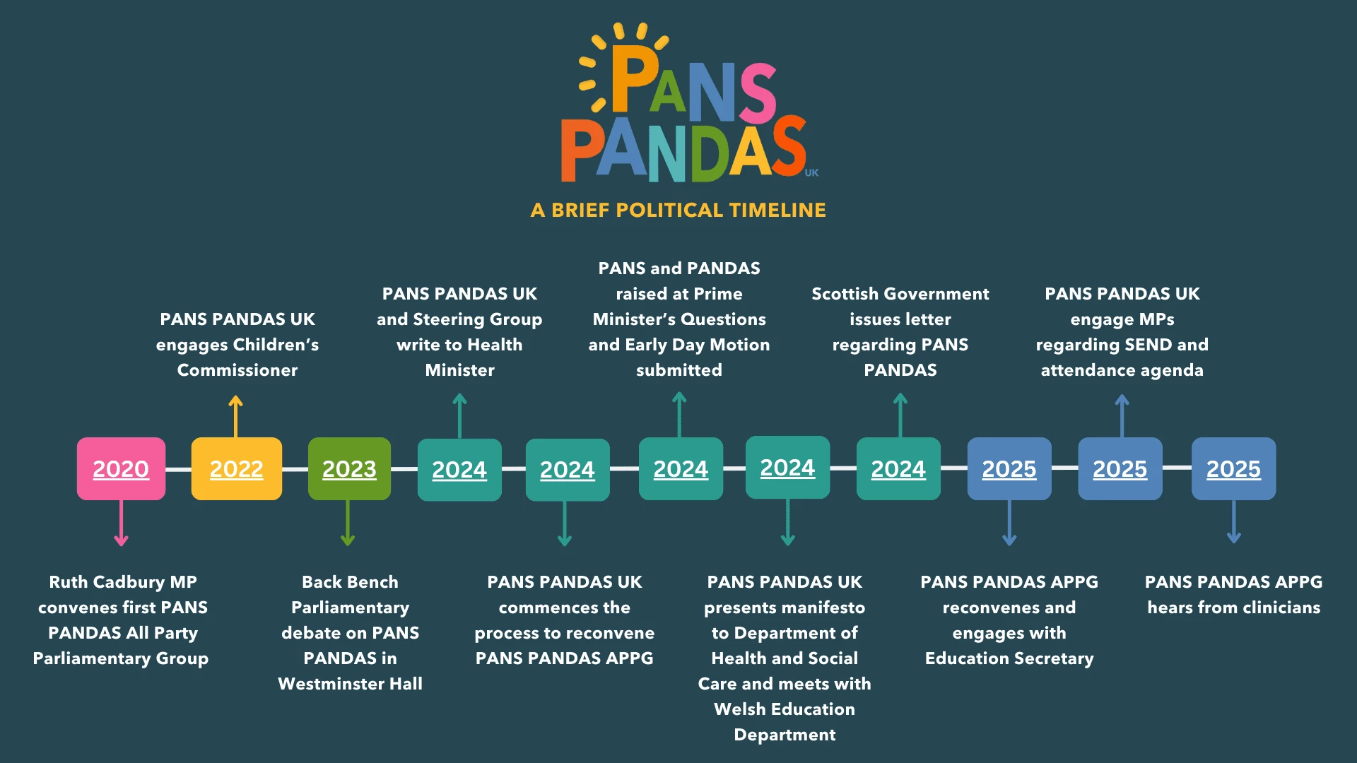
This infographic visualizes key milestones in the UK’s political advocacy efforts for PANS and PANDAS, from the 2020 formation of an All-Party Parliamentary Group to formal engagements with ministers, health departments, and MPs through 2025.
Design: A clean, horizontal layout with color-coded year markers helps delineate progress across multiple years.
Bold typography and upward/downward arrows emphasize initiative and institutional response, while icons and consistent spacing enhance clarity.
Business/Strategic Impact: As an advocacy tool, this infographic highlights persistent, multi-year policy engagement.
It’s designed to show strategic momentum, institutional recognition, and coalition-building, useful for influencing stakeholders, securing funding, or driving public awareness.
Best Use:
- Advocacy reports and policy briefings
- NGO stakeholder communications and donor decks
- Government engagement presentations or awareness campaigns
7. Event-Based and Thematic Timelines
FIFA World Cup Winners Timeline – Office Timeline
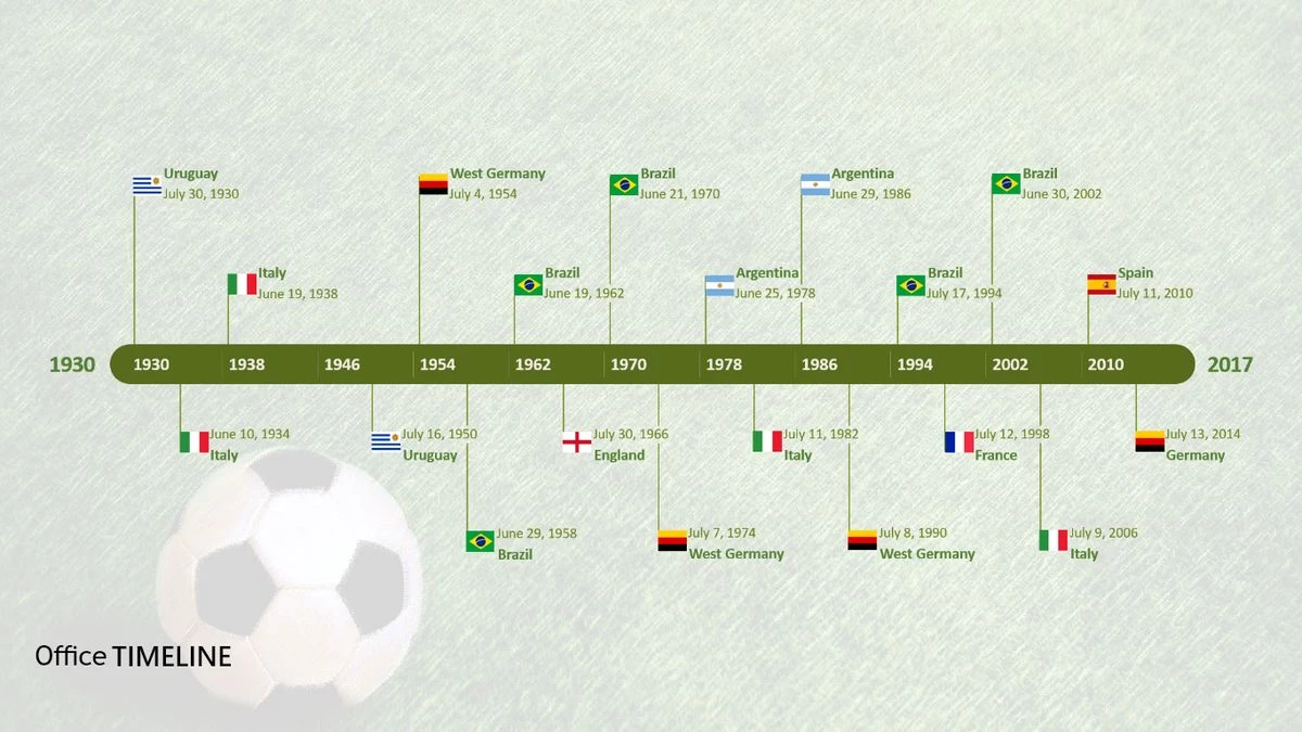
Source: Office TIMELINE
This graphic shows every FIFA World Cup winner from 1930 to 2014 in a minimalist, flag-based horizontal timeline. Each win is tagged with the national flag, year, and final match date.
Design: The clean horizontal layout keeps all data at eye-level. The use of flags instead of text adds visual recognition and international appeal.
A muted green background with soccer ball watermark grounds the theme while maintaining visual clarity.
Business/Strategic Impact: This timeline functions as a sports reference tool and fan-friendly content asset.
It excels in quick reference value, making it useful for broadcast, editorial, and classroom applications. For Office Timeline, it’s also a demonstration of their product’s data visualization capabilities.
Best Use:
- Quick-reference charts for sports broadcasters or fan sites
- Infographics in global sports journalism or sponsorship reports
- Visual examples of data timelines in PowerPoint tools or software demos
F1 Now and Then
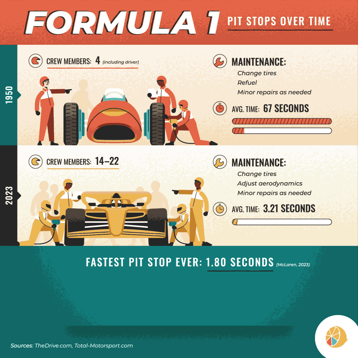
Source: Lemonly
This animated micro-timeline compares Formula 1’s past and present, contrasting vintage racing visuals with modern equivalents across categories like cars, helmets, and team gear. Delivered in GIF format, it functions as a looping before-and-after showcase optimized for social media consumption.
Design: The side-by-side comparison format leverages animation for contrast and clarity.
Clean, minimal framing draws attention to the transformation without distraction. Each frame is perfectly timed for scannability, making the evolution of F1 gear feel immediate and intuitive.
Business/Strategic Impact: For motorsport or media brands, this format is a masterclass in nostalgic storytelling.
It boosts engagement by tapping into fan memory while showcasing technological and design progression.
As microcontent, it performs exceptionally well on platforms like Instagram, X (formerly Twitter), and LinkedIn, where bite-sized visual content dominates.
Best Use:
- Visual storytelling for sports, automotive, or fashion industries
- Animated carousels for Instagram or media-rich Twitter/X threads
- Comparisons in brand heritage campaigns or anniversary content
The Positive Business Impact of Timeline Infographics: By the Numbers
Statistics Reinforcing Use and Impact
- Widespread Adoption: Over 300,000 infographics (based on Shutterstock) are available as stock design assets, indicating heavy demand and broad usage in marketing, business, and presentations.
- Business Benefits: Timeline infographics help businesses manage more effectively, set clear milestones for staff, and create roadmaps for stakeholders. They visually depict estimations and projections to maximize audience impact, streamlining goal-setting and resource planning.
- Audience Engagement: Timeline infographics are described as “powerful visual tools” that make complex information easy to grasp, enabling better storytelling and knowledge retention in a variety of industries, from business to education to journalism.
Positive Business Impact
- Enhanced Clarity: Timeline infographics simplify large amounts of information, turning detailed data into clear, sequential stories which are more likely to be understood and retained by viewers.
- Strategic Communication: Businesses use timelines to share their journeys, showcase milestones, and communicate progress to customers, partners, and employees. This increases transparency, builds trust, and cultivates stronger engagement.
- Improved Project Management: Timelines help with resource allocation, realistic goal setting, and monitoring of project progress. This leads to improved efficiency and better stakeholder alignment.
Behavioral Facts Supporting the Use Case
- Increased Recall and Understanding:Research published by the U.S. Department of Education suggests that images, diagrams, and other visuals can significantly improve memory recall.
- Motivation and Engagement: Visual timelines encourage active engagement, as viewers can follow a journey, process, or set of events in a logical, easy-to-digest way. This format supports both cognitive understanding and emotional connection with the subject matter.
- Visual Storytelling: Timeline infographics simplify complex stories, making sequences of events more relatable and memorable, which is vital in pitches, reporting, and education.
Market Size and Opportunity
The popularity of infographics translates into significant business opportunity.
Roughly 60% of businesses (and about 41% of UK businesses) now use infographics as part of their content strategy. The global market for infographic design tools was valued at approximately $1.2 billion in 2023 and is projected to grow about 15% annually in the coming years.
Furthermore, 88% of marketers planned to increase or maintain their investment in infographics going into 2024, underscoring confidence in this format’s ROI and future growth.
Timeline infographics offer measurable benefits for business communication, project alignment, and audience engagement. Their visual, chronological approach makes complex information accessible and drives both understanding and action.
Why Agencies Should Productize Timeline Design
Timeline infographics are no longer passive visuals. They are structured tools that help organizations communicate complex ideas, demonstrate momentum, and guide decision-making. Agencies that treat them as strategic assets can build repeatable service lines with clear business value.
Position Timelines as Multi-Use Strategic Assets
A single well-designed timeline can serve across multiple client channels:
- Investor Pitch Kits – Use milestones to validate traction and growth story
- Company Profiles & ‘About Us’ Pages – Reinforce credibility and heritage
- UX Onboarding Flows – Reduce friction by guiding users through time-based processes
- Sales Decks & Brochures – Anchor narratives around feature rollouts, product roadmaps, or client journeys
Offer timelines as flexible formats: static, interactive, or motion-based, depending on the platform and content lifespan.
Package for Specific Buyer Types
Build pre-scoped offers around high-demand use cases:
- Startups: “From Garage to Series B” visual growth timelines
- B2B SaaS: “Product Evolution” timelines for feature release narratives
- Consulting Firms: “Client Journey Maps” or “Service Launch Histories”
- Enterprise: Compliance or transformation project timelines
Each becomes a pitch-friendly, repeatable deliverable with a defined scope, timeline, and ROI.
Embed Timelines Into Content Systems
Don’t just sell a visual, integrate it into the client’s broader content ecosystem:
- Include it in brand storytelling kits
- Use it in lead magnets or landing pages
- Repurpose into carousel posts, TikTok reels, or explainer animations
By positioning timeline design as a modular asset, agencies can upsell related services like content strategy, motion design, or presentation refinement.
Monetize the Strategy, Not Just the Visual
Agencies like Column Five, Lemonly, and Superside don’t just make timelines, they sell strategic visualization. What commands higher fees isn’t the graphic; it’s the thinking behind it:
- Which events matter?
- What’s the sequence logic?
- How should the visual flow drive narrative comprehension?
Productize discovery and planning as billable phases. Clients are willing to pay premium pricing when timelines are backed by clear structure, messaging rationale, and audience intent.
Timeline Infographics: The Bottom Line
Timelines help clients explain what came before, what’s happening now, and what happens next. When designed with intent, they support trust, clarity, and executive decision-making.
Agencies that integrate timeline content into their offering are not just adding a design format. They are delivering a versatile, client-ready tool that supports visibility, alignment, and long-term positioning.
This is not decoration. This is structured communication. And it works.
![]()
In a market where clarity and momentum drive trust, timeline infographics are strategic assets. Whether you're mapping product evolution, corporate growth, or campaign milestones, these tools sharpen narratives and speed up stakeholder alignment.
That’s why top agencies and marketing teams are turning to partners who can transform data into business-ready timelines with real impact.
Looking for design talent that understands timelines beyond the surface?
Visit our Agency Directory to connect with the leading:
2. Best Graphic Design Agencies
You can also browse our Awards section for more outstanding design inspirations that inform, persuade, and scale growth today.
Timeline Infographics for Business Use: FAQs
1. What is a timeline infographic and how is it different from a regular timeline?
A timeline infographic is a visually designed chronology of events, milestones, or progressions. Unlike plain timelines (e.g., lists or Gantt charts), infographic timelines combine data, narrative flow, and visual elements (icons, color codes, illustrations) to enhance readability, memory retention, and emotional engagement. They're often used in marketing, internal communications, investor decks, and UX onboarding because they transform static data into compelling brand stories.
2. What are the most effective formats or types of timeline infographics?
The best format depends on your goal and platform:
- Horizontal timelines – Ideal for web pages and presentations
- Vertical timelines – Great for print, mobile, and long-scroll UX
- Circular or spiral timelines – Best for annual reports or cyclical narratives
- Comparative timelines – Useful for “Then vs. Now” storytelling or geopolitical shifts
- Animated micro-timelines – Designed for social media (e.g., carousels or GIFs)
- Metaphor-based timelines – E.g., Apple Tree, Roadmap, or DNA strand visuals used to anchor narrative to visual memory
3. What are the business benefits of using a timeline infographic?
Timeline infographics support high-impact communication across internal and external audiences. They:
- Clarify complex progressions (e.g., product rollouts, transformation journeys)
- Reinforce brand credibility through transparent storytelling
- Drive engagement and shareability across web, print, and social
- Support strategic alignment in investor decks, compliance docs, and ESG reports
- Accelerate sales or onboarding by illustrating key milestones or processes at a glance