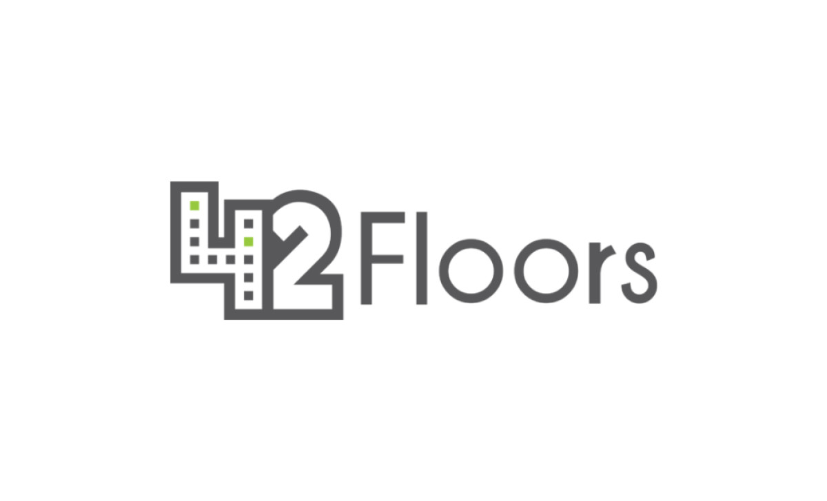
Standout Features:
- 4-shaped office building
- Smooth typography with a quirky character
- Gray palette with green accents
42Floors is a startup that helps small businesses find and rent office space, and its logo communicates precisely what they do by embracing creative simplicity. The number four is ingeniously designed to mimic an office building, immediately signaling their focus on the real estate sector.
The smooth typography, complete with a quirky twist on the letter “r” — its arched part intentionally shortened to introduce a slight imbalance — adds a modern, playful edge to the design. Complementing the design is a soothing grey palette accented by eye-catching green details, such as the two green “windows” that draw your attention instantly.
This startup logo design is a prime example of a modern and simple wordmark with creative nuances. It's easy to spot from afar and adapts effortlessly to evolving trends, making it the perfect visual representation of a forward-thinking brand.