Team Behind the Design
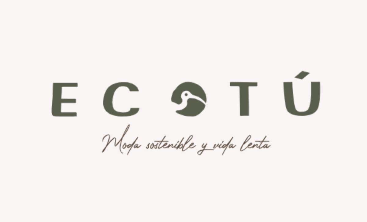
Logo Design Analysis
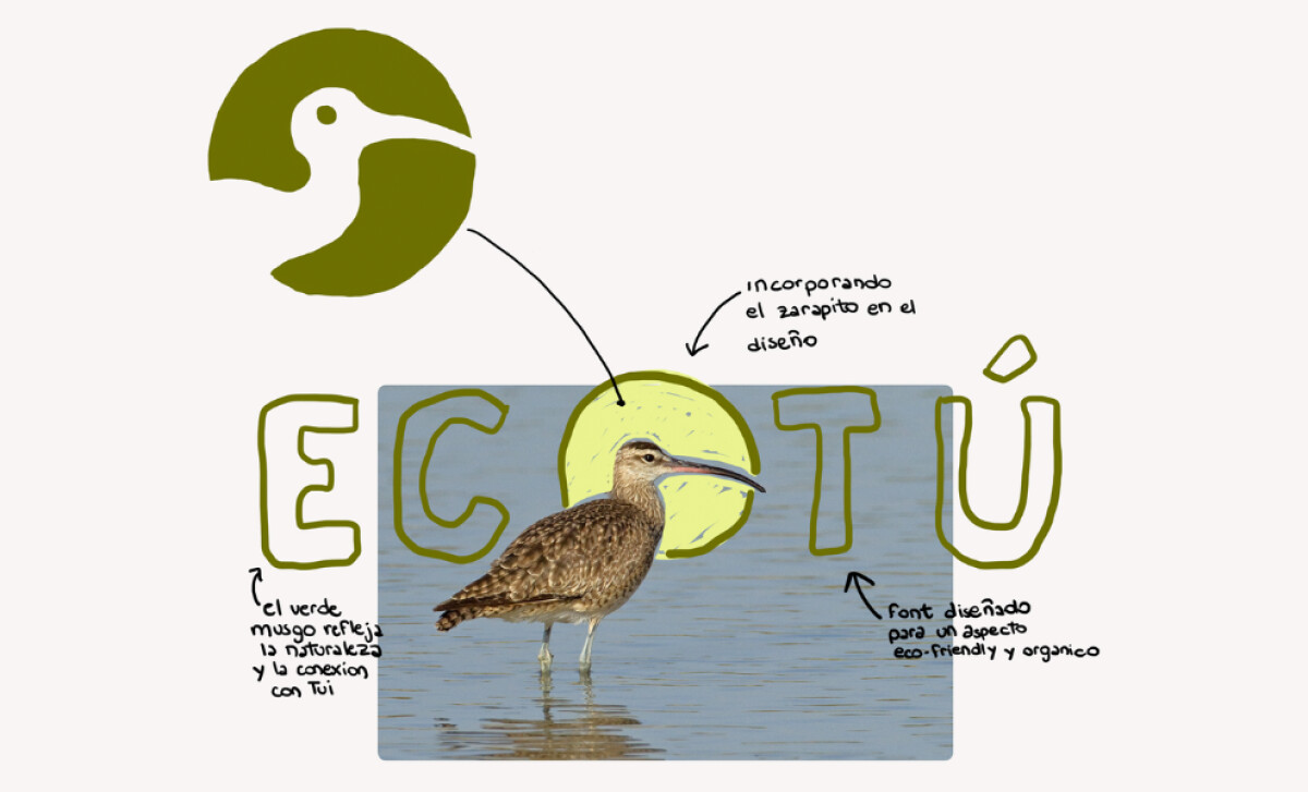
Logo design for sustainable, community-focused brands often works best when the visual language feels grounded and symbolic.
Here, the identity builds a sense of place by merging minimal illustration, organic shapes, and a muted palette that reflects the region’s natural environment.
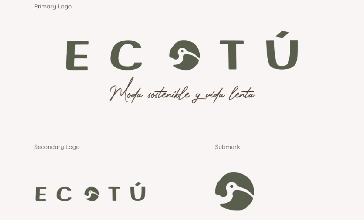
- Concept: The stylized Zarapito forming the letter “O” gives the mark a meaningful focal point. I like how this integration merges storytelling with function, creating symbolism without disrupting typographic clarity.
- Typography: The soft-edged sans-serif wordmark carries a handcrafted personality that supports the brand’s slow-living ethos. I appreciate how the subtle irregularities make the logo feel more human, setting it apart from the sharper geometry often seen in lifestyle branding.
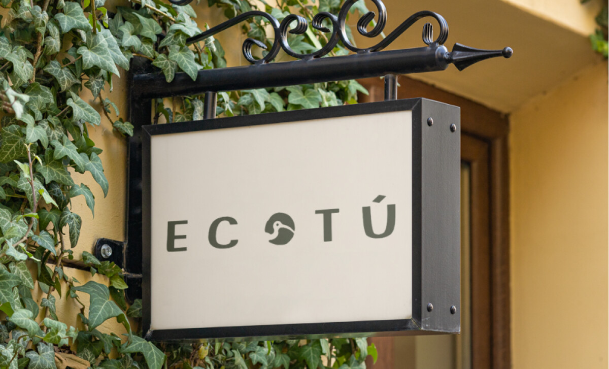
- Scalability: The circular bird emblem works well on small applications like labels and packaging stamps. I find its simplicity especially effective — the mark stays legible and recognizable even at tiny sizes, which is crucial for craft and retail products.
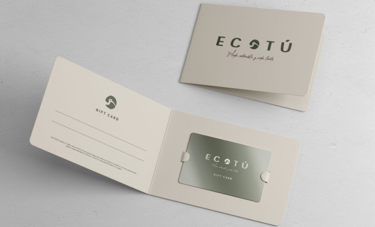
- Applications: The earthy palette and subtle script tagline enhance the identity across touchpoints. These choices often help eco-lifestyle brands project sincerity and emotional connection.
What Brands & Agencies Can Learn from EcoTú
EcoTú demonstrates how nature-inspired symbolism and restrained design choices often result in identities that feel both memorable and emotionally grounded.
1. Let Regional Symbols Carry the Narrative
Incorporating a local species like the Zarapito gives the logo built-in meaning and cultural relevance. This kind of symbolic foundation helps brands form deeper community connections and strengthens long-term recognition.
2. Use Organic Forms to Convey Eco-Friendly Values
Soft contours and handcrafted shapes can immediately signal sustainability and human touch. These details create warmth and authenticity — qualities that resonate strongly with audiences invested in slow living and conscious consumption.
3. Develop a Submark That Works Across Small, Tactile Applications
A simplified emblem ensures the identity stays clear on clothing labels, packaging seals, and artisan goods. Consistency across small-scale formats reinforces recognition and gives sustainable brands a flexible toolkit for varied materials.
About DesignRush Featured Designs
At DesignRush, we review hundreds of agency projects each month across branding, digital, and product design. The featured designs represent some of the most compelling work, standing out for creativity, execution, and brand relevance.
Top-performing entries may advance to our Monthly Design Awards, which spotlight exceptional industry achievements.
Check out more standout work across categories:
- Best Logo Designs
- Best Website Designs
- Best App Designs
- Best Print Designs
- Best Packaging Designs
- Best Video Designs
For a full list of design agencies and related services, see our Agency Directory.