Standout Features:
- Shield-emblem logomark with circuit-based design
- Smart modular grid for logo scalability
- High-contrast blue and orange palette
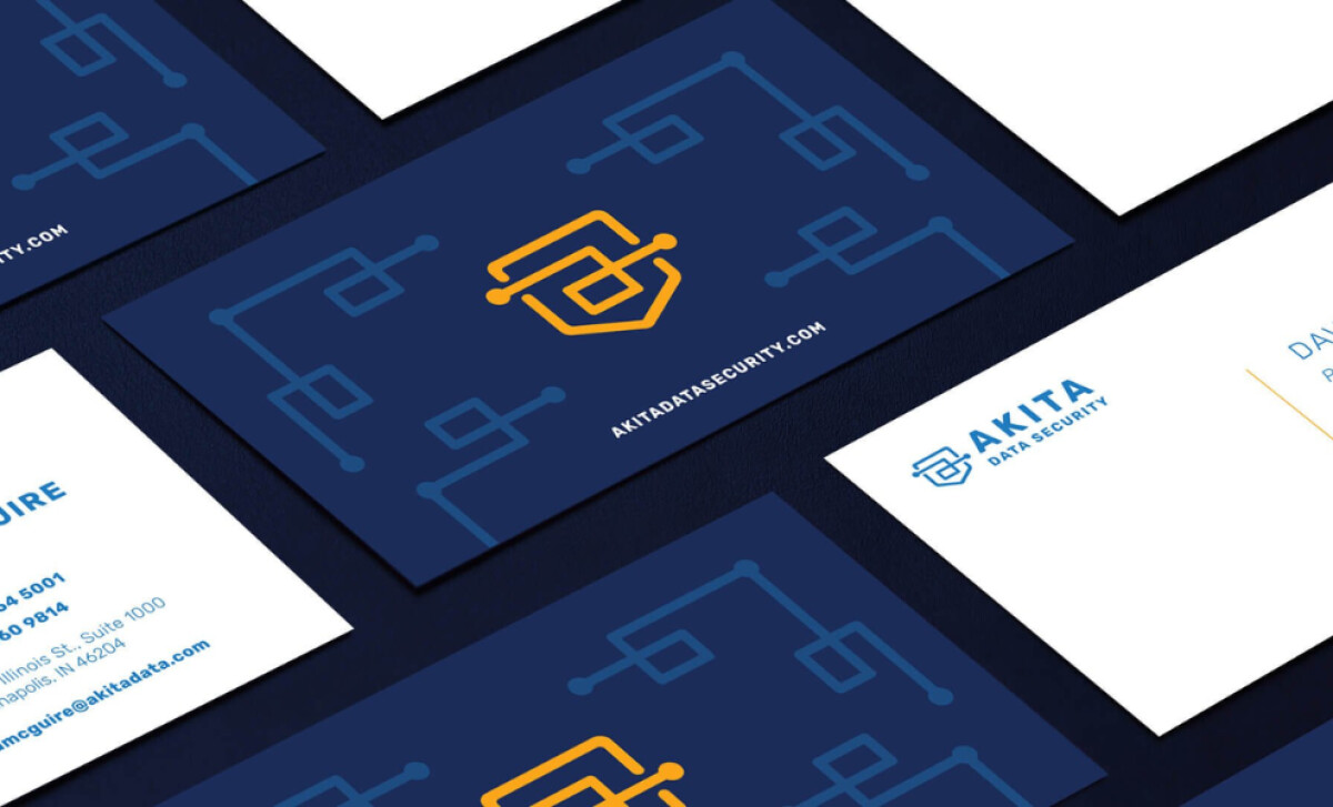
Akita Data Security is not your average tech brand; it exists to instill confidence in a rapidly evolving cybersecurity landscape. Sarah Bernard Creative engineered a brand identity that looks just as secure as the services it offers. Through a bold symbol and modular design system, the logo offers a clear and compelling visual narrative of protection and trust.
The custom logomark cleverly merges a traditional shield, a time-honored symbol of protection, with stylized circuit lines that form the letter “A” and “D.” This mark instantly communicates the brand’s function and identity. It strikes a strong balance between literalness and abstraction, making it recognizable and unique in a competitive space.
Scalability is a frequent pain point for tech logos, but not here. Sarah Bernard built the Akita logo system on a modular grid that allows for smooth transitions between lockups and sizes. Whether on a business card, app interface, or building signage, the integrity of the logo remains intact, ensuring consistency and legibility across applications.
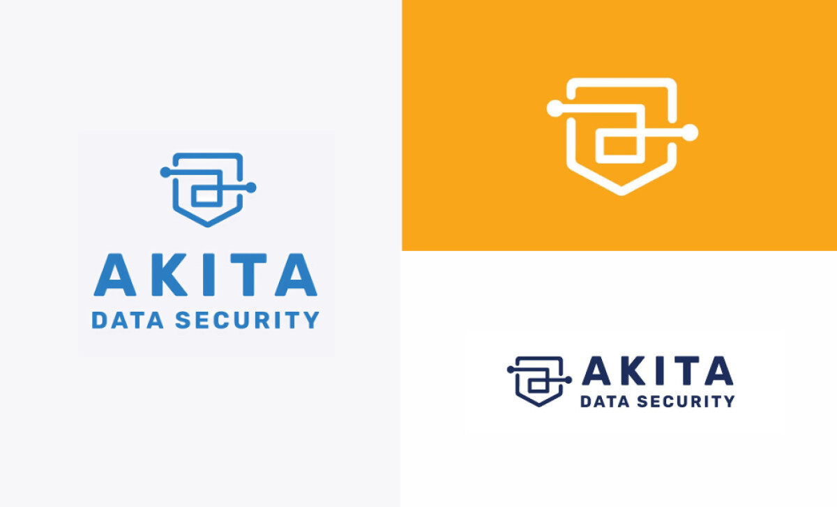
Color does a lot of heavy lifting in tech branding, and Akita’s palette is a strategic win. Deep navy blue grounds the brand in professionalism and reliability, while vibrant orange injects a sense of innovation and alertness. The contrast also enhances readability in digital environments — particularly critical for apps, dashboards, and email signatures where brand consistency matters.
Akita Data Security’s logo design is a visually intelligent solution for a brand operating in high-stakes digital environments. Sarah Bernard Creative distilled complex tech language into a symbol of clarity, credibility, and competence.

-preview.jpg)

