The Simple StreetEasy Symbol Embodies The Brand’s Services
StreetEasy is a blossoming real estate brand based in New York City. It offers apartment and home buying and rental services to residents in and around the five boroughs of the city, with a robust platform that makes finding a new home easier and more streamlined than many of its competitors.
It’s a relatively new service which seemed to gain success overnight. And that’s thanks to its compelling and creative logo design that captures its identity and aligns the brand as a modern innovator in the field.
And millennials can’t get enough.
The StreetEasy logo is made up of a symbol and wordmark. The symbol instantly grabs your eye and stand on its own in a powerful and comprehensive way.
Just one look and you get a pretty good feel for what this brand does even if you’ve never heard of StreetEasy before.
The symbol consists of an illustration of an apartment building. It’s a relatively basic image — a blue square with tiny squares within that represent windows. It’s created in a blue and white color scheme that pops from any and all mediums its set against.
This straightforward and simple illustration sits inside of a white circle — only this circle is so much more than a circle. It actually looks like a thought bubble or dialogue box with a little point at the bottom.
This gives off a friendly and approachable vibe. It’s like this logo is popping up and giving you helpful and relatable advice and insights. This brand is trying to align itself as a friend that is here to give you the insights you need to make an informed decision.
This symbol stands out and is instantly recognizable. It’s just different enough to add a bold and funky edge to the brand, but is still extremely intuitive and comprehensive, embodying the brand and its services.
The StreetEasy logo is modern, sophisticated and playful. And it helps to capture audiences in a way that is relaxed, cool and friendly.

StreetEasy’s Sophisticated Color Choice Promotes Trustworthiness
But it’s not just the overall design and imagery of the logo that stands out. The impactful color choice also works to give the brand a boost and align it in a certain way in the eyes of its target audience.
As you probably know, color can influence buyer behavior and consumer actions. It can make people subconsciously feel or act in a certain way thanks to the connotations and emotions these color evoke.
And the color blue is certainly an impactful color — you can probably tell from all of the brands, businesses and even social media sites that utilize this bold color.
The color blue emphasizes loyalty, confidence and trustworthiness. It tells consumers that this is a brand that knows its business and knows what it’s doing. It can be trusted because it has an authority that is unmatched by its competition.
Blue is a peaceful and relaxing color, and it puts people in a state to listen and absorb. And the more they see it, they more they are encouraged to have a positive feeling about a brand. And this positivity will make them more willing to interact, buy and learn more.
Blue is also an extremely productive color, and in this instance, you want your home rental search to be productive. The color blue gives you that assurance that you will, in fact, find the apartment of your dreams.
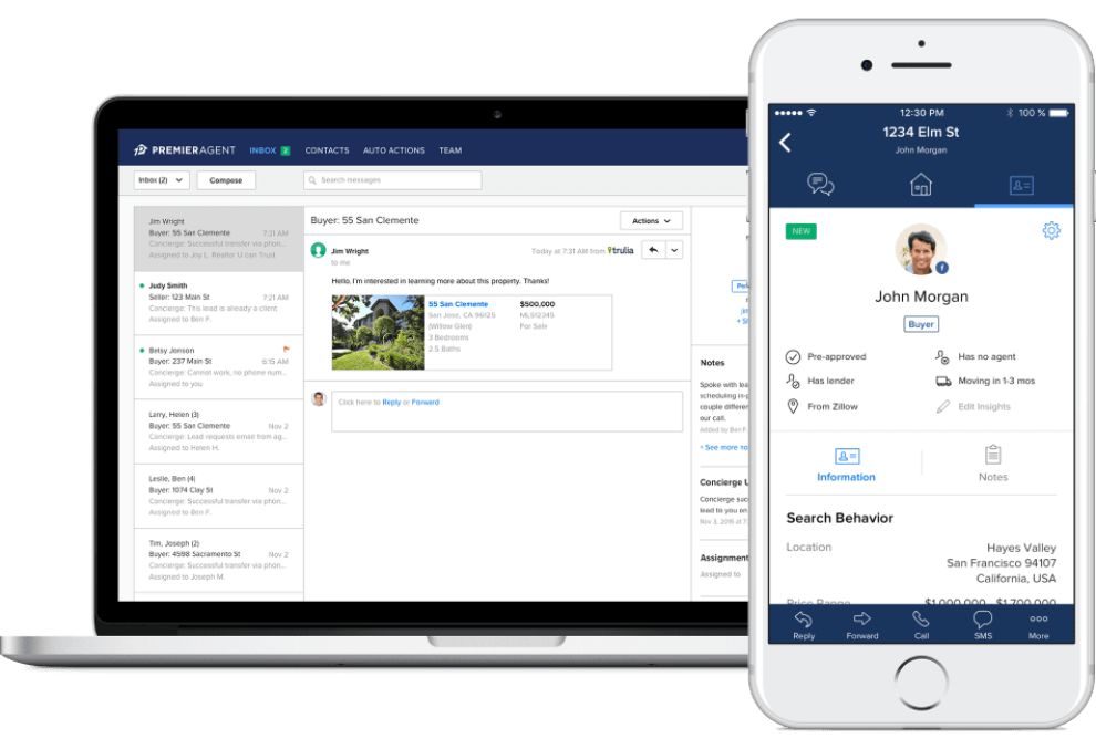
The color here makes up the logo as well as the app and desktop platform as a whole. This keeps branding consistent and keeps that brand authority and authenticity front and center at all points of the process.

Simplicity Gives The StreetEasy Brand A Modern Vibe
This logo design is simple, minimal and modern. The wordmark is a straightforward, sans-serif design that hangs in the background, letting the symbol take center stage. It gives off a bit of authority and strength, but its simplicity shows audiences that it means business.
Similarly, the logo itself is made up of clean and basic shapes. It’s a basic and blunt design. And this exudes a modernity and a vivaciousness that directly impacts the brand’s millennial audience.
Younger audiences want elegance and refinement. But they want boldness and simplicity as well. And this is embodied in this dynamic design.
It stands out and dares to be remembered. And StreetEasy’s youthful audience appreciates that.

StreetEasy’s Logo Is Effortlessly Integrated Across Various Mediums
StreetEasy is a youthful, exciting and passionate brand that has done a great job of interacting with its target audience and giving them the tools and resources they need to make fact-based rental decisions in the areas in and around New York City.
Its logo has had a hand in setting up this brand identity and robust persona. This is due, in part, to its modern, clean and young aesthetic. It’s a simple, stunning and elegant symbol that effortless captures the brand’s rental services.
But it also brings a peaceful and playful energy that consumers are excited to see and interact with.
And this logo design really brings the brand’s identity full circle. It’s seen in its app, its online presence and its advertisements that line New York City subway cars.
It’s an intuitive image that matches the powerful energy of the brand, bringing it to life and showing consumers that it’s a service that can be relied on a trusted.
The logo and its accompanying elements sit on most, if not all marketing materials. The serene and captivating blue and white colors create all of its designs. And in a similar fashion, the urban feel of the image that sits as the StreetEasy symbol is embodied in one way or another — whether it’s the symbol itself or a cityscape or skyline that shows users where this brand operates.
The effortlessness of this integration promotes the brand as a leader and shows users that this is a brand that means business.

What Is StreetEasy?
StreetEasy is a New York City-based real estate brand, that provides residents of all five boroughs, as well as residents of northern New Jersey, access to thousands of apartment and home listings. The brand offers homes to buy or rent, with an extensive offering that has quickly aligned it as a leader in the NYC real estate market.
The brand was acquired by Zillow in 2013, and this acquisition helped to give StreetEasy the boost it needed to dominate the market.
Here’s a brief bio of the company from StreetEasy itself:
StreetEasy® is New York City’s leading local real estate marketplace on mobile and Web. It provides New Yorkers, and anyone shopping for real estate in NYC, accurate and comprehensive for-sale and for-rent listings from hundreds of real estate brokerages throughout New York City and the major NYC metropolitan area. StreetEasy goes deeper than any other source, offering New York-specific information like whether a building has a doorman or an elevator, with proprietary data and useful search tools to help home shoppers and real estate professionals navigate the complex real estate markets within the five boroughs of New York City, as well as Northern New Jersey.The brand operates a robust and extensive platform on desktop devices as well as through a thorough and sophisticated mobile platform.
The brand is a modern one, with an identity that is geared more towards a younger, millennial market of apartment renters. This is obvious in its mobile platform and its modern aesthetic, and its intuitive logo design helps to promote this persona in a beautifully sophisticated way.

The Success Of StreetEasy’s Intuitive Logo Design
StreetEasy is a rapidly-growing brand with a powerful identity that helps it stand out from the competition. And like with all brands, this brand identity starts with a captivating logo design.
The StreetEasy logo is no different, and this stunning and successful image embodies the brand so beautifully it’s hard not to notice it.
The StreetEasy logo consists of a stunning image in the form of an outlined apartment building. This basic image sits inside a thought bubble-looking image. This gives the brand a conversational and relatable quality — the casual nature of the dialogue bubble makes the brand seem like a friend that’s offering reliable advice.
And that’s what StreetEasy wants you to feel when thinking about the platform.
The wordmark is a simple and effective extension of the brand that appears as a modern and sophisticated leader. And the overall blue coloring exudes confidence and trustworthiness.
There’s a simplicity and a modernity to this logo that keeps it fresh and youthful. And considering its audience is that of young, vivacious millennials living in and around New York City, that’s exactly the kind of persona the brand wants to give off.
This brand understands the importance of consistency and cohesiveness. This is evident in the overall blue and white color palette of its branded materials, app and desktop platform. That, matched with an equally comprehensive, clean and robust platform shows that the brand is one that is dedicated to giving its consumers everything that they could possibly need to make an informed decision.
There’s an elegance and a minimal quality to this logo that is transferred throughout its entire identity, and that’s what makes for a successful and engaging brand overall.
A logo can make or break a brand — create one that captivates consumers by utilizing these top-rated logo design companies!


