Logo Designed by
LB Brand Co, LLC LB Brand Co, LLC

Anchor Point Lodge

Anchor Point Lodge Logo Design
The Anchor Point Lodge logo blends heritage typography with subtle nautical symbolism to communicate stability, renewal, and place. Designed by LB Brand, the identity reflects the lodge’s mission to provide a restful, inspiring environment rooted in both faith and the natural beauty of Lake Tahoe.
Anchor Point Lodge Logo Design
Anchor monogram reinforces sense of place
Anchor Point Lodge Logo Design
Calm palette reflects natural surroundings
This website uses a colour palette of 4 colours
  • #448CA5
  • #F0F0F2
  • #F2F2F4
  • #0F6E91
Technologies & Tools
Description
Team Behind the Design
  • Agency: LB Brand
  • Client: Anchor Point Lodge
  • Category: Logo — Hospitality
  • Location: Bentonville, Arkansas, United States
  • Project Brief: Create a logo and identity system that reflects Anchor Point Lodge’s mission of renewal and rest while capturing its scenic Tahoe City location and its partnership-driven ministry focus.

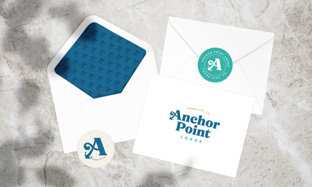
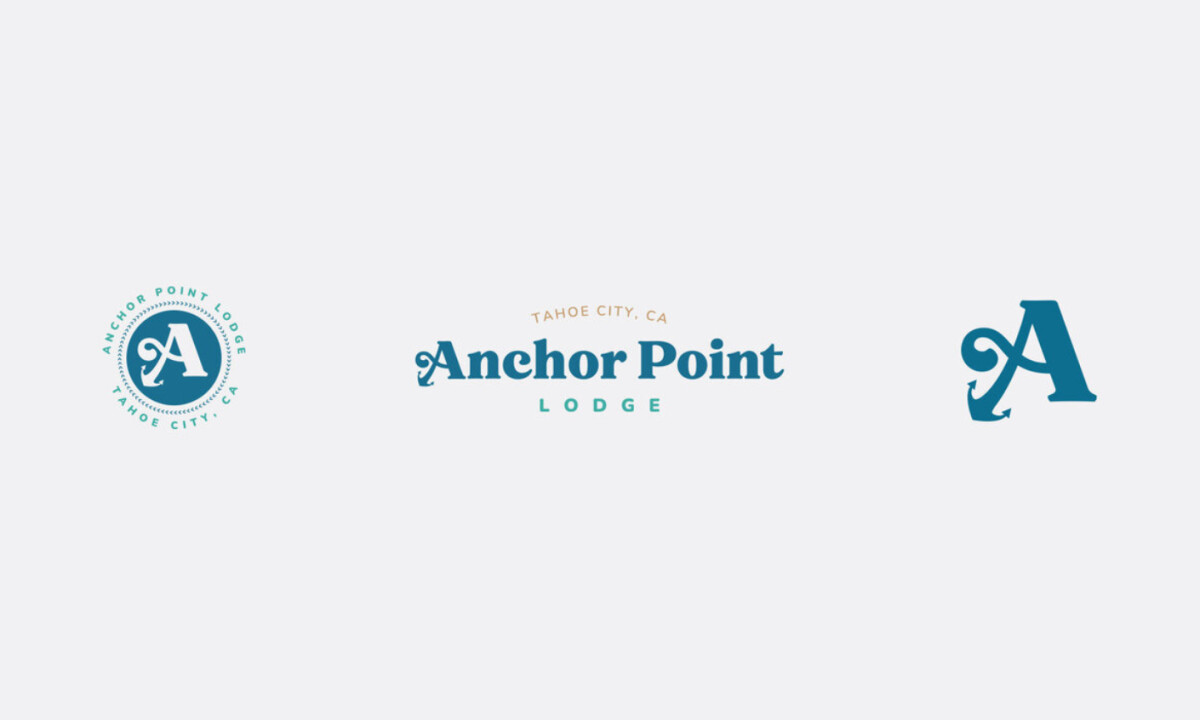
Hospitality logos in the non-profit space require clarity, approachability, and a sense of setting. Anchor Point Lodge meets that need through a composed serif wordmark, a maritime-inspired monogram, and calm, landscape-driven hues that reinforce stability and character. 

Ready to elevate your designs?