Athelo Logo Design by Senu Studio
Senu Studio created Athelo’s logo identity around the concept of athletes as high-performance systems shaped through science and measurable data. Inspired by anatomy, heat maps, and analytical precision, the project positions athletic development as a process of optimization, using visual language tied to intensity, performance zones, and scientific insight.
Runner wears vibrant jersey displaying striking yellow brand typography.
Athletic apparel prominently features bold, stylized typographic logo design
Three outdoor posters display athletic branding and app interfaces.
Triptych billboard presentation showcases vibrant gradients and modern typography
This website uses a colour palette of 4 colours
  • #FFFFFF
  • #397948
  • #13200C
  • #D1BC00
Technologies & Tools
Description
Team Behind the Design
  • Agency: Senu Studio
  • Client: Athelo
  • Category: Logo Design — Sports
  • Location: New Cairo, Egypt
  • Project Brief: Create a sports logo design that reflects Athelo’s data-driven approach to athletic performance and scientific optimization.

A sports logo design proves its worth when the visual system and the product's core proposition are inseparable. Senu Studio's identity for Athelo clears that bar by committing to a single creative premise and following it all the way through: athletes as measurable, engineered structures rather than inspirational figures.

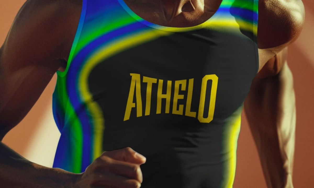
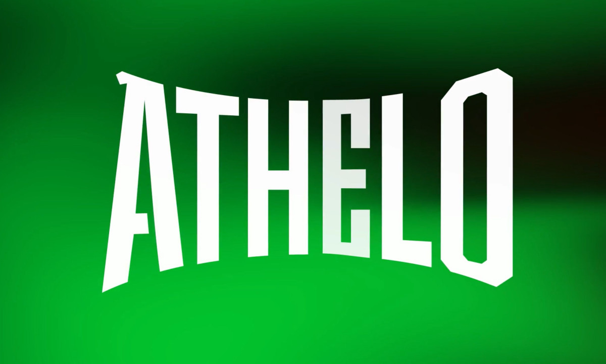
The wordmark scales without compromise. A condensed, arched display face with chamfered letterforms holds its authority from a small app icon to a full billboard, shifting between electric green, gold on black and yellow on teal gradients without losing consistency or recognition at any size.

The heat map visual language is the most creative and relevant move in the system. Fluid blue-green-yellow gradients borrowed directly from sports science software map performance zones across the athlete's body, turning a brand element into something that carries real meaning for the professional athletic audience it's targeting.

Versatility shows up in the out-of-home executions. "Skip it? Stay stuck." in tight white and yellow type over a deep blue heat map blur demonstrates that the system can carry a campaign tone, not just a logo lockup, and the identity is specific enough to stay memorable long after the billboard is out of frame.

Vote for the best design in this year's Design Awards and help decide which projects deserve top recognition. Every vote contributes to celebrating creativity and craftsmanship across categories like web, branding, product, and digital design.
Athelo Logo Design by Senu Studio

Athelo

Designed bySenu Studio
Balance Logo Design by Studio AIO

Balance

Designed byStudio AIO
Wellington Educated Logo Design by Stanley Street

Wellington Educated

Designed byStanley Street
La Famiglia - Gucci Logo Design by Affaire

La Famiglia - Gucci

Designed byAFFAIRE
Hoopla Logo Design by Self-titled

Hoopla

Designed bySelf-titled
Belle&George Logo Design by Abmo

Belle&George

Designed byAbmo
Redheads Logo Design by Oliver Grace

Redheads

Designed byOliver Grace
Casa Macui Logo Design by Fugitiva

Casa Macui

Designed byFugitiva
Pizza Feasto Logo Design by Berat KAYA

Pizza Feasto

Designed byBerat KAYA
View All BestLogo Designs

Ready to elevate your designs?