- Agency: Archelon Studios
- Client: Stephens Creek Soap Company
- Category: Brand Identity — Luxury
- Location: Gulf Breeze, Florida, United States
- Project Brief: Create a refined logo for Au78, a premium fragrance line that extends Stephens Creek’s handcrafted soap and skincare heritage into a luxury fragrance offering inspired by the elemental prestige of platinum (atomic number 78).
Designing a luxury fragrance logo requires restraint, symbolism, and typographic confidence rather than overt decoration.
Au78 demonstrates how minimal form and conceptual clarity can communicate prestige while remaining flexible across applications.
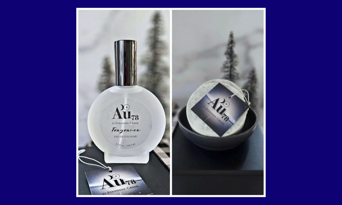
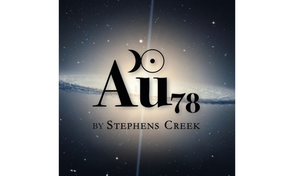
- Typography & Wordmark Structure: The logo is built around a high-contrast serif wordmark that immediately signals refinement and tradition. I find the typography effective in conveying luxury without appearing ornamental, which allows the letterforms themselves to carry the brand’s authority.
- Symbolism & Meaning: The integration of celestial and elemental cues references platinum’s atomic weight while evoking rarity and timelessness. I believe this symbolic layer adds significant depth to the logo by reinforcing the idea of something precious, considered, and enduring.
- Hierarchy & Brand Signature: The relationship between the primary name and the supporting text creates a clear hierarchy that balances independence with lineage. I think this structure smartly positions the brand as a premium extension rather than a disconnected sub-brand.
- Versatility & Longevity: The visuals perform equally well in isolation or monochrome contexts without relying on color or texture to maintain impact. I appreciate how this makes the brand mark highly adaptable and future-proof for a luxury market intended to scale.
What Brands & Designers Can Learn from Au78
This logo demonstrates how luxury identity systems can rely on clarity, symbolism, and typographic strength rather than decorative excess. Here are three key lessons from the Au78 fragrance mark:
1. Let Typography Establish Prestige
High-contrast serif letterforms communicate refinement and permanence on their own. When typography is confident and well-proportioned, it becomes the primary luxury signal.
2. Use Symbolism to Add Depth, Not Noise
Celestial and elemental references subtly reinforce rarity and timeless value. Symbolism works best when it enriches meaning without demanding attention.
3. Design for Longevity Across Contexts
A mark that performs in monochrome and minimal applications remains flexible as the brand scales. Future-proof luxury branding favors form and structure over surface treatment.