
AXIA Energia Logo Design by Tátil Design
Tátil Design created AXIA Energia’s new logo identity as part of the rebranding of Eletrobras. Inspired by the ideas of axis and value, the project positions the company as a central force connecting people, businesses, and opportunities through energy. The identity reflects transformation, sustainability, and long-term growth while maintaining the credibility of the company’s legacy.
Vibrant blue gradient illuminates a layered, translucent spherical logo.
Interconnected circular mark conveys dynamic movement against vibrant gradient
Corporate signage displays the glowing, translucent orange logo design.
Signages showcases the dynamic, interconnected energy brand mark
This website uses a colour palette of 4 colours
  • #1716F8
  • #FFFFFF
  • #DEDDDB
  • #514C49
Technologies & Tools
Description
Team Behind the Design
  • Agency: Tátil Design
  • Client: AXIA Energia
  • Category: Logo Design — Professional Services
  • Location: Rio de Janeiro, Brazil
  • Project Brief: Create a professional services logo design that reflects AXIA Energia’s transformation into a modern energy and value-driven organization.

A professional services logo design carries institutional weight when it can hold six decades of legacy and a forward-looking repositioning inside the same mark. Tátil Design's identity for AXIA Energia does that by transforming Eletrobras, one of Brazil's most influential energy companies, into a brand built around connection and value creation rather than generation alone.

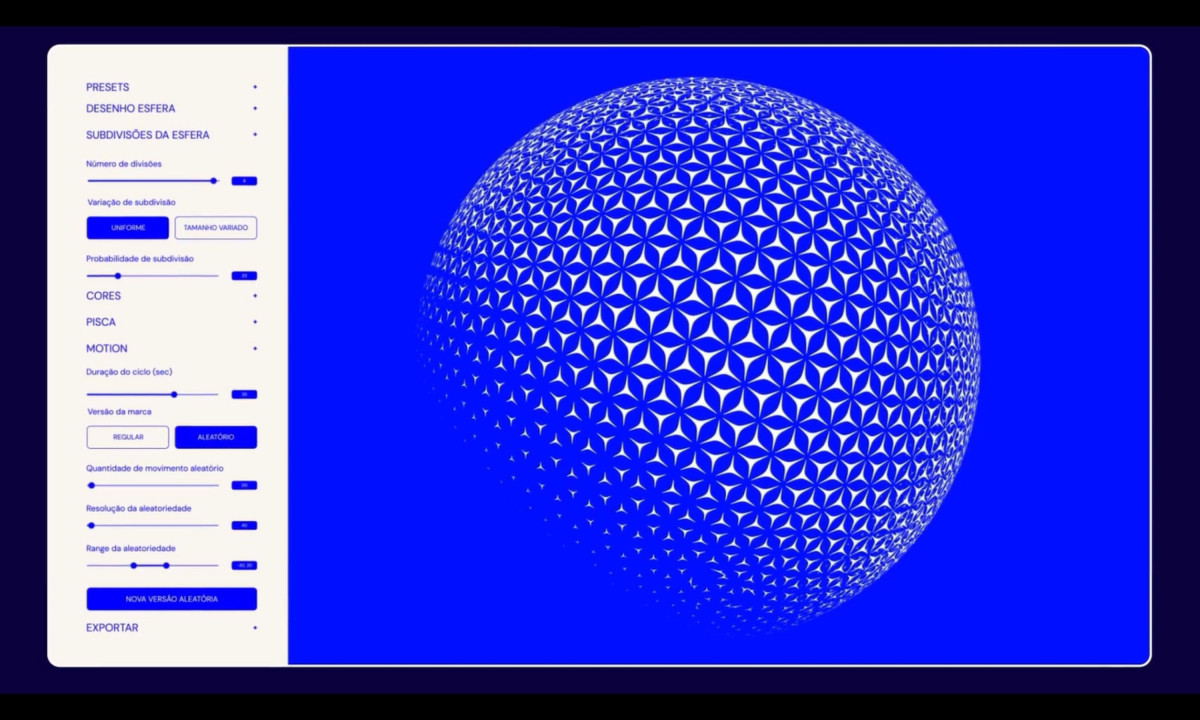
The mark is a sphere assembled from interlocking four-pointed star forms, rendered in white against an electric cobalt blue. The pattern reads as both a network in motion and a globe under construction, which puts articulation and growth into the same image without either reading canceling the other.

The name AXIA draws from axis and value simultaneously, anchoring the brand's verbal identity in the same conceptual territory as the mark. Confident, spaced-cap typography sits beneath the sphere with enough restraint to let the mark do the primary work.

The identity balances institutional credibility with contemporary expression across a system built for a new era of renewable energy leadership. Tátil Design delivers a rebrand specific enough to signal transformation and stable enough to carry sixty years of earned trust into whatever comes next.
Vote for the best design in this year's Design Awards and help decide which projects deserve top recognition. Every vote contributes to celebrating creativity and craftsmanship across categories like web, branding, product, and digital design.
Aperture Capital Logo Design by Numinous

Aperture Capital

Designed byNuminous
AXIA Energia Logo Design by Tátil Design

AXIA Energia

Designed byTátil Design
Athelo Logo Design by Senu Studio

Athelo

Designed bySenu Studio
Balance Logo Design by Studio AIO

Balance

Designed byStudio AIO
Wellington Educated Logo Design by Stanley Street

Wellington Educated

Designed byStanley Street
La Famiglia - Gucci Logo Design by Affaire

La Famiglia - Gucci

Designed byAFFAIRE
Hoopla Logo Design by Self-titled

Hoopla

Designed bySelf-titled
Belle&George Logo Design by Abmo

Belle&George

Designed byAbmo
Redheads Logo Design by Oliver Grace

Redheads

Designed byOliver Grace
View All BestLogo Designs

Ready to elevate your designs?